TAKEAWAY: Putting type on a photo is a delicate decision that all designers and editors have to make at one point or another. No single explanation or rule has the answer. Each photo must be evaluated on its own potential before type is positioned on it. My own rule: when in doubt, don’t do it. Pure Design download gives you some tips. PLUS: Unusual photo of Cuban iconic ballerina, Alicia Alonso. ALSO: Postcard from Lagos, Nigeria: last day presentations to staff of Next
Type or no type on that photo?
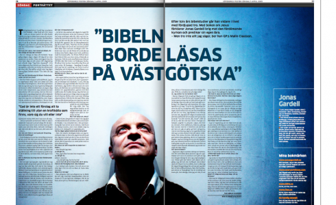
Double page from Sweden’s Goteborgs Posten: type worked well over this photo.
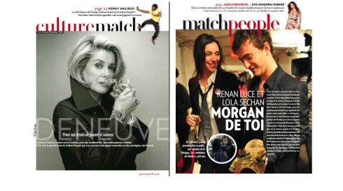
Two pages from France’s Paris Match: type more successfully used over the Catherine Deneuve photo than the one on the right. Glossy paper makes a difference here.
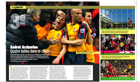
Double page from France’s L’Equipe Mag—careful with type that may not be easy to use (as paragraph top), but rest works well here.
Of course, if you ask a staff photographer at your newspaper or magazine, the answer is NEVER put any type on a photo.
However, I think that radically non-inclusive rule does not apply all the time. Yes, take up the discussion with the photographer who took the photo, by all means, before you put type on his/her photo.
In some cases, this is an effective technique; in many other cases, a photo is better left untouched by type. Read all about it here.
Alicia Alonso makes an appearance
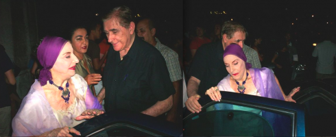
The Cuban legendary ballerina, Alicia Alonso, arriving at a Havana theatre this weekend, a very rare appearance in public by what many claim is the best ballet dancer ever to portray Giselle and Carmen
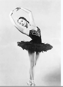
Alicia Alonso in 1955 photo
One of my cousins in Cuba was in attendance at the National Theater of Havana this weekend, when the globally known Cuban ballerina, Alicia Alonso, made an appearance to honor dance students. She is considered a legend and is most famous for her portrayals of Giselle and Carmen. Many claim that, aside from Fidel Castro himself, Alicia Alonso is the most famous and internationally recognized Cuban ever. Alonso, who is almost blind, no longer appears in public much, so when I got these interesting photos of the diva, the journalist in me had to put them here for you to enjoy.
Professionalism and Passion: Minding your P’s
It was my last presentation here in Lagos, Nigeria, for the team of Next —-which will launch the daily edition of Nigeria’s newest newspaper in mid August. This was a combination master class, design styleguide review and inspirational pep rally. I am happy to say that all three of these goals were accomplished. Because so many of the young journalists on the staff have not had much formal journalistic/design training, one has to turn the conference room into a university classroom, and deal with the basics of the craft.
“This is a combination Journalism 101, Journalism 201, Design 101 and Design 201 class, in three hours,” I told the group. The enthusiasm and desire to learn of the group, however, makes it all worth it, and we ran through a full presentation: from creating hierarchy on a page, to visual journalism techniques, to photo editing and color palettes.
Dele Olojede, Next publisher, helped tremendously:
You are here at the creation of Nigeria’s newest newspaper; you have a responsibility to be the best that you can be. I want all of you to study the styleguide presented here, and, until we are experts at it, I want you to follow it to the letter, and not start inventing and branching out into concepts of your own.
Amen, said I, as I recommended the same thing. A newspaper/magazine/website is basically about 75% formula——the foundations created at the beginning—-and 25% surprise: the headline you write, the photo or illustration you select. Let the foundation guide you, make the job easier for you, and create a sort of visual branding of the publication. For that to take place, everyone must follow the design/journalistic style as presented in the guide. There will always be time for experimentation later.
I will be doing follow ups and will present Next the daily to all of you here at this blog when it appears.
For more information about Next, go here:
The official website:
www.234next.com
Previous blogs dealing with Next:
https://www.garciamedia.com/blog/articles/Weekend_Updates_A_visit_to_Victor_Ehikhamenors_studio
https://www.garciamedia.com/admin/index.php?S=3d288590d403189c70a2b177e20a8bb8577a3b25&C=edit&M=edit_entry&weblog_id=6&entry_id=685
https://www.garciamedia.com/admin/index.php?S=6bed83f06c1beac7b1d0578a3c490f80481ba6b1&C=edit&M=edit_entry&weblog_id=6&entry_id=684
https://www.garciamedia.com/blog/articles/nigerias_next_on_sunday_changing_journalism_one_sunday_at_a_time/
https://garciamedia.com/blog/articles/next_on_sunday_the_new_newspaper_that_raises_journalistic_bar_in_nigeria/
Jacky was a hit on Sunday

Jacky captivated many of you, so he will be back next Sunday
Frank Deville’s dog, Jacky, made a cameo appearance in this blog yesterday (see above), and we joked that the Luxembourg-based pooch was an avid reader of the German newspaper, Bild Am Sonntag. Well, many of you wrote to say that you found this dog exceptionally cute and smart. So, by popular demand, Jacky will be back Sunday to tell us which Bild Am Sonntag story he sniffed as the best. Stay tuned for more of Jacky, who apparently prefers his newspaper “in print” and definitely NOT online.
Download entire first section of Pure Design: Words
Now that I have fully presented the first of six sections of Pure Design on TheMarioBlog, I am offering the entire initial section, “Words,” available for download—all 33 pages of it. This may be useful for those of you saving or printing out Pure Design and will be done following each of the remaining sections. At the end of our journey through words, type, layout, color, pictures, and process, I will publish the entirety of Pure Design in one file.
Follow me at www.twitter.com/tweetsbydesign
Follow the Marios

Two Marios. Two Views.
Follow Mario Jr. and his blog about media analysis, web design and assorted topics related to the current state of our industry.
http://garciainteractive.com/
Visit Mario Sr. daily here, or through TweetsByDesign (www.twitter.com/tweetsbydesign)
In Spanish daily: The Rodrigo Fino blog
:
To read TheRodrigoFino blog, in Spanish, go:
https://garciamedia.com/latinamerica/blog/
TheMarioBlog posting #322