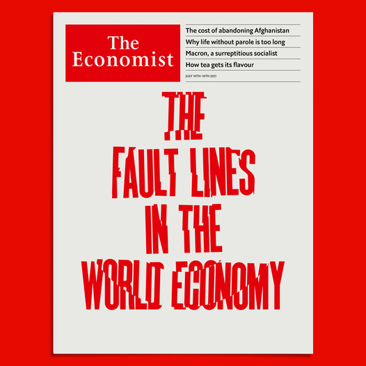
Take a look at the cover of The Economist above.
The art director here allowed for type to carry the day. It is unusual not to see an illustration accompanying a powerful headline on the covers of The Economist.
That is the reason I stopped to look when I saw this week’s cover, where the type in the headlines includes “fault lines” to tell us the story: the world’s economy in the Covid era is fractured.
I call these treatments “type attacks”—relying solely on typography (and color) to convey the significance of the story. Bravo for The Economist.
Of related interest
Our mobile storytelling workshops now available remotely

Professors: get your review version of The Story on time for fall classes
As an academic, I know the importance of having the right tools to advance our students, especially on the important subject of mobile storytelling. Please drop me an email if you would like to sample The Story in its digital edition: mario@garciamedia.com
Start writing or type / to choose a block


The full trilogy of The Story now available–3 books to guide you through a mobile first strategy. Whether you’re a reporter, editor, designer, publisher, corporate communicator, The Story is for you! https://amazon
TheMarioBlog post # 3327