This is the weekend edition of TheMarioBlog and will be updated as needed. The next blog post is Monday, February 18.
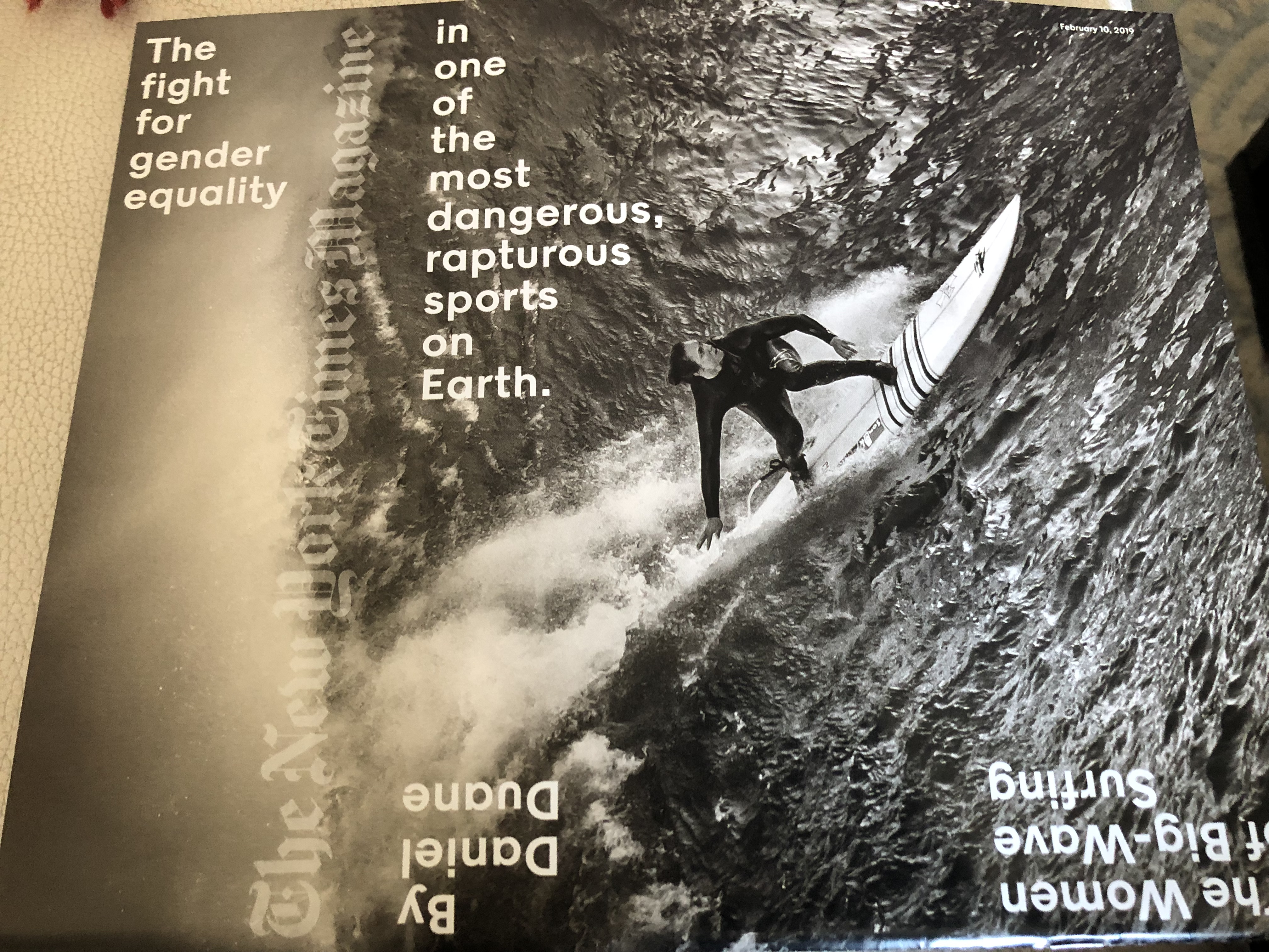
Which is the right side up here?
I am a fan of The New York Times Magazine, and it is one of the few publications that I read in its print edition each Sunday at home in New York City.
I usually like the content (superb and surprising), and the design (always so elegant and functional).
That is why I was not so happy with the cover of the Sunday, Feb. 10, edition.
It happened to arrive the week that I was preparing to discuss elements of typography with my Columbia University students.
I made these images to incorporate into my lecture with the following annotated comments:
When you first look at the magazine cover, you see the image perfectly well, but you must turn the magazine into a more square format to read the type.
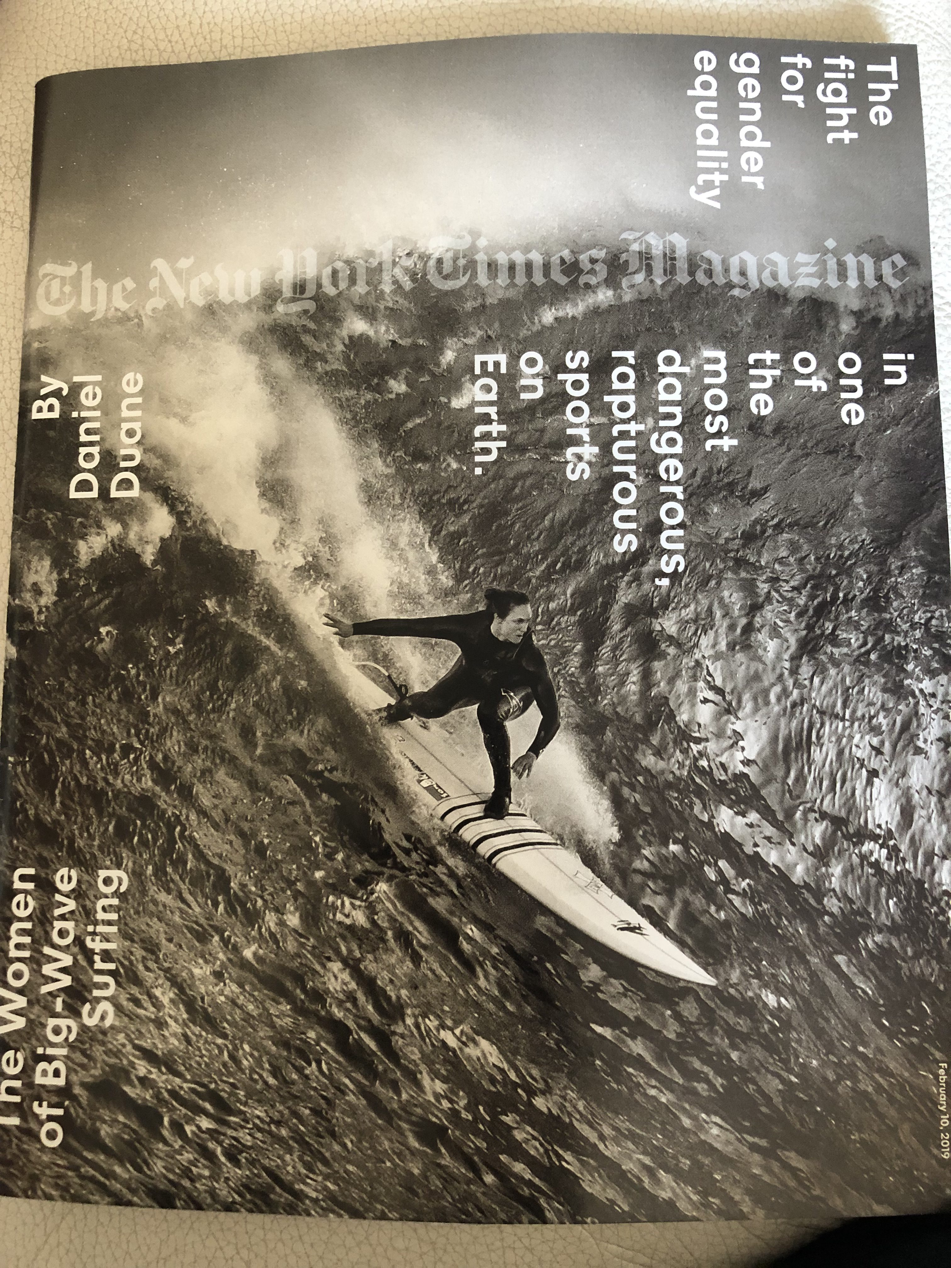
….but even when you do that, there it type on the edge of the page that is facing a different way. This is, indeed, a three way cover when it comes to optical orientation, the straight magazine format, then on your side, then upside down. Is that too much work for the reader?
How could this be done differently and simpler? We should not make the reader work this hard to get the information.
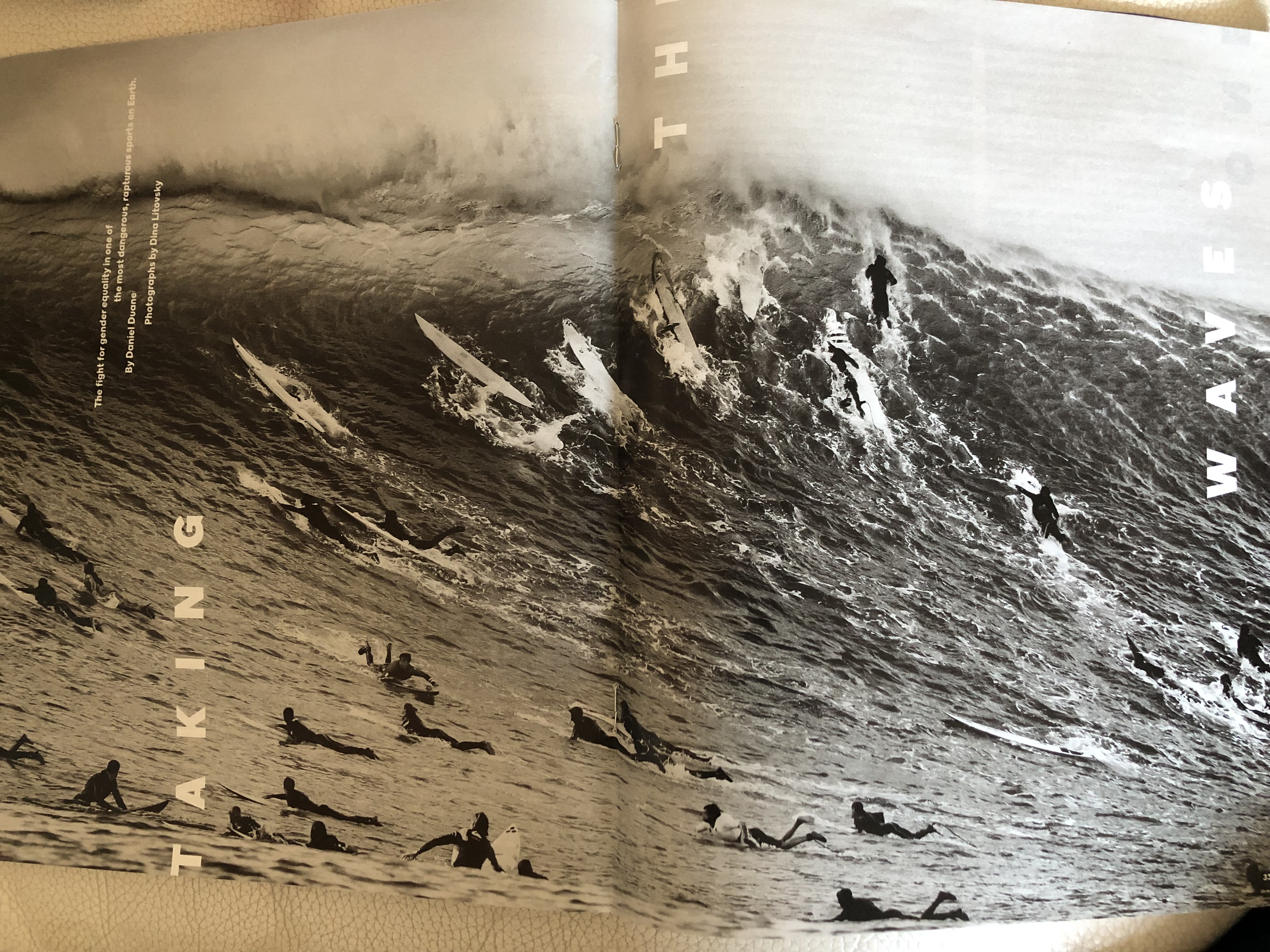
The inside pages
It’s clear that the art director here meant to be for the “page on the side” concept to be carried inside as well. Take a look:

TheMarioBlog post # 2993