TAKEAWAY: Type—-it is more than letters, numbers and punctuation marks. It is what gives our publications’ design that “ten seconds” of instant recognition, acceptance, rejection and, most importantly, when used well, what makes the information easy to read. Today we look at some interesting type considerations that go beyond an analysis of ascenders, descenders and serifs. Take a look at expression through type
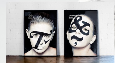
My blog post of today is totally inspired by a wonderful set of images on the website of Atipo (TypoJungle).
If you have not seen it yet, then you must visit the Spanish design house, Atipo, and look at the new faces of type.While the actual faces on which the type is applied are new, the fonts are not. In fact, they are quite classic. Take a look and see how those creative Spanish designers have put a new face on such familiar fonts as Caslon, Helvetica and Clarendon.
Of course, this creative approach to type use made me think of type and my own associations with certain fonts.
As designers, we have a greater awareness of type than our readers and users, as it should be. To them, type is only as beautiful and as legible as it needs to be. Period.
But notice that we in the design community drop the names of fonts as if talking about friends that we just spent the weekend with, or long gone pets that we adored as children, or, at our worst, with a sense of gossipy repudiation as in “God, can’t stand to see another magazine with …………on the cover!”. And, of course, whoever you are having this conversation with laughs and adds another even more terrible or tired font of the moment.
But, alas, there are those fonts that are forever revered like sports stars, movie stars or deceased Presidents.
Mention Didot, for example, and those around you smile—-images of fashion magazines of a certain era, refined and classic. Make a reference to Helvetica, and everyone thinks New York City Subways and, in my case, that forever printed in my subconscious Minneapolis Star Tribune of the late 1970s, a typographic poem to Helvetica by Frank Ariss
, who used it for every word printed, including the newspaper’s logo.
Mention Palatino, and, I hear what I have come to refer to as aPalatino laugh, memories of a long ago Poynter Type Talk conference in which the mere mention of that font made guru and type expert Roger Black go into heavy laughter. A definitive Poynter moment.
So, you see, we all have our type references, and we express them differently.
Type associations
After seeing the Atipo images, I started thinking, while running in Vienna today: what are some definitive type associations that I have. It came down to four, which I illustrate here.
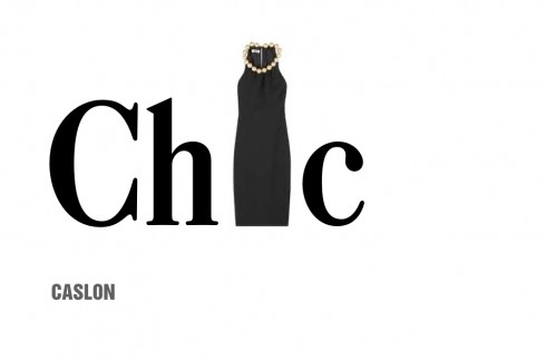
Caslon——one of my all time favorite typefaces. You can’t go wrong with Caslon, not if you wish to project a stylish, classic, ageless look. So, to me, Caslon is like a black dress by Coco Chanel. That Chanel dress is as elegant today as it was in the 1930s when the French couturier created them.
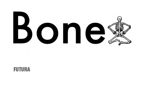
Futura——don’t ask me why, but I never liked it, and found it dehumanized, skeletal, so I immediately think of bones.
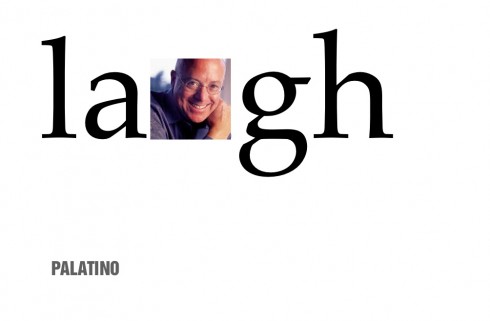
Palatino: It brings back the memory of media guru Roger Black and his hearty laughter after hearing the name of this font mentioned
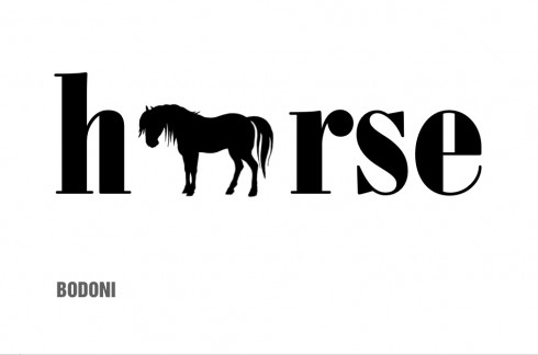
Bodoni——it was early in my career, in those days when 75% of all newspapers used Bodoni for headlines, and I heard an editor refer to Bodoni as a workhorse font. The image never left me.
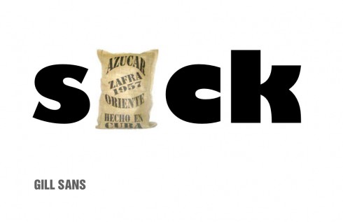
Gill Sans—-another one of those fonts in my never never list. Clunky, fat and reminds me of those sugar sacks that I used to see piled up to the ceiling in the sugar mill where my uncle worked in Cuba when I was a little boy.Nothing sweet about this Gill Sans.
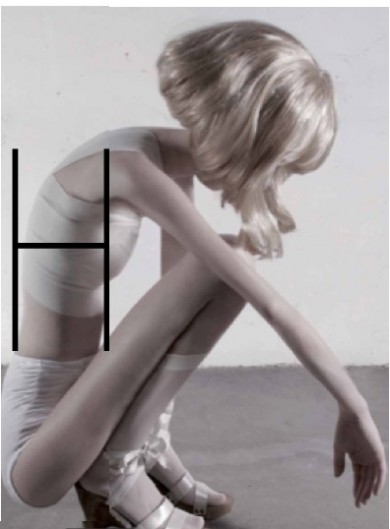
Finally, I make an association between this photo illustration that was used in the design of a feature page about anorexia in Lebanon’s An Nahar newspaper and Helvetica Thin. The photo is by Ivonne Thein, courtesy of Galerie Voss, Düsseldorf (Germany).
Type as art
Massimo Gentile, design director at Italy’s Il Secolo XIX, contributes some images from a fun personal project that he is working on, a tribute to jazz musicians through typography.
“ Here I am having a lot of fun with some of my favorite type fonts and my favorite jazz musicians, great artists of jazz, so I combine my two passions as I do these,” he writes.
jpeg_thumb.jpg)
jpeg_thumb.jpg)
jpeg_thumb.jpg)
Don’t miss these
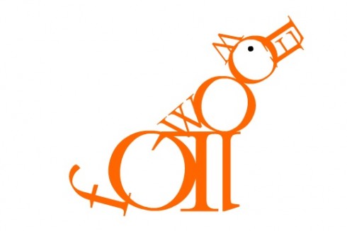
From Roberto de Vicq Cumptich: Bembo’s Zoo
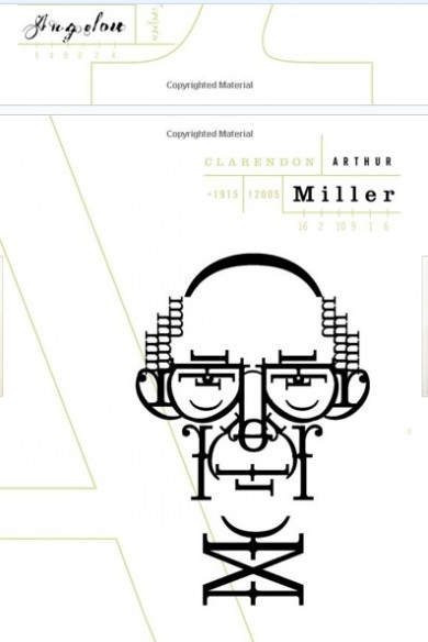
Roberto de Vicq Cumptich: Men of Letters (Arthur Miller)
For type as art, take a look at Roberto de Vicq Cumptich. He started with Bembo’s Zoo , and then continued with Men of Letters and People of Substance (http://www.amazon.com/Letters-People-Substance-Roberto-Cumptich/dp/1567923380/ref=sr_1_2?ie=UTF8&qid=1303174544&sr=8-2).
WoodWing’s Xperience seminar May 24-25

I am honored to be one of three keynote speakers at the upcoming WoodWing Xperience seminar in Amsterdam May 24-25
I did a previous keynote for a WoodWing Tour function in London in 2010.
For those interested in attending, here is more information:
May 24-25, 2011, Amsterdam, Netherlands
http://xperience.woodwing.com