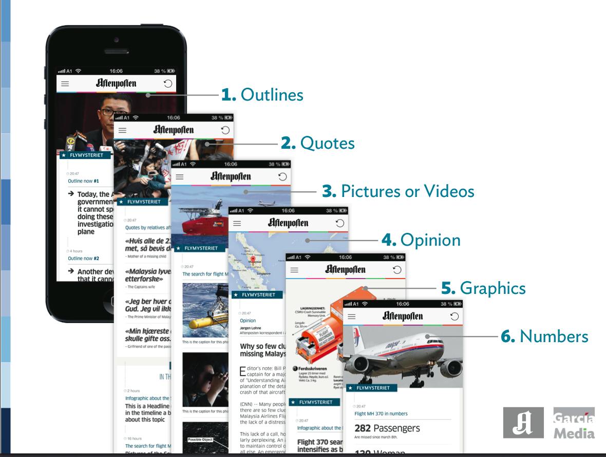
A variety of alternative, short story forms ideal for mobile platforms
Perhaps one of the richest experiences I am finding myself lately is that of helping editorial teams with the creation of story structures palettes that emphasize two important points:
1. With the constant flow of news in the 24/7 cycle, our audiences are better informed than ever. The majority are well aware of how most important stories have developed. They want short story formats to update the story, not necessarily a recap of the entire story which they know well.
2. We must develop story forms that allow for the essence of the latest that has happened int he story to come forth, especially on mobile platforms.
Most recently, and working with Norway's Aftenposten, we developed a few story structures that can lead to templates for editors to use to update stories.
Sometimes, it is only a quick outline with three bullet points of the story.
Or a video and a series of quotations that update what has happened now in the development of the story.
It could be a short photo gallery.
It could be an explanatory simple graphic.
It could be a simple commentary.
We are testing how these story forms would work on mobile platforms. The emphasis is on short and alternative story forms.
Which is why I was interested to read that recently, Brian Carovillano, AP’s managing editor for U.S. news, sent a memo to staff saying stories are getting too long and encouraging staffers to stick to the word count they were assigned, or to “consider using alternative story forms either to break out details from longer stories, or in lieu of a traditional text story.”
We can all learn from the way Circa does it, for example. It explores the quick, the now and the short story forms that emphasize one of the elements I mentioned above, as opposed to the traditional headline and text formats.
It's not a matter of eliminating any story genres. It's however, about devising formats that respond to the needs for the now update, and, hopefully, leading readers to the more lean back experience that a longer narrative offers.
As we mentioned in our blog post yesterday, it is about the short and long of it all. The now and the later. The two tempos.
Meanwhile at NRC in Holland
And, while discussing the two tempos of news, take a look at this video promoting Holland's NRC Q, the business daily's new offering optimized for mobile devices.
Promoted as 'business news with an attitude”, NRC Q taps into the lifestyle of the busy and always connected audience.
More from Nieman Lab:
“We’re your guide for the day,” says [editor Freek] Staps. He says the app borrows heavily from the lessons of Quartz (“The newsonomics of Quartz, 19 months in”). Its content is structured around repeating features like “Three questions about,” “While you were sleeping,” and “This is what you need to know,” all highly visual and arranged in an endless scroll.