TAKEAWAY: These are two new iPad apps that promise to conquer the hearts of users who like the wonderful (and expensive) things in life. For those who study iPad apps as part of our daily craft, the Iconist and Deluxe are fun textbooks to analyze. Here is the first of our upcoming series TheiPadLab, lessons on the essentials
It is what the iPad and future tablet platforms are best for: content that is presented in magazine format with a combination of longer pieces, medium size articles, mini stories that pop up when the finger touches an object, tons of photos, some videos, a little audio.
Two recent editorial apps answer that call and remind us how powerful the tablet platform can be.
First, Deluxe, the supplement about life and luxury published weekly by our client newspaper in Austria, the WirtschaftBlatt, a financial daily. Second, we will show you the latest issue of the Iconist, a tablet only publication from Germany’s Axel Springer group.
In both cases, we find great textbook case studies of how to do it right, and, indeed, each of these apps approaches the tablet differently.
Deluxe will show how the team at WirtschaftBlatt with whom I work closely throughout the year has taken its first “baby steps” into the world of tablet publishing and pop ups with this app. The WB does publish a daily tablet edition, and a very successful one it is, although it is still the 1.0 version with pdfs of the pages, enhanced by pop up windows that update the stories that appear in the printed edition
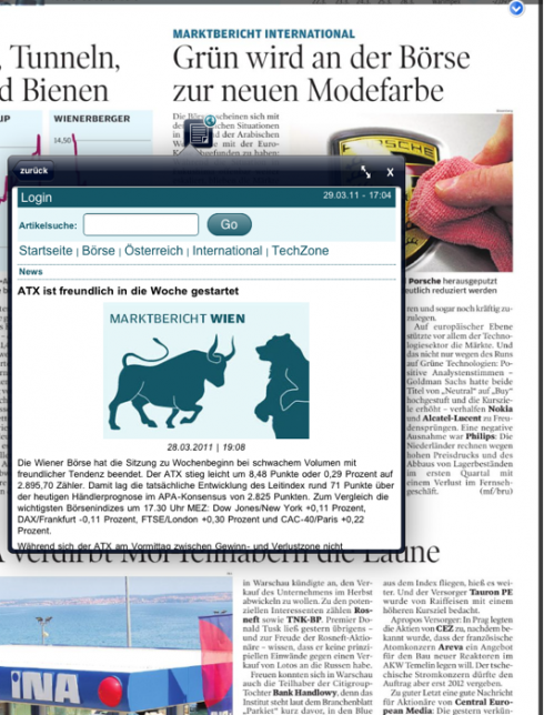
The Wirtschaft Blatt updates the evening market Report (NYSE) with the morning stock report of online (Asia and Vienna)
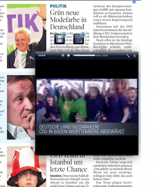
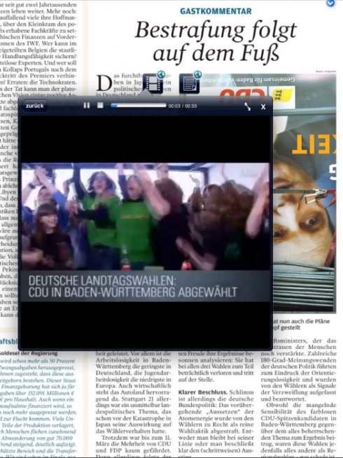
Here another pop up window that emerges from the page regarding elections in Baden Wuerttemberg and a Video Coming with the news. Indeed, the static printed page suddenly comes alive here.

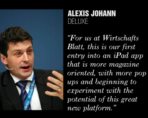
To hear Alexis Johann, manager of digital operations at WirtschaftBlatt tell it:
“We know that our tablet edition for the daily is basic, the essentials and it is a pdf of the page, but it is extremely successful with our users and I can prove that the CEOs who read us in Austria, who tend to be conservative, devour it, and use it. We are not so sure that they would like us to make a switch to a tablet-only edition without the pages of the newspaper. Not at this point.”
However, Alexis is aware that the 2.0 version——he agrees that they have probably taken their 1.0 into the 1.5 and beyond already——will have to have a more “tablet only” feel about it, and he is hoping to do that.
According to Alexis as well as CEO Dr. Hans Gasser, it is very clear that readers of their newspapers are happy with the existing daily iPad app:
Talks with our key readers showed us that they prefer a newspaper layout on the iPad – and furthermore – they want it to be the real newspaper, not something that looks like a paper but is in its heart an online edition (like WSJ or Die Welt) do it. This was clear choice of our readers: Give us, what we expect it to be. But then we wanted to add all the updates, so that yesterday’s stories get through the day and always stay fresh
These updates on the iPad, Alexis adds, are taken from the mobile edition, which is their fastest platform.
My personal research showed me, that many newspapers in Europe experiencend similar feedback from their readers, as 70 to 80 percent chose the paper-near versions (at daily Telegraph or at Les Echoes)
So, as Alexis puts it, and we don’t have an answer for this at the moment, this begs for the question:
Are these first movers / users on the iPad relevant for the future or will there be a second generation of users, that look for the fast information – or shall we concentrate on producing uniquely created iPad editions, not necessarily updated all the time, their own type of edition?
Another question: how do advertisers feel about all of this?
The Deluxe app was designed by WB design director, Jan Schwieger, who oversees all design across platforms.
With the deluxe-app i wanted to develop a new magazin-feeling for our lifestyle-topics. With high class photography, interactive elements and a smart navigation through the deluxe-issue it should be an adventure for the reader. Of course you have to look for rhythm, variety of interaction and topics and unfortunately for the file size
that the app works.
Germany’s Iconist

Next, take a look at the Iconist, which premiered in the summer of 2010 with a German only edition and now is also available in an English, international edition.
Brian O’Connor, who designed the app and is a partner in Rethink, writes us that with this #4 issue he has been able to do all the things he always wanted to do, although, he writes “it was not easy to get the technical guys to do all that I wanted to do, but it happened.”
Brian offers these tips to those getting started with an iPad app development:
Four tips from Brian O’Connor
1. Remember you are a designer! so keep it simple
2. It’s not the internet! The internet was a barren wasteland for designers and i have found the best way to develop ideas is to have a mix of analog and digital thinking, most of the people who in my experience deliver great story telling ideas don’t have to have an internet background
3. Love the programmers: it doesnt mean you always have to listen too them and you should also try too follow your vision but without them you have no app
4 .Get the management on board, its not enough that they pay the bills, they have to be interested in the product, too. Mathias Döpfner ,the Axel Springer CEO, is totally involved in the digital revolution and has been from day one a supporter of the Iconist project
Promo for iPad Iconist
Cover—Actress Diane Kruger is the cover girl for this issue #4 from Germany’s Iconist
Open the bag and, the pop ups start, what is inside the suitcase: mini stories follow
A unique pop up with text: clik on a headline summary, then get additional text to support the statement in the text.
A story about watches, with audio
Jewelry window: the closest thing to being there trying the jewelry on; the technique is simple, image and mini story

Getting a new car? Here is Iconist’s walk through a car, at the touch of your finger.
Time for book reading on the Iconist; page turner
In both cases, these apps are sort of brand extensions produced by newspaper companies: Deluxe is a supplement of the Wirtschaft Blatt; Iconist from the Axel Springer group.
The Daily: the way it could have been
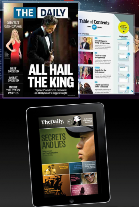
Image of landing screen for The Daily as it appears, and one of Alfredo Triviño’s prototypes
Want to take a peek into one of the prototypes created for The Daily, but that was not implemented.
Alfredo Triviño, director of Creative Projects at News Corporation in London, who participated in the development of The Daily, tells us about his experience and, for the first time, shows the prototypes.
Go here:
http://alfredotrivino.tumblr.com/
Of interest today
– USA: The New York Times Paywall: Yes, It Works
http://mashable.com/2011/03/28/new-york-times-paywall-2/
– UK: UK Times Claims 79,000 Digital Subscribers
http://paidcontent.co.uk/article/419-uk-times-claims-79000-digital-subscribers/
– USA: The Baltimore Sun Begins Digitally Preserving and Selling Original Photos From Its Historic Photographic Collection of Images
http://www.worldofprint.com/us/meldung2.php?NID=10533899
– UK: The Independent launches free smartphone app
http://www.brandrepublic.com/news/1062732/the-independent-launches-free-smartphone-app/
TheMarioBlog post #742