TAKEAWAY: Our Garcia Media Latinoamerica office in Buenos Aires has just completed the redesign for the websites of two Brazilian dailies, Diario do Pará, in the Amazon region, and Diario O Povo, of Fortaleza. In both cases, Garcia Media had carried out the print redesign as well.
Evolving into better multi platform environments


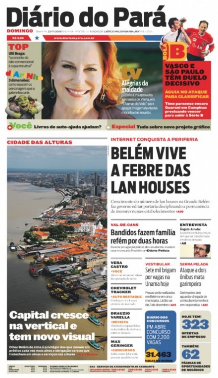
Front page of the printed Diario Do Pará
Diario do Pará is the leader in its market already, so the briefing behind creating a new design and information architecture for its website was part of the mission of Grupo RBA to create a digital platform and informational portal that would not just be a mere replica of the printed edition. So Dol (diario on line)—-newspaper on line—-was developed to be the most informative portal with the greatest number of users in Pará. The portal links users, makes itself indispensable to the audience, and it was developed following these premises:
1. Capitalize on the high volume of visits that the digital edition of Diario do Para already has.
2. To create a new brand and a new channel of information that could extend coverage already available and go more into entertainment and services for various type of users.
3. To create a portat that would be compact in its presentation, but diverse in its offer, and very easy to access.
4. To prioritize multimedia content and photo galleries.
5. To capitalize on the vast content of the newspaper’s website and its color coding system.
6. To connect all its content to social networks and to create its own social communities for user interaction.
7. To create a portal that would maintain good balance between the depth of the content and the volume of information, without excessive page scrolling to access the information.
8. To offer a portal with various levels of navigation and grouping of information.
9. To maximize the daily production of content passing through the newspaper.
10. To create sections that will not depend solely on the newspaper’s content, allowing them to be service oriented as well as entertaining.
For case study of Diario do Pará in Spanish:
http://garcia-media.com.ar/blog/post/las-marcas-del-futuro-ii/130
Diario O Povo: Fortaleza

For O Povo, a newspaper with which Garcia Media has had a long association, starting with redesign of its print edition 12 years ago, the next step in its evolution was to create a website that would maximize all that great content that the daily newspaper offers. Published in Fortaleza, in northeast Brazil, O Povo has emphasized “close knit” ties with its readers long before the word interactivity had become part of our daily working vocabulary. So the idea during the briefing here was to plan a website that would enhance what print does, and that would coincide with the next print redesign, soon to be unveiled.
The goals behind the redesign:
1. To create a website that would have total synergy with the printed edition, in the organizatin and naming of content and sections, plus color coding.
2. To unify the brand between print/digital.
3. To maintain a left hand side vertical navigation, something the users are used to and were not very willing to see changed.
4. To create different levels of navigation, provide easy access, including to all blogs and all the vertical offerings in the portal.
5. To organize all content to the page views, going easy on the number of animation elements.
6. To standardize as much as possible the size of ad spaces sold.
7. To amplify the use of RSS channels to be able to connect the portal to all type of platforms.
8. To unify all the typographic components for both print and digital editions.
9. To create content modules for the various sections.

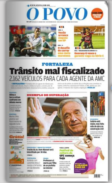
Today’s front page of the printed O Povo
For case study of Diario O Povo, in Spanish:
http://garcia-media.com.ar/blog/post/las-marcas-del-futuro-ii/130
TheMarioBlog post #658