Updated Tuesday, Sept. 1, 2009, 06:49 EST
TAKEAWAY: It is Tuesday and our topic today is typography. Have some fun with these links. PLUS: Pure Design download: the look of newspapers in Europe AND: Steve Foley, of The Age , Melbourne,Australia, chimes in on the state of US newspapers as models to be imitated.
It’s all about type here
The following items should please all the typography followers out there. Of course, this blog is richer because of the contributions of our summer intern, Reed Reibstein (Yale University ‘11), who has contributed these wonderful tidbits of type information to me. By the way, summer is over, and Reed is now all unpacked and ready to settle into his junior year at Yale. However, this does not mean he will not continue to contribute his talent to the Garcia Media summer projects in which he has participated. In addition, I am hoping we will be able to tap into Reed’s vast sources of information.
In fact, I have asked Reed to prepare a sort of “end of the summer internship” status report to share with you. How does our crazy world of media in the midst of an economic downturn look to a 21-year-old real digital native with great knowledge of and respect for traditional typography and design? Reed has promised us his “what I did this summer” blog entry soon.
Following are some links that you may find of interest:
More about FF Dagny
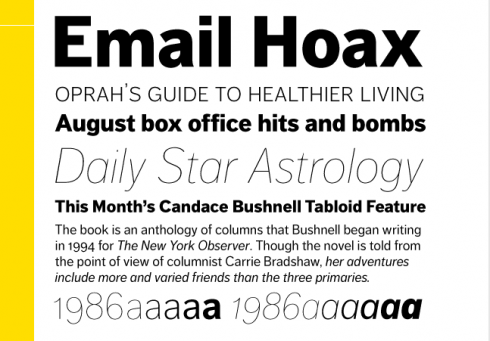
Here is FF Dagny: For the FontFont library several adjustments were made. The contrast in stroke thickness was reduced for better legibility in small sizes and characters were redesigned The family now includes a range of consistent weights from Thin to Black. The name Dagny is an abbreviation of Dagens Nyheter as well as an old nordic female name meaning “new day”.
Yves Peters, one of the bloggers for the wonderful type blog FontFeed, has written a piece on FF Dagny, “New FontFonts: FF Dagny from Tabloid to Desktop”: http://fontfeed.com/html/archives/new-fontfonts-ff-dagny-from-tabloid-to-desktop/.
He traces Dagny’s evolution from Dagens Nyheter to the present and discusses my own participation in the process as I worked closely with Orjan Nordling, who designed the font.
Read our blog post on FF Dagny:
https://garciamedia.com/blog/articles/all_about_ff_dagny_evolution_of_a_newspaper_type_font/
And now: the Wikipedia of type
Typedia, “A Shared Encyclopedia of Typefaces,” just launched: http://typedia.com/. It works much like Wikipedia—anyone can add information about any typeface—and aims to become an impartial reference on type and its designers. Reed admits “loving it” and says he has already added 13 typefaces and edited bits and pieces of many more. See the entry for Gotham as an example of how Typedia works: http://typedia.com/explore/typeface/gotham/.
Kerned Events? We like that title
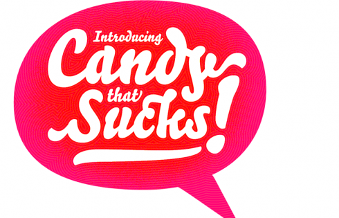
The stock image and typeface reseller Veer has a feature called “Kerned Events,” in which participants create a “headline” (more of a typographic composition) based on a story in the news: http://ideas.veer.com/group/kernedevents. There are some great designers at play here; a few favorite headlines are “Giant Jellyfish Poised to Invade Japan” (http://ideas.veer.com/group/kernedevents/gallery/156), “Bolt Wins” (http://ideas.veer.com/group/kernedevents/gallery/167), “Hedgehogs: Why Can’t They Just Share the Hedge?” (http://ideas.veer.com/group/kernedevents/gallery/172), and “Introducing Candy that Sucks!” (http://ideas.veer.com/group/kernedevents/gallery/185). Best of all, there is a new headline every weekday!
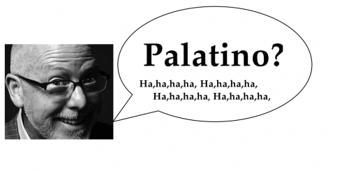
This is the most fun anyone has had with type since the day Roger Black performed his now famously called Palatino laugh during a Poynter Institute seminar.
A participant in one of those popular Type Talk seminars raised her hand and said:
“Mr. Black, I wonder what you would think of mixing Palatino with,…..”
Before she could finish, Roger erupted into one of his legendary deep laughs and exclaimed:
“Palatino?”
In fact, it would be great for someone to go to Kerned Events and try this headline (send it to me):
“Palatino?,” Black said. “Ha, ha, ha, ha.”
Pure Design download: the look of Europe
Today’s best of the European
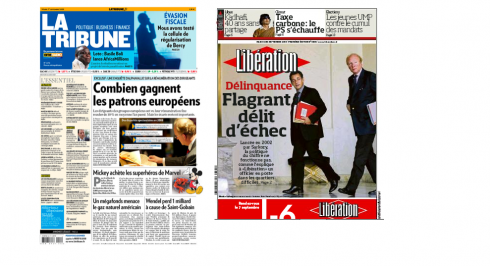
France: no longer lagging behind in state of newspaper design. Here La Tribune and LIberation front pages of today
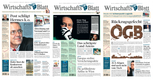
Austria’s Wirtshafts Blatt : showing that a financial daily does not have to be visually unappealing (recent Garcia Media project)
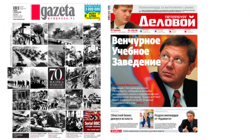
From the East: Poland’s Gazeta and Russia’s Delovoy
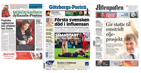
Some of the most progressive continue to be the Scandinavians: Jyllands Posten (Denmark), Goteborgs Posten (Sweden), Aftenposten (Norway)
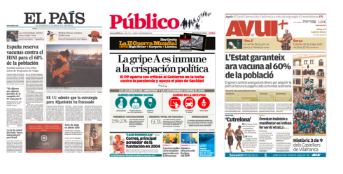
Spain continues to be at the top of the list with some of the best designed newspapers: El Pais (Madrid), plus newcomers Publico and Avui+
Here is how I described the look of newspapers on the other side of the Atlantic as I wrote the chapter for Pure Design in 2002.
Perhaps one of the most dramatic changes taking place since I wrote this “fable” has been in France. At the time, I said that I was somewhat disappointed that France—-a country where everything was designed with a capital D—-did not have the best designed newspapers in the world. Today, that has changed: Le Monde is a classically designed newspaper with great appeal; Liberation has been redesigned by Garcia Media and now embarks into another design project with a different firm. The financial daily, La Tribune, is attractive (Garcia Media project two times) and we have also worked closely with Paris Match and L’Equipe Mag. Also find ourselves now working with the team of L’Equipe newspaper.
Why US newspapers are no longer the model, one editor’s opinion
Yesterday we discussed the topic of US newspapers as traditional models for journalists and designers from around the world to emulate. We have received a comprehensive reply from Steve Foley, of The Age, Melbourne, Australia, that we wish to share with you.
Here is what Foley has to say:
It is true that many of us looked to US newspapers for inspiration back in the 90s. Their preparedness to experiment with creative page designs, cutting edge graphics and investigative techniques were to be lauded, and imitated. The more progressive US newsrooms were ground-breakers when it came to watchdog or campaigning journalism. How I wish the pioneering work with data bases and computer-assisted reporting had caught on here.
But something seems to have gone awry in the past decade. It’s not just the migration of audience to online. I despair at what has happened to fine mastheads across the entire US but I question how bold and vigilant their proprietors, managements, and quite possibly, their editors, have been in ensuring American newspapers kept innovating.
A case in point is The New York Times. Yes, it is the world’s most admired newspaper; its journalism is impeccable in the main. But look at the actual paper which appears to me to be locked in a 19th century time warp.
The NYT has not embraced full color as an editorial design asset; it has allowed advertising to dominate right hand pages and in common with most US papers appears in a shape that makes reading a challenge.
As I’m writing this I’m looking at a Berliner version of the syndicated NYT in Britain’s Observer newspaper. This version is infinitely more attractive, it uses full colour, is attractively laid out and is a more manageable size. I certainly don’t feel the Berliner-shaped Times has diminished authority.
I feel I’m looking at what the Times should be in the 21st century but given its woes, I worry that I’m looking at a missed opportunity.
STEVE FOLEY, AUSTRALIA
The Impact of the Compact
Pure Design: Download entire section: Type
Download entire first section of Pure Design: Words
Now that I have fully presented the first of six sections of Pure Design on TheMarioBlog, I am offering the entire initial section, “Words,” available for download—all 33 pages of it. This may be useful for those of you saving or printing out Pure Design and will be done following each of the remaining sections. At the end of our journey through words, type, layout, color, pictures, and process, I will publish the entirety of Pure Design in one file.
![]()
Who is Jacky?
Jacky belongs to Frank Deville. The Luxembourg-based pooch is an “avid reader” of the German newspaper, Bild Am Sonntag. Every Sunday Jacky picks stories and interesting graphics in Bild Am Sonntag , the German newspaper.
WAN’s World Trends 2009 Report

The 2009 edition of World Press Trends from WAN/IFRA is now available. I always like to review this report for its complete information on global circulation, advertising and online trends in our industry. All countries in the world where daily newspapers are published are covered in the publication.
This year the WAN/IFRA folks have decided to publish a print version but only make the book available on pdf.
Those interested go:
http://www.wan-press.org/forms/wpt2009.html

Follow me at www.twitter.com/tweetsbydesign
Follow the Marios

Two Marios. Two Views.
Follow Mario Jr. and his blog about media analysis, web design and assorted topics related to the current state of our industry.
http://garciainteractive.com/
Visit Mario Sr. daily here, or through TweetsByDesign (www.twitter.com/tweetsbydesign)
In Spanish daily: The Rodrigo Fino blog
:
To read TheRodrigoFino blog, in Spanish, go:
https://garciamedia.com/latinamerica/blog/
TheMarioBlog posting #350