TAKEAWAY: What do you tell a group of newspaper editors about their printed newspaper? Some thoughts as I prepare a keynote presentation for WAN IFRA Middle East 2013 in Dubai Tuesday.

Tuesday in TheMarioBlog: Several art directors and designers have written to me stating they are surprised SND 34 did not award as many infographics entries as in the past. It has become a source of controversy. Tune in as we talk to a variety of people in the industry, SND competition judges and others, all with the aim of looking at this important segment of the valuable SND contest.
Newspaper print editions and what’s important
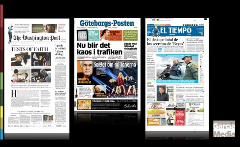
From the Garcia Media portfolio: The Washington Post (USA), Goteborgs Posten (Sweden), El Tiempo (Colombia)
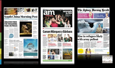
From the Garcia Media portfolio: South China Morning Post (Hong Kong), a.m. (Mexico), Sydney Morning Herald (Australia)
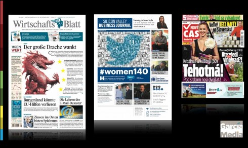
From the Garcia Media portfolio: WirtschaftsBlatt (Austria), Silicon Valley Business Journal (USA), Novy Cas (Slovak
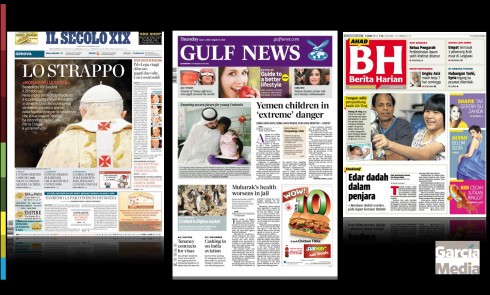
From the Garcia Media portfolio: Il Secolo XIX (Italy), Gulf News (UAE), Berita Harian (Malaysia)
Thinking about the power of print this Monday as I put finishing touches on a presentation for the WAN IFRA Middle East conference here in Dubai Tuesday. The two day conference will have me do an opening keynote devoted primarily to the printed newspaper, but the closing keynote is about all things digital, with emphasis on the tablet. Good bookends, I would say.
What’s to say in a keynote about the printed newspaper?
There is plenty to say and to be optimistic about, as I will remind the audience
.
Some highlights of my keynote:
Today’s newspaper must capitalize on its brand, on that fabulous recognition element, then highlight the role of print in the midst of the media quartet.
There is no question that the printed newspaper remains the mother’s milk for all the content, regardless of how it is utilized in the various other platforms.
The newspaper of 2013 must be seductive and serious, but without taking itself too seriously. It should dabble in the silly as well. It should emphasize quality journalism through storytelling that connects emotionally with the reader.
Editors of a printed newspaper must do print happily and think that their newspaper can still offer surprises, even in the fast moving world of Twitter and Facebook.
Publishers also need to study the role of frequency of publication: should every newspaper publish daily? Maybe not.
But one thing is for sure: the weekend newspaper will be robust and still a great companion, so pay attention to this particular edition.
What are the strategies I recommend for print newspaper editors?
Review content flow: Are all the sections and topics that you carry in your newspaper today necessary? Perhaps not. In 2013, time to do an inventory, and retire topics that may no longer be viable, while adding others, such as health and technology which need to be emphasized.
Photos and info graphics: These visual elements of a newspaper have never been more important. Review how your newspapers handles visual storytelling. More is better. Especially, include faces, of which readers can’t get enough.
Link your newspaper to its digital siblings: Don’t doubt it for a moment, more and more of your print readers are also connected to your digital editions. The trend is for more of your audience to move across platforms, including print. Echo this in your publication. Tell me what you have online, or on the mobile phone or tablet. And give the newspaper a navigational system that will be friendly to those whose bring the digital mentality to print.
Some pieces from the Garcia Media portfolio:
Finally, I will show a variety of projects that we at Garcia Media have had the privilege of being involved with the past 24 months. Each of these projects is different and offers a variety of approaches to the challenges presented by print, from the classic look (The Washington Post), to the contemporary (Goteborgs Posten of Sweden), the innovative (El Tiempo of Colombia, Gulf News of UAE, Il Secolo XIX of Italy), the energetic tabloids (Berita Harian and Metro, of Malaysia, Novy Cas of Slovakia), and the digitally inspired (Silicon Valley Business Journal and WirtshaftsBlatt of Austria).
The key, as I will mention in my presentation, is that each newspaper recognizes the importance of its local impact and capitalizes on it; that it develops a look and feel that is aimed at specific target audiences, and that it knows its DNA, can articulate it in a tweet, and, more importantly, in the product itself. We take pride in working hard to achieve that in all of our projects, and, as you can see in this sampling not too look alike, as it should be.
Clever visual storytelling
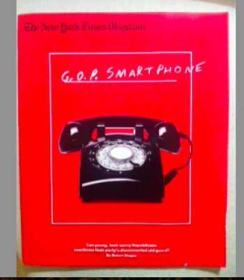
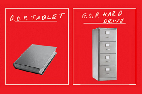
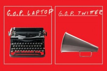
The New York Times Magazine cover: a photo of a 1960s dial telephone marked “GOP Smartphone.”
Simple, direct and to the point. That’s how I would describe the current cover of The New York Times Magazine, using a variety of images to relate to what the editors feel is the Republican Party’s backwards approach to life generally.
They did not have to write a long editorial to make their point, whether you agree with it or not (that’s another story). Here the message is clear in 10 seconds. Obviously, the editors had fun with this approach, as did readers.
In typical NY Times fashion, the piece is solid journalistically beyond the easy to grasp illustrations.
The question under the cover imagery read: “Can young tech-savvy Republicans overthrow the party’s disconnected old guard?” The writer of the nine-page piece inside, Robert Draper, answered: “No!”
The Economist: a winning cover
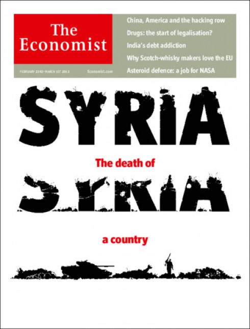
Syria: The Death of a Country
While on the subject of effective visual storytelling, this week’s cover of The Economist is another winner, making us grasp the powerful story inside by just taking a look at a powerfully illustrated cover. The Economist’s comment reminds us that as Syria disintegrates, it threatens the entire Middle East and urging the outside world to act before it is too late
Pages we like
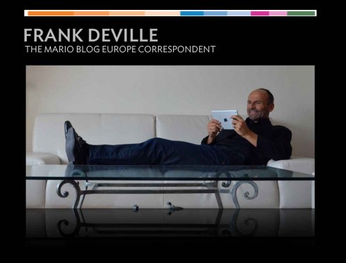
Frank Deville sends us these interesting pages from the Bild am Sonntag, the Sunday edition of German’s Bild.
In each of these, they excel with visual storytelling beyond just a narrative. In each case, mini stories appear to facilitate reading related to images on the page. See below:
Faced with a crisis about the presence of horse meat in food products, Europe copes with the problem, while Bild has fun with it. Headline here reads: *Here we guarantee no horse meat!*
Bild am Sonntag won five awards during the recent SND 34 competition. Here they write a note about it and show the winning page spreads.
Headline reads: Horse power, I love you!
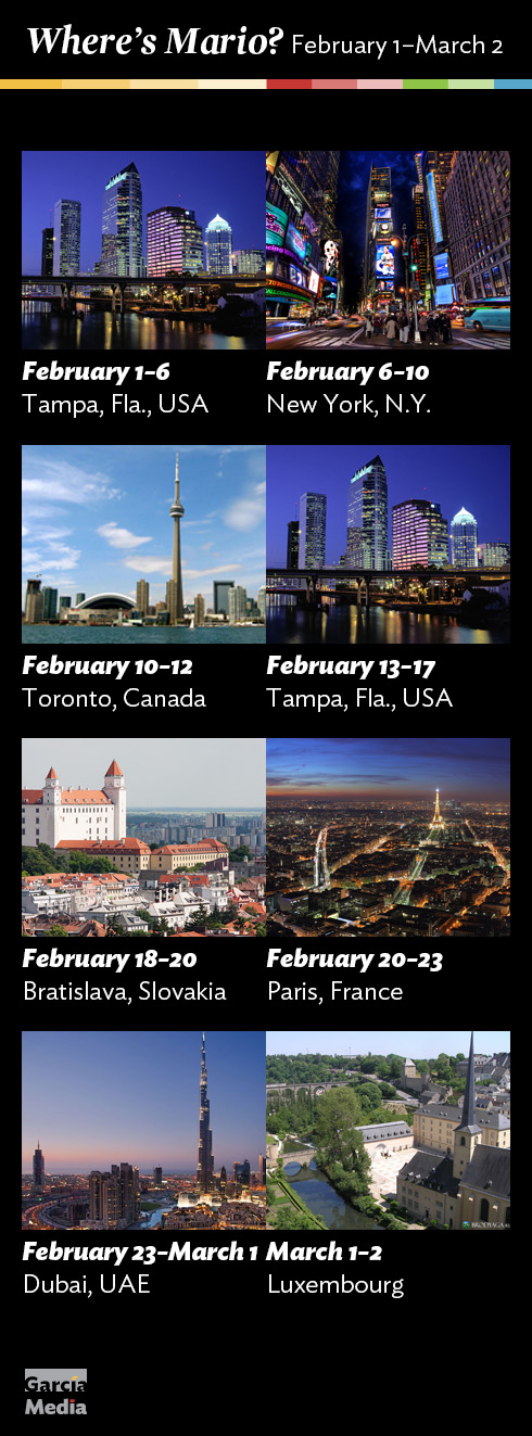
Where’s Mario until March 2, 2013?
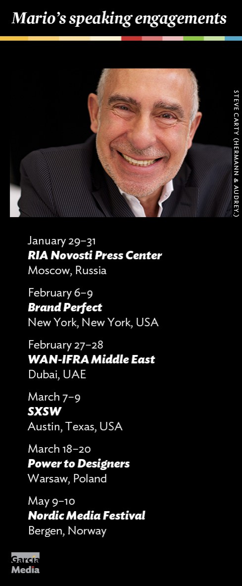
Mario’s upcoming speaking engagements
Take advantage of our iPad Design/Ad Lab workshops
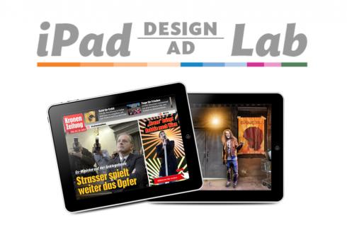
Do you want to take your brand to the next level by creating a tablet edition? Garcia Media can help. We now offer one- to two-day iPad Design Lab workshops on demand to jumpstart your presence on this exciting new platform. We also offer iPad Ad Lab workshops to develop engaging advertising models for your app. Contact us for more information.

Purchase the book on the iBookstore
iPad Design Lab has been given the QED Seal
The QED (Quality–Excellence–Design) Seal is bestowed by the judges of the Publishing Innovation Awards after “a thorough, professional 13-point design review with an eye towards readability across multiple devices and in multiple formats.”
Learn more about the QED Seal here.
The EPUB version of book is HERE:
Now available: The EPUB version of  iPad Design Lab: Storytelling in the Age of the Tablet, ready for download via Amazon.com for Kindle:
http://tinyurl.com/8u99txw
Here is how you can get iPad Design Lab book:
The original version of the book is the multitouch textbook version available on the iBookstore for iPad (iOS 5.0 and up):
https://itunes.apple.com/book/ipad-design-lab/id565672822
This version includes video walkthroughs, audio introductions to each chapter, swipeable slideshows, a glossary and a sophisticated look and feel.
Apple only sells multitouch textbooks in certain countries at this time, unfortunately. Copies are available in at least the following countries: Australia, Austria, Belgium, Canada, Finland, France, Germany, Great Britain, Greece, Italy, Latvia, Luxembourg, The Netherlands, Poland, Portugal, Romania, Slovakia, Spain, and the United States.
For those in other countries and without an iPad, we have made the book available in a basic edition for other platforms. This basic edition includes the full text of the original, along with the images and captions, but lacks the other features such as audio and video. It is available on the following platforms in many countries:
Amazon Kindle:
http://amzn.to/SlPzjZ
Google Books:
http://bit.ly/TYKcew
Take a video tour of iPad Design Lab
“iPad Design Lab” trailer on Vimeo.
Read the Society of Publication Designers’ review of The iPad Design Lab here:
http://www.spd.org/2012/10/must-read-ipad-design-lab.php

Keep up with Mario Garcia Jr.. via Garcia Interactive: helping transform online news since 1995.
www.garciainteractive.com