Updated Wednesday, April 1, 10:24 am EST
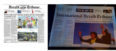
Before and after front pages of the International Herald Tribune: notice major redesign of the newspaper’s nameplate
Classic and nice
That is how I would describe this new look for the International Herald Tribune, which I just discovered upon landing in Frankfurt this Wednesday morning April 1.
And, no, it is not an April Fool’s joke. Even the logo is new, streamlined, but what stands out is the use of white space, which is ample, the almost purposedly orchestrated use of color in very limited basis, and a sort of typographic monochromatic approach, with little contrast, but which sits well with how type, white space and page architecture have been coordinated here.
The design, carried out by The New York Times design team, I assume back in New York City, reminds one of the peaceful, meditative visual pace that we often associate with elite German weeklies, such as Die Zeit. No loud headers, or color boxes, or distracting elements here. The designers and the editors assume you will flip page by page, which is the case in this one-section, 18 pager. Is this the sign of future newspapers to come (single sections, fewer pages—-see posting below).
IHT new look details
According to a press release, The International Herald Tribune (IHT), the global edition of The New York Times, has launched two major product innovations for its worldwide audience of digital and newspaper readers.
A new online Global Edition at global.nytimes.com combines the international voice of the IHT with the worldwide breadth of reporting of The Times and the digital expertise of NYTimes.com. It is edited in New York, Paris and Hong Kong to provide users with a 24/7 flow of geopolitical, business (with Reuters), sports and style, news and commentary from a distinctly global perspective.
Simultaneously, the IHT unveiled a fresh new look for its newspaper. The result of a year-long collaboration with the award-winning newspaper design team at The New York Times, the front-to-back redesign gives more definition to the 122-year-old paper’s journalistic strengths and emphasizes its international personality.
This is what the new look of the IHT attempts to accomplish:
Clearer headings, improved page navigation, more anchored positions, better designed briefs columns and pointers to Web articles, as well as greater emphasis on photography all serve to make the new-look IHT newspaper easier to navigate, more visually arresting and helpful in directing readers to additional content at global.nytimes.com.
A cleaner nameplate that gives ‘international’ more prominence and a new Cheltenham typeface to lend contrast and openness throughout.
The Business section which is produced in collaboration with Reuters, is given added prominence by being anchored at the back of the newspaper Monday through Friday, creating a new business-oriented environment that showcases the popular Breaking Views feature and columns by authoritative, analytical writers like Andrew Ross Sorkin and Floyd Norris.
For the weekend edition, a new section called Weekend Arts full of interviews, reviews and lifestyle reporting draws together the arts coverage of The Times with IHT regulars, such as art critic Souren Melikian, to create a stimulating weekend read.
Micro design is here
As i have taken extra time to analyze page by page of the new IHT, I realize that this is what we might refer to as “micro design”—-the designers in charge of creating this new look have emphasized :
—-typography UNDER 12 points (or even smaller than 10 in some cases) for a variety of areas: datelines, bylines, billboards that describe a topic (opera review), and even the texts in the People column
—generous doses of white space surrounding every element, including (and especially) top of the page headers: Sports, Culture, etc.
—all caps Cheltenham headlines for secondary readings: very effective, indeed.
—the smallest ever two line headlines for briefs: but they actually work
The new IHT displays elegance in a minimalist way. The word stimulus is much used today. Perhaps the design of the new IHT stimulates simply because it attempts to relax the reader more than to pump him up and get him excited.
For more information about the IHT new look:
http://www.designtaxi.com/news.jsp?id=26002&monthview=0&month=3&year=2009
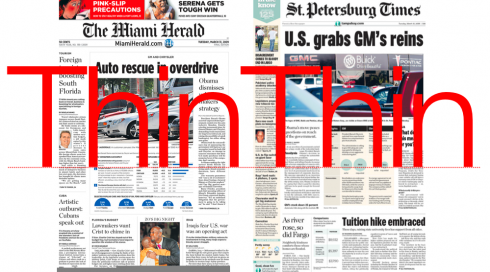
Front pages of The Miami Herald and The St. Petersburg Times, Tuesday, March 31: pagination is down
Those flimsy U.S. newspapers: fewer ads, fewer pages
First in Tampa, as I bought a copy of The St. Petersburg Times before boarding my flight to Miami, then there The Miami Herald as I waited to board my Lufthansa flight to Frankfurt. These two newspapers, Florida’s largest (and rivals in the perennial question: which has the largest circulation? The Times claims the prize) looked rather flimsy on this Tuesday, March 31.
In the case of The Miami Herald, the news Section A was 14 pages, with Metro (local) at 8, Business a mere 6, then Sports/Classified combo at 14. It was very similar for the pagination of The Times. Perhaps Tuesday is a slow day for advertising in both cities, but I don’t think I recall seeing such skinny newspaper packages ever. A sign of the times. Let’s remember that, according to the Newspaper Association of America,, total industry advertising (both print and online) in the third quarter of 2008 was $8.9 billion, down 18 percent from the year before. The online portion of that was $750 million, down 3 percent. So far in the first three quarters of 2008, the industry’s total advertising revenues have shrunk by $5 billion to $27.8 billion.
No wonder these newspapers have become light weight in your hands.
Remembering Professor Garfunkel
My thoughts regressed immediately to my journalism professor, the late Barbara Garfunkel, who taught us Journalism 101 at Miami-Dade Community College in the 1960s. Miss G—-as she was affectionately referred to by legions of students who went on to become editors at The Miami Herald and The Miami News—-had a particular love affair with The Herald, a newspaper she admired for its journalism, its layout (it was called make up in those days), and because she could point out to a variety of columnists and tell you what year she had them as students during her many years as THE journalism teacher at Miami Senior High School (my alma matter, by the way).
But it was more than admiration for the work of those she had taught, Miss G would actually use The Herald and The News (the afternoon daily which ceased publication Dec. 31, 1988) as her textbooks.
I can still see the image of this petite, impeccably dressed woman with the sweet, handsome face, drilling us on how to write a feature lead, as she held a page from The Herald in her hand, then she would switch to the first person column and how a certain columnist would draw his readers in. “Seduce your readers in that first sentence,” she would say, a touch of a southern accent giving away her Florida roots. Her desk, at the front of the classroom was covered with fat sections of both The Herald and The News.
Those were the days. Newspapers were a bounty of mostly black and white pages, with a touch of “spot” color here or there as a major visual event. Headlines were big for the afternoon The Miami News, always smaller for The Herald. Columnists had the following of local rock stars. Section after section would provide everything a reader might want, and more, since most people in those days spent over 35 minutes a day with their newspaper.
Today, Miss G would still find examples to teach her students from in both The Herald and The St. Petersburg Times, but they would be fewer, and her desk would probably look less cluttered.
I often think of Miss G and how she would have reacted to a multi media world. She would still be teaching us those forever useful universal lessons: write clearly, seduce your readers with good writing and great content, write about that which you know, accuracy, accuracy, accuracy, and, please check your spelling and grammar.
Today she might add: tailor your writing to the medium for which it is intended.
And now, the Carmen Miranda page of the day
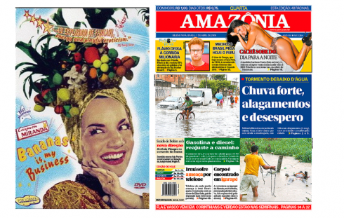
From time to time we remember our favorite Brazilian star, Carmen Miranda, when we come face to face with a front page that, well, Carmen could have folded and put over her head as part of her elaborately colorful hats. Here is it, directly from Brazil, Amazonia.
“What can save the newspaper?”
Rodrigo Fino deals with the question in his blog today. More importantly, he shows a six minute video from by Polish designer, Jacek Utko, who shows his work for newspapers, inspired by a performance of Cirque de Soleil.
:
To read TheRodrigoFino blog, in Spanish, go:
https://garciamedia.com/latinamerica/blog/
TheMarioBlog posting #229