TAKEAWAY: No typographic scheme is complete without a good condensed version of that font you are planning to use for headlines. Some interesting choices here.
Condensed can be elegant


No typographic scheme for any publication is complete without a good condensed version of the font.
In fact, as I work with my teams making typographic selections, I dot the usual “i’s” and cross the perennial “t’s” we all know and use without thinking.
Like, how does the W look? And the M? How about descenders and ascenders. Take a look at the letter “Q” in caps and “q” in lowercase. Don’t forget to see numbers and punctuations. If the quote marks are not appealing, stray away from that font.
Then I ask the question: how about a good condensed version of the font? This the one your copy editors will be asking for to make headline writing easier and the one that adds a touch of distinction and contrast to the type fabric of a page.
Now, Jonathan Hoefler of Hoefler & Frere-Jones shares with us a full collection of their condensed fonts. Worth looking at. In their own words:
Whether it’s a naturally narrow design like Tungsten, or our Verlag family that includes three different widths, condensed fonts are a designer’s secret weapon for delivering maximum punch. Below, ten of our hardest working condensed fonts: see these, and hundreds of other designs, exclusively at H&FJ.
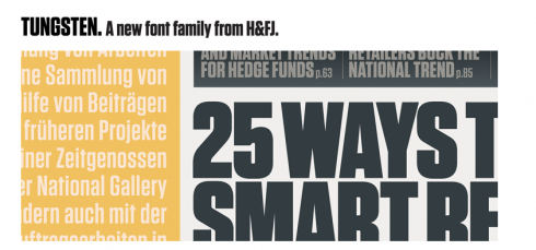
Among the ten condensed version of fonts shown, the new one Tungsten is a beauty. I can see it as a durable sans that many tabloid designers will be lured to, especially for front page headlines bigger than 180 points! Truly robust and elegant, but packs a strong punch!
I can see Tungsten as a great choice for any new newspaper or magazine starting publication in 2010. Modern. Economical. A touch of elegance. It will be a major consideration for my next project.