Let’s face it: we are all isolated and staying at home in the days of the Coronavirus epidemic.
If we do a reality check: we are staying here for the long haul, or, in the case of the US, until April 30 and beyond.
If you are like me, you structure your day as best you can, trying to block certain times for specific tasks: I am fully into my German lessons for at least one hour a day, I convert my Columbia class lectures into more online-friendly opportunities for the students. I cook. I clean. I feed a friendly bird to appears at my 7th floor balcony as I isolate myself in Tampa, Florida, geographically close to my children and grandchildren, but not in contact with them beyond FaceTime.
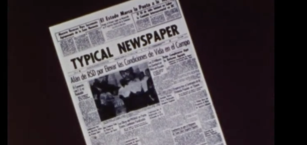
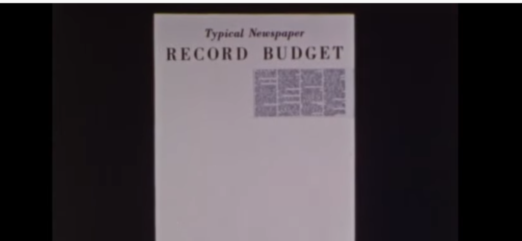
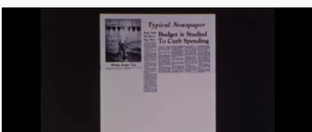
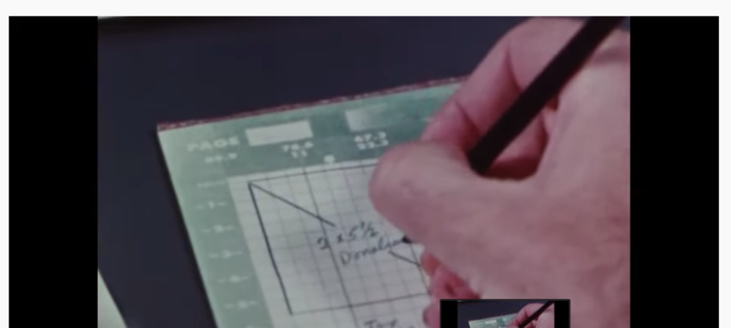
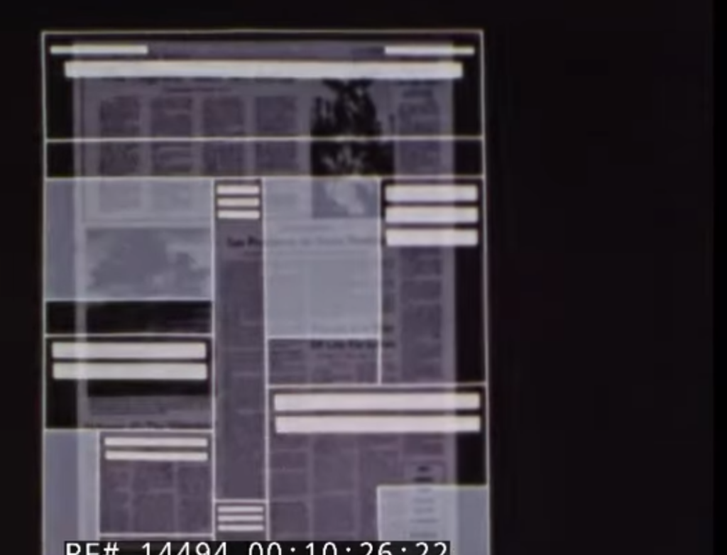
Still, there is time to explore books, television and old documentaries like Newspaper Layout, from the 1970s. This is a real retro gem of newsrooms that I remember from my early days in this business. The documentary begins with the roaring sounds of a printing press churning out black and white newspaper pages.
There are typewriters and sideburns, and old filing cabinets, telephones with long chords.
Lessons that still resonate today
There are newspaper layout lessons, too, some which have aged well:
- Make the news presentation more appealing.
- Be generous with white space.
- Type selection is important.
- Keep the pages fresh and inviting.
Take a tour of newspaper layout of the past here
Let The Story guide your mobile first strategy!
The full trilogy of The Story now available–3 books to guide you through a mobile first strategy. Whether you’re a reporter, editor, designer, publisher, corporate communicator, The Story is for you! https://amazon
TheMarioBlog post # 3237
