New Delhi, India—
The design of a newspaper has a lot to do with the culture and the environment in which it circulates.
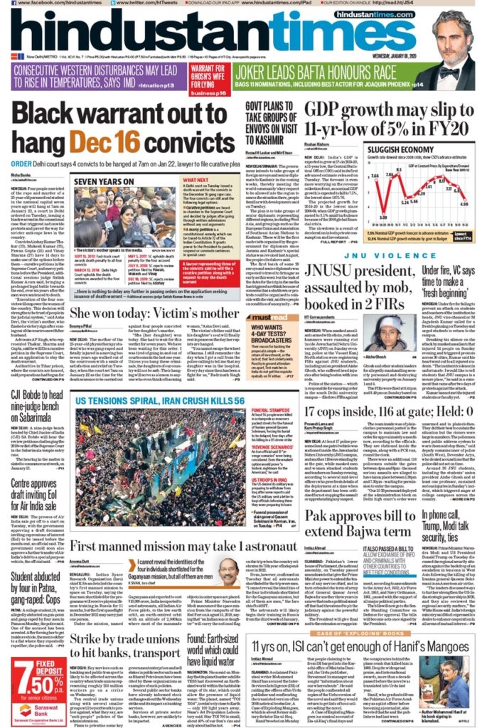
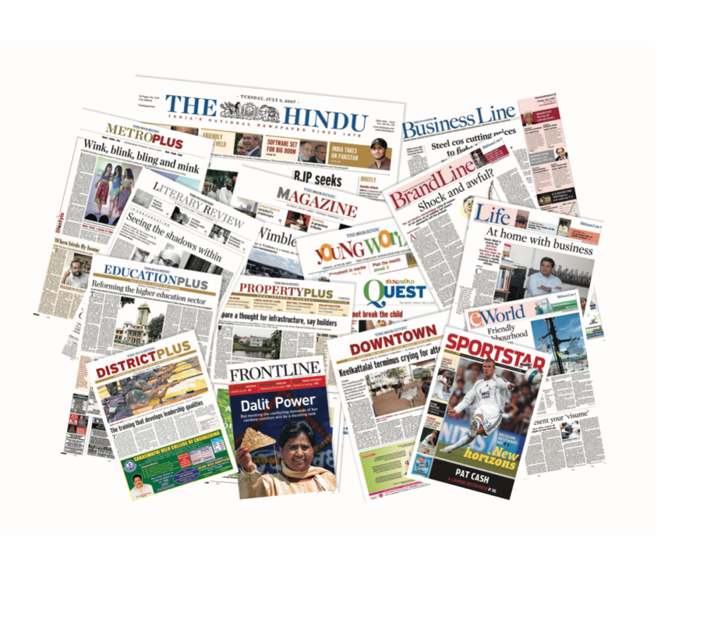
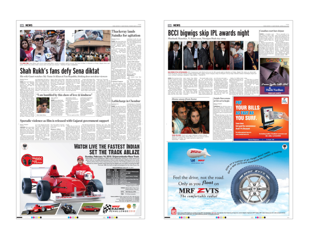
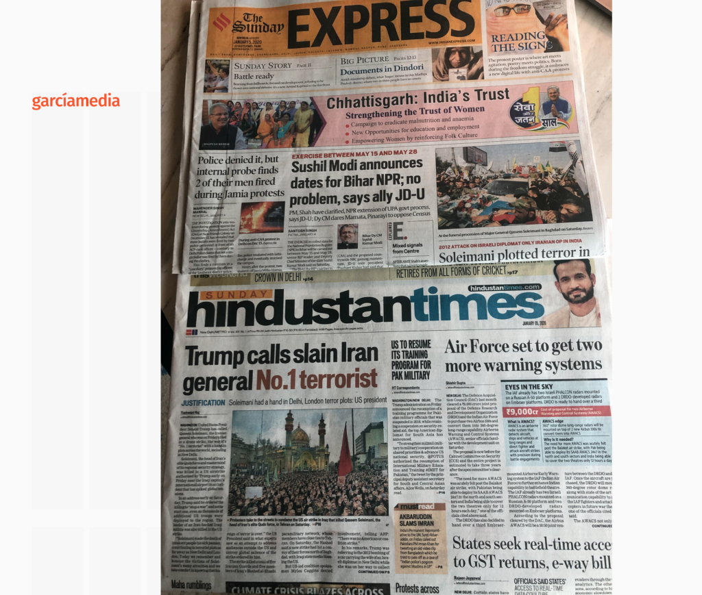
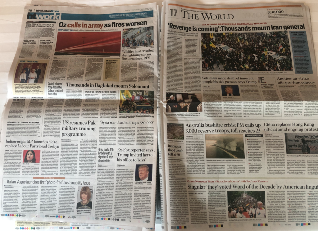
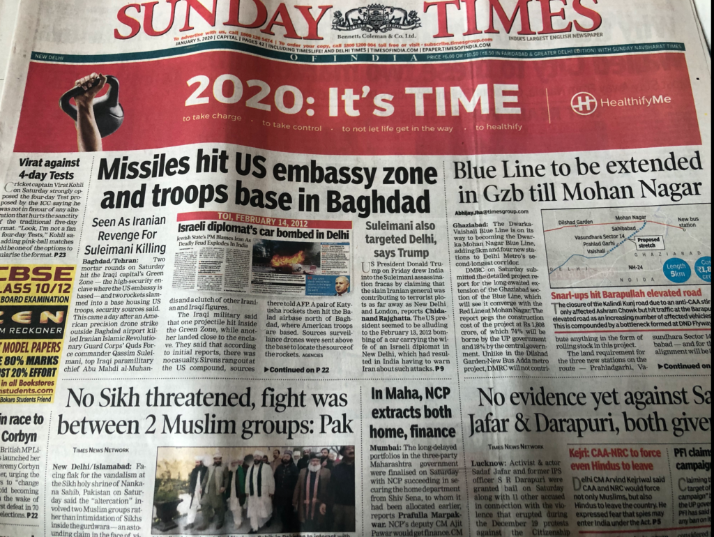
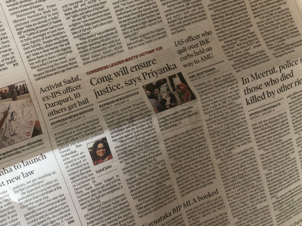
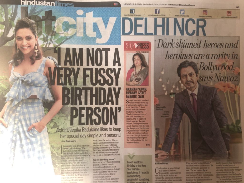
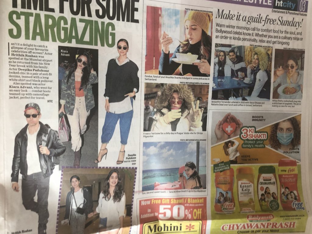
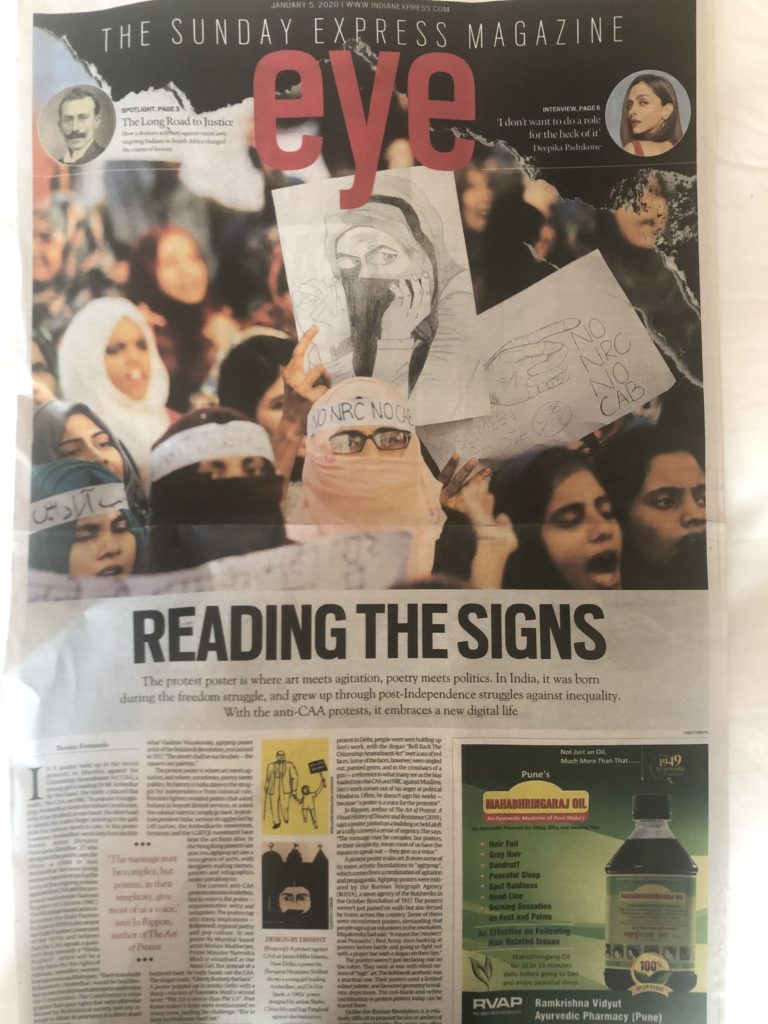
Indian newspapers, for the most, and with perhaps one exception, The Hindu, published in Chennai, have one thing in common when it comes to design: a little bit of visual clutter and chaos. The overall visual philosophy is that more is best. Spice it up, add two more stories. Today, the Hindustantimes front page includes 18 stories! Take a look:
Disclaimer: We at Garcia Media were involved with a rethink of The Hindu in 2005, which was reinstated in 2013. Many thanks to Brian Gaughan, the now retired art director of The Hindu, with whom I worked, for sending these images. Our Garcia Media art director for this project was Jan Kny, currently with Germany’s Die Zeit. Disclaimer #2: We are in Delhi to work with the team of the Hindustantimes on a far reaching project that includes print/digital. Read about the redesign of The Hindu here:
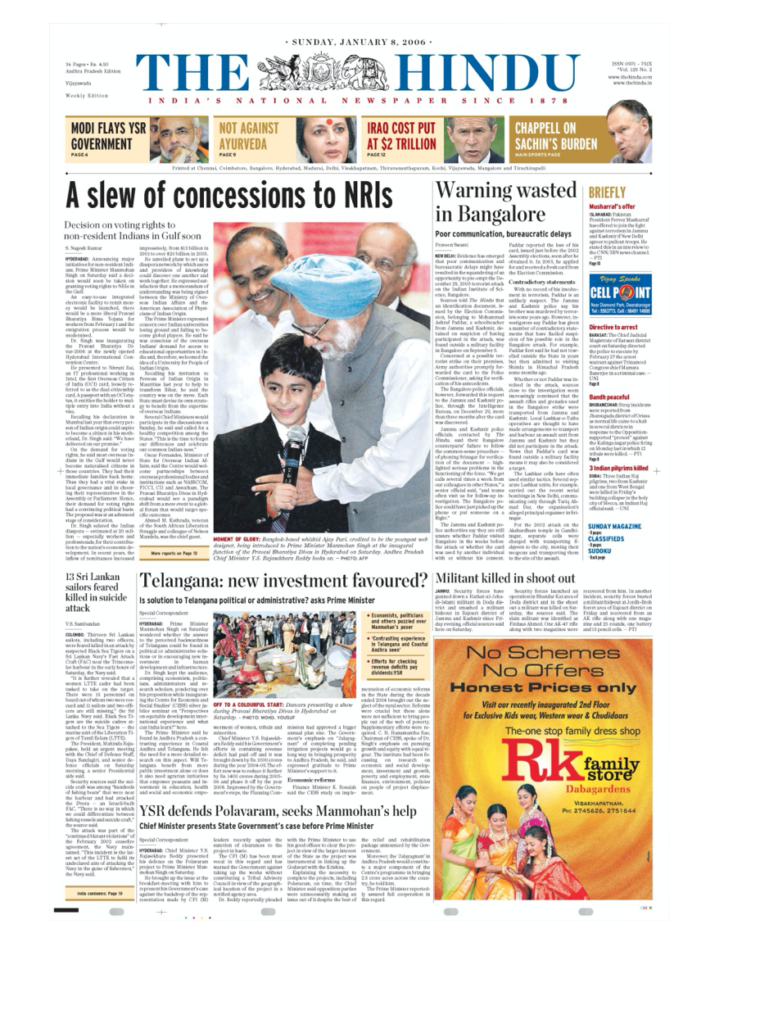
The Hindu keeps it classic, clean
Less should be best
I am all for the design of a newspaper reflecting the culture of its environment. However, my general observation is that many pages carry more short items than they should, resulting in chaos and confusion for the reader. Perhaps, in today’s media landscape, with mobile consumption as high as it is, printed newspapers globally need to embrace a philosophy of less is best. Readers are getting plenty of snippets of information on their mobile devices. When they come to print (if they do!), it is for a more relaxed, lean back experience.
Perhaps a little bit more systematic chaos would probably be the answer.
I don’t think anyone should turn any of the Indian newspapers into something that they should not be. However, we now live in the mobile age, and India has an extremely youthful population that I am told are connected to their phones all day, and not very interested in newspapers that look like those their grandparents read, or used to read.
I am convinced that regardless of where a printed newspaper is published today, those readers who come to it are interested in a lean back experience, which means less overall chaos. Maybe Indian newspaper publishers need to take notice. They seem to continue to create newspapers for readers of another decade—the 80s come to mind.
We also remember how, at the start of the Internet, printed newspapers of the 90s wanted to be more like magazines, I am starting to think that today they want to be more like books. We come to books to relax, not to be agitated.
Spicy design with a touch of chaos
Take a look at some of the images here of Indian newspapers in the past few days:
Start the year with The Story
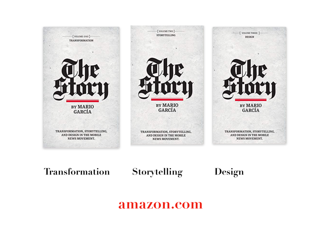
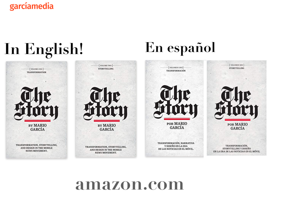
A good read to start the year 2020: The full trilogy of The Story now available–3 books to guide you through a mobile first strategy. Whether you’re a reporter, editor, designer, publisher, corporate communicator, The Story is for you! https://amazon
Mario’s speaking engagements
March 13, 2020
Keynote presentation at the National Media College Association Spring Convention, New York City, NY
March 27, 2020
Keynote
New York Press Association (NYPA), Saratoga Springs, NY.
TheMarioBlog post # 3181