This is the weekend edition of TheMarioBlog and will be updated as needed; the next blog post is Monday, Oct. 29
Update 1: Friday, Oct. 26, Frankfurt, Germany, 20:21

Purchase the book on the iBookstore
“iPad Design Lab” trailer on Vimeo.
The EPUB version of book is HERE:
Now available: The EPUB version of iPad Design Lab: Storytelling in the Age of the Tablet, ready for download via Amazon.com for Kindle:
http://tinyurl.com/8u99txw.
Read the Society of Publication Designers’ review of The iPad Design Lab here:
http://www.spd.org/2012/10/must-read-ipad-design-lab.php
Read the review from Dr. Pegie Stark Adam in her blog
http://pegiestarkadam.com/
TAKEAWAY: From small to large: testing type and design has always followed this important mandate; the arrival of the iPad Mini could solidify the concept and make things better all round. ALSO: Gulf News wears pink in the fight against cancer
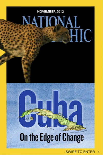
National Geographic takes its magazine to the small screen of the iPhone
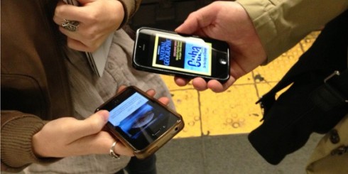
The Joe Zeff Design team involved with the process of bringing National Geographic to the iPhone (image courtesy of www.joezeffdesign.com)
One of the earliest typographic lessons I learned was this: always test your choice of a font in the smallest canvas possible.
So, in the traditional print world, we would see how type would look on a business card, for example, or how the logo of the newspaper would be rendered when reduced to its smallest.
The arrival of the iPad Mini presents us with an opportunity to create the design of apps thinking of this smaller 7” screen, then advancing to the larger platforms.
Those who are involved with responsive design have already begun working with this idea in mind: if the design is going to work across various digital platforms, then start with the smallest. Chances are that if it works there, it will work even better on the larger screens.
This is the same philosophy as the popular web strategy of Mobile First design for the most constrained experience, then expand and add features from there.
For more on this, go this great piece from The Verge with perspectives from developers on the iPad Mini:
http://www.theverge.com/2012/10/24/3547898/app-developers-respond-ipad-mini
A highlight from that piece:
“[The iPad mini] will be a concern for apps that did a poor job designing for the larger model, and for apps that are too busy and have too many things going on on one screen,” one-time Flipboard for iPhone designer Craig Mod said on The Vergecastyesterday. He called out stock trading apps and financial apps as experiences that might get significantly diminished and perhaps become illegible on a the iPad mini’s smaller screen. Yet, at the same time, he said that since the iPad mini’s screen is the same aspect ratio as its iPad brethren, designing for it might yield a nice bonus for developers. “If you design for a 7-inch screen first, then it will probably work great on a 10-inch,” but does that logic apply when you flip things around?
“Mod may have predicted a new trend in iOS app design: focusing on the iPad mini experience first, and then scaling up from there …”
If you truly want to think about design and the smallest of canvas, the iPhone, then take a look at the marvelous work Joe Zeff Design has done bringing that iconic magazine, National Geographic, to the tiny screen of the iPhone.
Of related interest
With iPad Mini on the way, how is the Nexus 7 doing?
http://www.theverge.com/2012/10/23/3542612/google-nexus-7-sales
Highlight:
Few will argue that the iPad blazed trails at its 2010 introduction, but today’s iPad mini is a slightly different story: it’s coming to market as a fast follower, a direct response to the perceived success of smaller tablets like the Kindle Fire and, more recently, Google’sNexus 7. In reality, of course, Apple has likely been prototyping the iPad mini since long before the Fire came to retail — but that’s of little consequence to consumers who’ve been seeing Amazon’s tablets on shelves for a year.
The new National Geographic for iPhone app:
https://itunes.apple.com/us/app/national-geographic-magazine/id418671597?mt=8
New storytelling for photojournalism: Reuters’ The Wider Image app
http://www.editorsweblog.org/2012/10/25/new-storytelling-for-photojournalism-reuters-the-wider-image-app
First paragraph:
Aiming to re-imagine the way news photography can engage its audience on a multimedia platform, The Wider Image app offers the public a selection of the best photos gathered by the news agency’s vast network of photographers around the world.
– USA: New York Times reports sales rise
http://www.guardian.co.uk/media/2012/oct/25/new-york-times-subscriptions-rise
Gulf News: in the pink
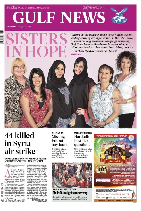
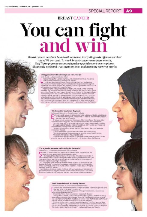
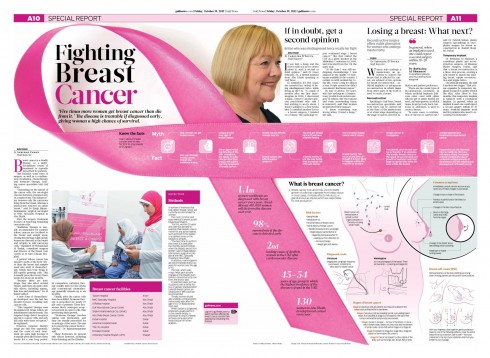
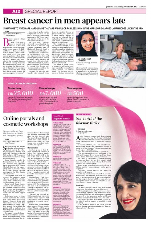
In Dubai, Gulf News took to the color pink as it devoted part of a recent edition to the fight against breast cancer.
Miguel Gomez, Gulf News design director, sends us these pages, starting with page one, where the logo went pink as well for the day.
“We had very good reactions to the campaign, and everyone had a good feeling about joining forces for this cause,” Miguel said. “It was nice to bring all the ladies into the studio for a photo.”
“This was purely a team effort, and it shows what you can do when you bring all your talents together.”
Let’s hear it for those big front page ads
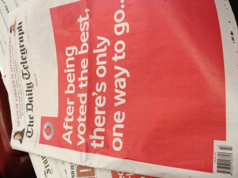
Friday was my last day in London, before taking the long flight to Sydney, Australia, where I will be all of the coming week. What a surprise to see that Vodafone made a big, red splashy entrance into the front pages of at least two of the major dailies, The Telegraph and The Independent.
While the Independent ran a lead story UNDER the ad, and gave Page 3 entirely to its regular front page, The Telegraph had no stories at all on Page One, given to Vodafone entirely, then had the regular Page One as page 3.
