
Typographica’s Choice of Best Faces of 2008
It doesn’t matter what your current project may be: a daily or weekly newspaper, a lusciously glossy magazine, the logo for a new wine brand, online branding. Or, perhaps, it is time to reinvent yourself through a new business card.
If you are at that point in the project where you are reviewing tons of type books, waiting to land that perfect alphabet that will dance sweetly on the page or screen , then, take a look at : Typographica’s: long awaited list of “favorites faces of 2008”.
This list does not disappoint, and I thank :Reed Reibstein:, our :Yale University friend and soon to be Garcia Mediasummer intern, for discovering the list and bringing it to my attention.
Stylistically, you dream it, and it is here from slab serif, typewriter, blackletter, stencil, brush script, to some that you feel like grabbing and using on a project where you had already selected another font. It is almost never too late to switch to that font you just can’t be without.
My favorites of the favorites:
History
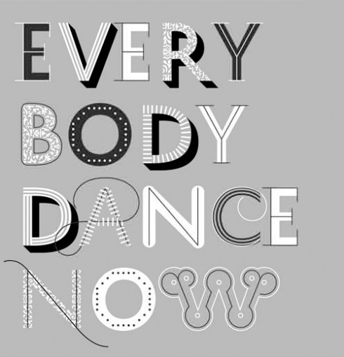
: Playful I start with Peter Bilak’s History. This is the kind of font that would be great for the titles on a Fred Astaire/Ginger Rogers film. But, a newspaper aimed at the young could also use this type. It says fresh, lively, come dance with me.
You could call it the interactive font. According to the description in Typographica, “Peter Bilak’s typeface speaks to the current interest across the design fields in engaging users in the design process.”
Carmen
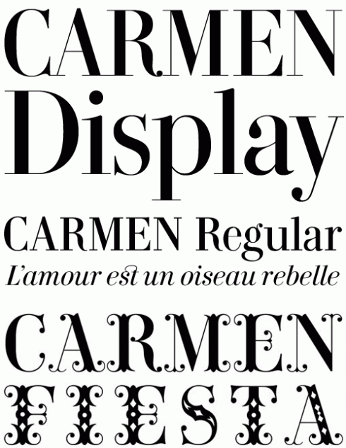
Elegant Carmen by Andreu Balius is a little : Caslon, some Didot, some : Bauer Bodoni, and it makes for a striking headline font for that luxury magazine, or even the headlines of a high brow newspaper.
Described by the creators as “A beautiful Roma woman, murderous jealousy, a Basque hidalgo, fortune telling, knife fights, sexual persuasion, the occult.”
Moyenage
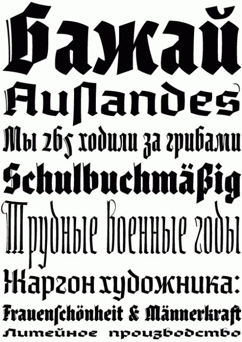
That old Blackletter Magic: We mentioned it earlier last week, the blackletter is back, and if you really want to try it, no better version than this Moyenage by Frantisek Storm
Unique: “Štorm’s newest and most original blackletter design yet.”
Inspiration: draws inspiration from 1830s Spanish type specimens that were clearly rooted in the famous work of the Frenchman Firmin Didot.

:
To read TheRodrigoFino blog, in Spanish, go:
https://garciamedia.com/latinamerica/blog/
TheMarioBlog posting #252