Update #2: Tuesday, July 26, Cape Town, South Africa, 13:00
TAKEAWAY: Sometimes satisfying that curious finger touching an iPad screen is simple and uncomplicated.

Pop ups made easy
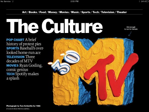
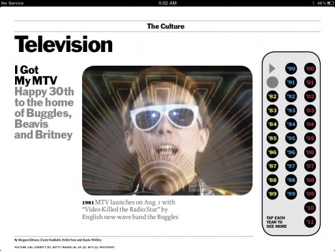
Click on any of the buttons on the right with numbers that refer to years
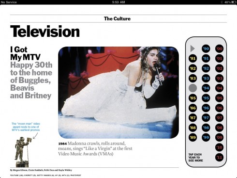
...then see a representative image that signals a “landmark” moment for MTV
See the short video
Such is the case in this week’s TIME magazine in which a 30-year retrospective of key moments in the life of MTv allows the user to simply tap into one of the circles with the last two numerals of a specific year, and immediately access the photo and caption that describes what landmark moment took place, as in 1984, when Madonna caused shock as she “crawls, rolls around, moans ” with her rendition of Like A Virgin
The simple pop up allows for quick and fun access to the information, satisfying that curious finger.
Ironically, the same issue of TIME left me wanting for a more animated and interactive graphic treatment for the cover story , about how men and women divide domestic chores and how women’s complaints that their men do not share the load equally are wrong——I can already see the Letters section next week with a barrage of letters from women who will , no doubt, will disagree and let the editor know it, including, perhaps, his own wife.
But, back to the graphic titled How Men and Women Divvy Up the Work:
I think there were missed opportunities here to make the graphic interactive, and definitely more animated.
I believe strongly that while we enjoy seeing still photos in the tablet, we are less forgiving with flat graphics, something for the great art and design team at TIME to think about as they enhance their tablet edition in the future.
The simple, but effective, approach TIME took with the MTv story, could have been applied to the graphic, starting with animating the icons that define the graphic.
Something to think about.
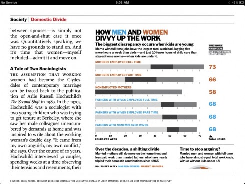
The graphic as it appears: totally linear, as in the printed edition of the magazine
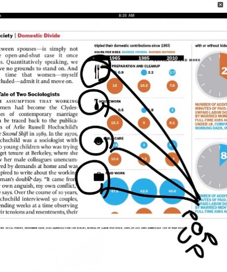
I have circled the icons that could provide a pop up moment here
Media 24 Conference: South Africa
Here I am during my presentation to Media 24 group in South Africa this morning while cartoonist draws me graffiti style on the big screen behind me- cartoonist Roy Blumenthal did drawings related to what I was saying during entire presentation! This was a first for me, simultaneous cartoon drawing of speaker.
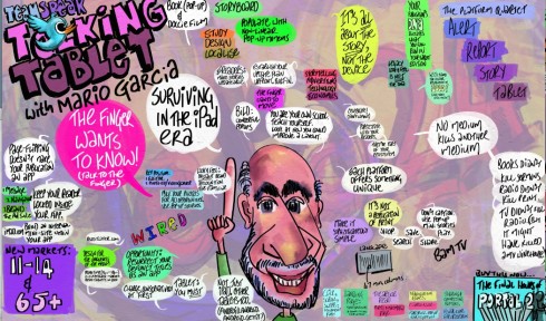
What is fascinating is that Blumenthal captured highlights of what I was saying and he was drawing these into the canvas of the caricature during the course of the presentation. But, somehow, the audience never seemed to be distracted. I am told that entire frames of each of the presenters’ and their presentations will be available for members of the audience to have and to keep as they try to remember key points.
Participating today in the Media 24 Conference in Kleinmond, South Africa. Later in the week conducting tablet workshops for the Media 24 publications, with emphasis on their magazines, which will move promptly into tablet editions.
Of special interest today
Apps in html5 gaining momentum!
Amazon, others cave to Apple on in-app purchases today, HTML5 tomorrow
http://www.zdnet.com/blog/btl/amazon-others-cave-to-apple-on-in-app-purchases-today-html5-tomorrow/53116