TAKEAWAY: Students and faculty have returned to the Yale University campus. The Class of 2013 has arrived. The Yale Daily News, oldest college daily, performs its annual ritual of offering orientation to everyone arriving for the new academic year. We revisit the YDN one year after it went through a redesign. ALSO: Pure Design download of The Wall Street Journal, a case study. What has changed?
The Class of 2013 and the Yale Daily News

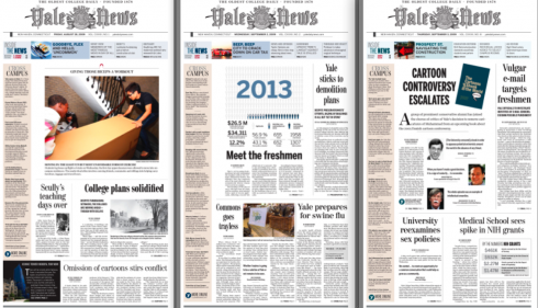
Front pages of the Yale Daily News from last week

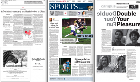
Feature and news pages of the YDN

Sports section front and other inside pages from the YDN of last week.
It is almost a year to the day when the first edition of the newly redesigned Yale Daily News of Yale University—-the oldest college daily in the nation—-premiered on campus with a new design, to welcome the class of 2012, that important year to which we refer often, as it is the year that anyone turning 22 that year will be the first group of adults NOT to remember life without the Internet. So many of our projects are aimed at 2012 worldwide.
So, for my colleague Dr. Pegie Stark Adam and I, it was a fascinating exercise to work with the young and smart editorial staff of the YDN as they presented to us what their priorities were for a better, leaner, more reader friendly Yale Daily News. It was in the process of working with the YDN that we met Reed Reibstein (Yale University ‘11), with whom we have worked closely ever since. By the way, Reed, who has been our summer intern at Garcia Media the past two years, will tell us about “what he learned this summer” in a special blog entry tomorrow. Be on the lookout for Reed’s blog posting here.
Reed is back in school, and working hard with the YDN team. I asked him to send us pages from the first issues distributed on campus. Here they are: fresh, the design intact (but evolutionary), and a good mix of news and features that depict what getting back on the architecturally beautiful Yale University campus has been all about, especially as the University welcomes the class of 2013.
Previous postings about the Yale Daily News:
A newly designed Yale Daily News appears on campus:
Front pages from 2007 the last redesign in which I was involved at the WSJ. Goal was to take the newspaper to a narrower web.

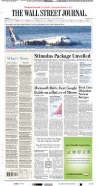
Front page of the WSJ, January 2009, displaying a very unusual treatment for the classic WSJ: a six column photograph across page one.
Much has happened since the 2001 and 2007 redesigns of The Wall Street Journal, both of which I was honored to be a part of. Among other things, the newspaper is now owned by Rupert Murdoch’s News Corporation. The core editorial team is basically different. The newspaper itself appears to be more visually oriented, especially the use of photos. When I was involved, our visual tools were mainly info graphics, illustrations, an occasional photograph and, of course, the iconic pencil vignettes used for important business people in the news.
Today, more color is used (and with a brighter palette). In addition, photos are seen as a main staple of the graphic designer’s bag of tools. I believe that change is good, and many of the pages I see, especially inside pages, tend to be visually inviting.
The Impact of the Compact
Pure Design: Download entire section: Type
Download entire first section of Pure Design: Words
Now that I have fully presented the first of six sections of Pure Design on TheMarioBlog, I am offering the entire initial section, “Words,” available for download—all 33 pages of it. This may be useful for those of you saving or printing out Pure Design and will be done following each of the remaining sections. At the end of our journey through words, type, layout, color, pictures, and process, I will publish the entirety of Pure Design in one file.

Who is Jacky?
Jacky belongs to Frank Deville. The Luxembourg-based pooch is an “avid reader” of the German newspaper, Bild Am Sonntag. Every Sunday Jacky picks stories and interesting graphics in Bild Am Sonntag , the German newspaper.
WAN’s World Trends 2009 Report

The 2009 edition of World Press Trends from WAN/IFRA is now available. I always like to review this report for its complete information on global circulation, advertising and online trends in our industry. All countries in the world where daily newspapers are published are covered in the publication.
This year the WAN/IFRA folks have decided to publish a print version but only make the book available on pdf.
Those interested go:
http://www.wan-press.org/forms/wpt2009.html

Follow me at www.twitter.com/tweetsbydesign
Follow the Marios

Two Marios. Two Views.
Follow Mario Jr. and his blog about media analysis, web design and assorted topics related to the current state of our industry.
http://garciainteractive.com/
Visit Mario Sr. daily here, or through TweetsByDesign (www.twitter.com/tweetsbydesign)
In Spanish daily: The Rodrigo Fino blog
:
To read TheRodrigoFino blog, in Spanish, go:
https://garciamedia.com/latinamerica/blog/
TheMarioBlog posting #357