This is the weekend edition of TheMarioBlog and will be updated as needed. The next blog post is Monday, November 17


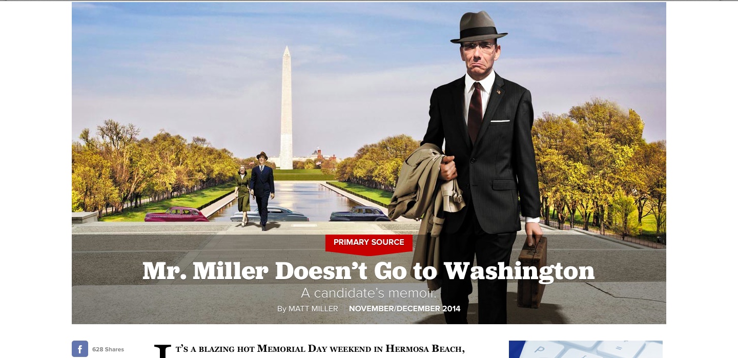
Politico.com’s new look: elegant, emphasis on large images, clean article page.


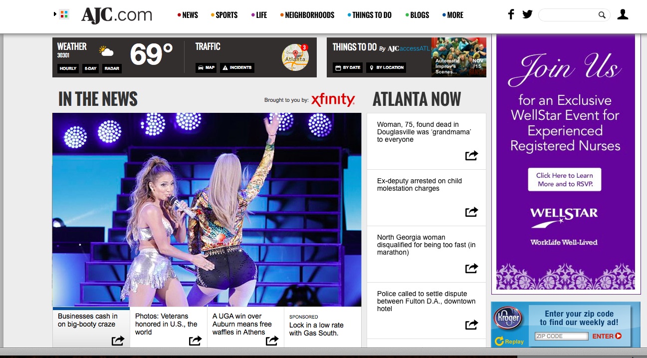
ajc.com: lots to choose from (a little on the busy side), breaking news, celebrities and advertising that appears as part of the lead story carrousel
Two website redesigns of consequence this week: Politico and The Atlanta Journal Constitution.
While these two publications are quite different in terms of content and audience, it was interesting to read the narratives about those projects, as written by their own editors. We see trends that all publishers are following as they redesign their digital platforms.
Politico describes its redesign as “the best of what we aim to provide our readers: urgent, indispensable and authoritative coverage of Washington”.
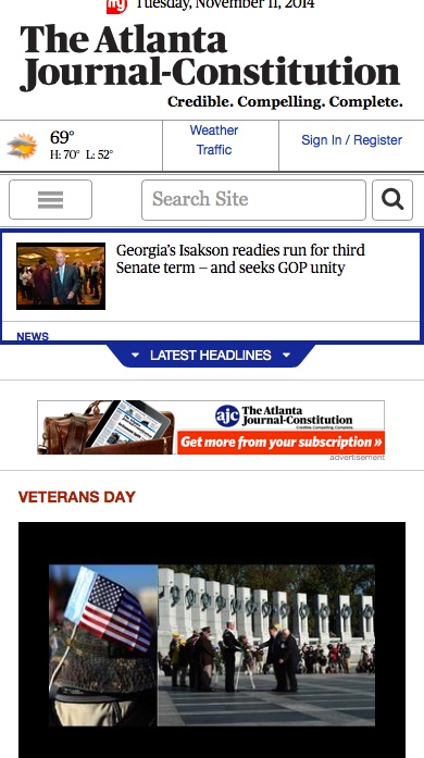
The AJC is a different story. It has two websites, one, a premium one, http://myajc.com, offers exclusive content to subscribers and is home to much of the paper’s in-depth beat reporting and investigative stories.
In addition, there is http://acj.com, a free website devoted to breaking news, with what seems to be a heavy dose of celebrity news.
Both redesigns, Politico and ajc.com, promise users the following:
–better, easier navigation
–fully responsive design
–more videos and photo galleries
–more social media
–more links to related content
In terms of aesthetics, the Politico redesign is our favorite: clean, classic, elegant and functional. The ACJ.com redesign, on the other hand, disappoints for how crowded it is, with elements almost on top of each other, lacking in hierarchy and, truly, reminiscent of websites of the 1990s.
Read about these redesigns here: in their own words
http://www.politico.com/story/2014/11/welcome-to-the-new-politicocom-112737.html#ixzz3Ine6V3vs
http://www.ajc.com/news/business/redesigned-ajccom-launches/nh2sB/
A different view
AJC's website redesign, digital paywall frustrates some readers, staffers
http://clatl.com/freshloaf/archives/2014/11/11/ajcs-new-website-digital-paywall-causes-frustrations-among-some-readers-staffers
Newsstands

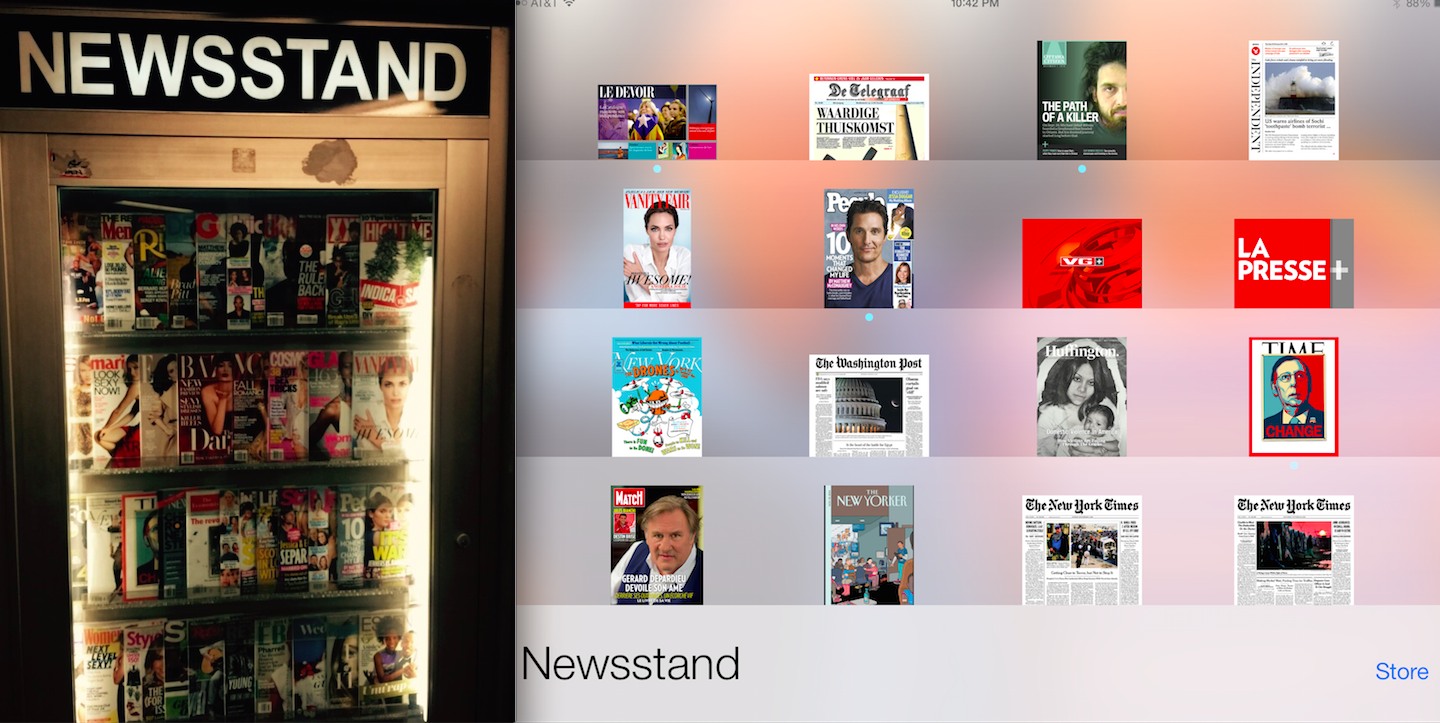
There I was, standing in front of a real (as opposed to a virtual) newsstand at the New York City subway station of Lexington & 59th Street, while not a single soul would stop to peruse what was behind the glass. Have these newsstands become nostalgia pieces along with the rest of the old and often decaying elements one sees while commuting thru the New York subway system?
I came home to put the real and the virtual newsstands side by side. I know the one I use most often, the one behind the glass of my iPad screen.
How about you?
Mario Garcia: Teaching Master Class at Poynter November 20

Innovation and Storytelling: Master Class with Mario Garcia
You can attend the class in person, or via the archived replay which will take place right after the live session.
Go here for more details:
https://www.newsu.org/masterclass-garcia