TAKEAWAY: It is likely to happen: US daily newspapers may finally realize that it is better to be published in smaller formats than the traditional format. Now, The Cincinnati Enquirer and The Columbus Dispatch, announced plans to switch their printing formats from classic broadsheet to a new compact style more akin to a tabloid, ALSO: The New York Times looks at the kitchen table of the future—-coffee, cereal and swiping.
Two reports from the Nieman Journalism Lab provide us with interesting news today, and I recommend both.
First, a story about The Cincinnati Enquirer and The Columbus Dispatch, both of which announced plans to switch their printing formats from classic broadsheet to something more compact, although the term tabloid is not specifically mentioned.
This has been a long time coming and those of you who read this blog know that I am an advocate of the smaller formats. My European and Asian friends are constantly asking why the American publishers are so resistant to changing from those big broadsheets to smaller formats. We know that the arguments have to do with the practicalities of how advertising is sold in the US, the fact that printing presses in some cases have to be prepared to print smaller formats (at a cost), and, most importantly, the fact that for many American publishers and editors “tabloid” is a dirty word that has connotations of cheap, down market publications with scandalous stories, big headlines and little credibility.
Of course, we know it does not have to be, as shown through the many “classic style” compacts that appear worldwide, including two tabloid editions of The Wall Street Journal in Europe and Asia.
Finally, with these two midwestern newspapers from Ohio deciding to go smaller, this may be the inspiration and the push some publishers may need to realize the advantages of such a move.
Margaret Buchanan, president and publisher of The Enquirer, is quoted in the Nieman report saying that response to print prototypes indicated that the audience wanted their newspaper to change. “We conducted focus groups with existing loyal readers,” she said. “We were concerned that if our loyal readers wouldn’t like this format, it probably wouldn’t be in our best interest.” She added that those focus groups wanted a paper that was, all in all, “easier” — easier to fit into briefcases or laptop bags, easier to read on a table at breakfast, or easier to keep together in one piece. Their testing made clear, Buchanan said, that people want a paper that is “more adaptable.”
We have heard the same comments at dozens of focus groups worldwide.
The smaller, easier to carry newspaper is what readers want today when given a choice. And if the compact can be stitched, then so much the better.
Here is the kitchen table of the future
For those who like to gaze into the not so distant future, this second Nieman report will please you. And, as you can imagine, it is a tablet edition of The New York Times at your breakfast table, to swipe the pages as you enjoy your granola and coffee.
The New York Times imagines the kitchen table of the future
The Times Co.’s R&D Lab is betting breakfast will be less about sharing out newsprint and more about swiping through stories, ambient commerce, and the quantified self.
http://www.niemanlab.org/2011/08/the-new-york-times-imagines-the-kitchen-table-of-the-future/
First paragraph: At The New York Times Company’s R&D Lab, the group’s collective of technologists, artists, and journalists talks a lot about “information shadows” — the auras of data that surround us in our daily lives. Tracking and processing the info trails we leave, the thinking goes, allows for deeper insights into ourselves — and it can also help media organizations to provide their users with news consumption experiences as intimate as they are relevant. We tend to emphasize the “self” aspects of “the quantified self“; the R&D Lab is exploring what it means to be a part of a quantified community — and, for the Times, what it means to be a provider of information to that community.
And…..
Mirror, mirror on the wall: get me the sports pages, pronto!
Mirror, mirror, The New York Times wants to serve you info as you’re brushing your teeth
http://www.niemanlab.org/2011/08/mirror-mirror-the-new-york-times-wants-to-serve-you-info-as-youre-brushing-your-teeth/
First paragraph:
Information is everywhere — in the world, in your home, everywhere. In today’s pair of videos from my visit to The New York Times Co.’s R&D Lab, Brian House, The Times Co.’s Creative Technologist for R&D, demonstrates the Lab’s, er, reflection of that idea — in the form of a data-bearing mirror. The device (working name: “the magic mirror”) uses Microsoft’s Kinect motion-sensing technology to read physical cues from its user; it uses voice recognition technology to detect verbal cues. (In the videos, you’ll hear House talk to the mirror, Snow White-style.) The mirror also uses the the Times’ powerful APIs to serve up information on-demand.
Of related interest today
The Impact of the Compact
Free download of my white paper about the advantages of compact formats
http://issuu.com/mariogarcia/docs/the_impact_of_the_compact
Not all tabloids are created equal
https://garciamedia.com/blog/articles/not_all_tabloids_are_created_equal
Why a smaller format creates a bigger future for American newspapers
https://garciamedia.com/blog/articles/why_a_smaller_format_creates_a_bigger_future_for_american_newspapers
Readers prefer those stitched tabs
https://garciamedia.com/blog/articles/readers_prefer_those_stitched_tabs/
Stitching: the newspaper that stays together!
https://garciamedia.com/blog/articles/a_stitch_in_time_the_newspaper_that_stays_together/
The March of the Tabloids
http://www.poynter.org/uncategorized/44361/the-march-of-the-tabloids/
Mario Garcia on the WSJ’s tabloid redesign
http://www.newsu.org/courses/mario-garcia-wsj-tabloid-design-seminar-snapshot


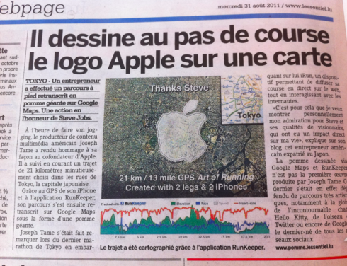
Talk about a passion for Apple—as in the brand that brought us the iPhone and the iPad!
A runner inTokyo who really really liked Apple ran a full track forming the Apple logo on a map with two iPhones.
The headline in this L’Essentiel of Luxembourg story reads: He paints while running the Apple logo on a map. It was a 21k run (roughly 13 miles). The runner, who said he was doing this to honor Apple’s Steve Jobs on his retirement, used the application Run Keeper during his artistic run.