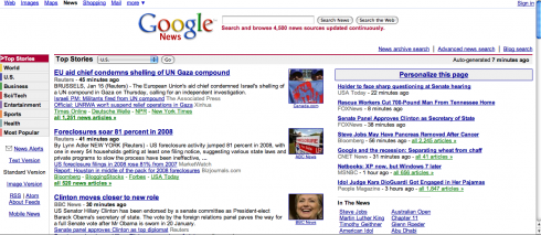
Google:there are 54 possible points of entry on the small canvas of the screen.
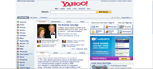
Yahoo: there are 43 possible points of entry on the small canvas of the screen.
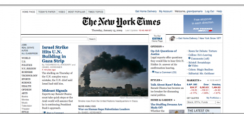
nyt.com: there are 40 possible points of entry on the small canvas of the screen.
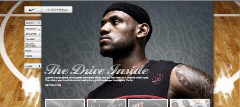
nike.com: there are 9 possible points of entry on the small canvas of the screen.
We all know the word promiscuous, and we usually attach it to the indiscriminately sexually active. But the term is just perfect to describe many media users of today——me included—who are impatient, want information when they want it and how they want it, and who follow little of the rules of design, including hierarchy.
So when this graduate student asked why so many pages and screens lacked a strong element for the eye to go to first, my reaction was to think of this promiscuous user who runs wild through pages or screens.
Webster’s Dictionary attaches the following synonyms to the word promiscuous: licentious, loose, unbridled, unrestricted, wanton and, indeed, wild. All of these apply, by the way.
Do I think that we still need to have a sense of hierarchy on a page or screen? For sure.
Do I think that this becomes the first point of entry for the user? Not always.
For example, users who go from web to print are used to seeing the following:
You open the Google news page, and there are 54 possible points of entry on the small canvas of the screen.
You open the Yahoo news page and there are 43 possible points of entry on the screen.
You open The New York Times’ website and there are 40 possible elements to click on. Yes, the Times does have a “lead” element that is distinctive and larger than the rest. After that, it is all pretty much the same size.
Yet, somehow, we all find our way around it. We, the promiscuous users, know what we want, and in the case of our frequently visited products, we also know where to find it. Hierarchy, visually speaking, becomes secondary to habit .
But, alas, hierarchy still plays a role in commercial websites, such as nike.com, where only 9 items compete for attention, and you have the ultimate visual grabber—-a photo to lure you in.
If you ask me (and this grad student did), MORE is better for news and informational websites. One not only get the sense of the ultimate timely and constantly updated medium, but also one who makes me, the promiscuous user have greater amount of choices.
For the promiscuous user, hierarchy is in the numbers, not necessarily in the volume of one specific item.
TheMarioBlog posting #169