![]()
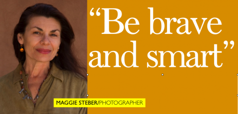
Anyone who knows the vivacious Maggie Steber also knows that her passion and enthusiasm for her craft of photography are contagious. Maggie inspires. Maggie transforms even the least visual editor in the newsroom into a “believer”. I have worked with Maggie during our redesign of The Miami Herald, then in Dubai, where I introduced her to the photo staff of the Gulf News, where she still makes periodic visits, teaching the photographers and editors the value of a powerful photo. She is a part of the Garcia Media team wherever solid photo training and magical inspiration are needed.
I had the honor of taking a photo of Maggie myself (how daring of me!). Maggie, whom many fondly refer to as the Mata Hari of Photography, posed for me, lying on a red velvet couch. A mini moment that still lingers with me. I am hoping someone still has that image, as I lost it when my computer was stolen.

Mario: Maggie, you have been a photographer most of your professional career, including a photo editor at The Miami Herald. How would you summarize your opinion of the state of photojournalism in newspapers today?
Maggie: I’ll start by explaining that I was director of photography at the Herald, an important distinction from staff photo editor.
This person sets the tone for photographic philosophy, with a vision and also courage to maneuver within the antiquated newsroom culture of hierarchy. Photo editors should oversee visual journalism.
I’m disappointed at choice and use of photographs at many papers. Most papers use photos that are banal and repetitive.
There are great photo staffs with enormous talent that goes unappreciated. Daily journalism is the most difficult in terms of constant production. A talented staff can get weighed down in stupid stuff. A dynamic leader has to change that, recognize
new venues in the paper, and win trust of editors. You have to be brave and smart. I encourage photographers to look at magazine photography and picture stories on agency websites, become more edgy, take chances, and learn HOW to fight for their photos.
We live in a visual culture, audiences are sophisticated, and images can be more complicated, less traditional. Photography has changed, progressed, explored. Newspaper photography has not kept pace. Evocative, telling, forceful images can help prolong the life of newspapers, both print and online. I very much like what Magnum photographer Paolo Pellegrin said recently about the great divide between journalism and art. Paolo has crossed that divide and speaks a new more subjective language of photojournalism. (Nothing is really objective, merely by the fact that a human makes the decisions and choices, shaped by years of living.) For Paolo photojournalism is about asking questions. He is interested more by unfinished work that leaves space open for the viewer, that there is very good photography that does not allow for space because it is too composed, too formatted. I think that is the big problem, especially with American newspapers: the
thinking in everything is formatted and formulaic in a new world order that is anything but that.
Mario: What advice do you have for designers and art directors who must work with photos and photographers?
Maggie: When designers, art directors and photographers work well together, discussing the philosophy and importance of a photo
and the design, the final product must always be better if there is mutual respect. And it really comes down to that. Mutual respect is imperative. Working against each other hurts the final product and makes life hell. Brainstorming should be a regular newsroom practice, always involving the photographer or picture editor. You learn things about a photograph that might make a difference in size, design, and placement on pages. Please don’t crop without consultation. This one thing will save you headaches and make you loved among the photo staff.
![]()
MAGGIE SENDS YOU TO HER ALL TIME FAVORITE PHOTO LINKS:
***http://www.nytimes.com/
http://www.snd.org/ Society for Newspaper Design
***http://www.esquire.com (especially covers archives)
***http://www.newsdesigner.com/blog/
***http://www.vanityfair.com/
***http://seedmagazine.com/ (well-designed mag science mag with good photos)
***http://www.thefader.com/fader26/index.html (very hip magazine, lots of young talent used)
***http://www.daylife.com/ (be prepared to spend time and dig deeper)
***http://www.magnumphotos.com/ (great photographers for magazines, projects)
***http://www.viiphoto.com/ (great conflict and issues photographers)
http://thevirginianpilot.com/ (well-designed, good photo use paper)
http://politiken.dk (Danish paper with interesting design/use of photos)
***http://www.worldpressphoto.nl/ (the best array of international photojournalism of all kinds!)
***http://www.foto8.com/ei8ht/previews/index.html (photo magazine with exceptional photo stories)

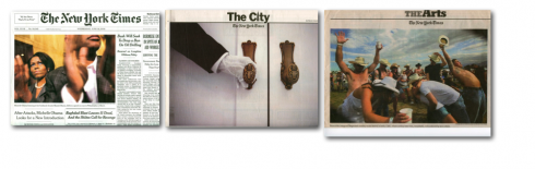
MAGGIE DISCUSSES PHOTOS AT THE NEW YORK TIMES
Maggie feels that The New York Times provides a perfect example of how to integrate the skills of photo professionals into the visual presentation of the newspaper.
“I decided to pick the New York Times to show a newspaper that is innovative….they set a good example. When trying to describe photo use at other papers, it is a lot of hit and miss, but the Times rises to the occasion everyday.
“And I attribute the New York Times’ excellence in photography, in part, to Michele McNally, who is the AME for Photography. She comes from decades of
magazine experience including as longtime DOP at Fortune Magazine. The Times wanted someone from magazines,
with a more sophisticated vision that suits their readers. It’s also lucky that Metro Editor Joe Sexton is crazy about photography, and gets its importance in storytelling, isn’t afraid to play it big or bold.”
![]()
THE MAGGIE STEBER BIO:
Maggie Steber has worked as a documentary photographer in over 56 countries. Her longtime work in Haiti received the prestigious Alicia Patterson Foundation Grant and the Ernst Haas Grant. A collection of the Haiti photographs was published in “Dancing on Fire: Photographs from Haiti”, by Aperture. She served as Asst. Managing Editor
Of Photography and Features at The Miami Herald from 1999-2002 when the photo Staff was twice Pulitzer Prize finalists and winner of a third one.
In 2007, she received a grant from the Knight Foundation to design a new
kind of newspaper through the new Knight Center for International Media
at the University of Miami.
Maggie has a marvelously well deserved list of honors, including:
The Leica Medal of Excellence
First Prize Spot News World Press Photo Foundation News
First Prize Magazine Documentary in Pictures of the Year (iPOY)
The Overseas Press Club Award for Best Photographic Coverage from Abroad
Medal of Honor for Distinguished Service to Journalism from University of Missouri.
Her work appears regularly in National Geographic Magazine, Life, Newsweek, The New York Times Magazine, Smithsonian and many other American and European publications. Her photographs appear in numerous anthologies and museum and private collections and is widely exhibited, nationally and internationally.
Contact information: Maggie Steber
Email: maggiesteber@earthlink.net

We show you images of the “newspaper of the future” that Maggie Seber and her class prepared during a one-semester experimental course, the result of her 2007 Knight Foundation grant she received to work with the new Knight Center for International Media
at the University of Miami.

IT IS GULLIVER FONT FOR USA TODAY
In our postings of the past few days, we have mentioned that USA Today’s text type appears to be the largest in size, allowing for comfortable reading in all sections.
Richard Curtis, USA Today’s managing editor/design, sends us this update:
Just for the record, USAT’s body type is 9.2 point Gulliver on 10.0
leading. I’m hoping that it appears larger to you (and everyone); it was
chosen specifically because of its legibility and readability. We’ve done
extra-special work with it (by Neil Manusa) in developing thousands of
kerning pairs, one reason that we have such even type color.
Thanks, Richard. By the way, Gulliver is the creation of Dutch type designer, Gerard Unger, who also created another elegant font, Swift.
Go http://www.gerardunger.com/
![]()

HAPPY BIRTHDAY FRANK DEVILLE!
Celebrating his birthday at home in Luxemburg today is Frank Deville (www.frank-deville.com), former football player in Luxemburg’s National Team, banker, father of Maurice—-who at 16 is another football star in the makings—-and part time model. Frank, who is my running partner and trainer, writes the Frank on Fitness column for Dubai’s Friday for Men Magazine.
![]()
In Paris, France, the rest of this week. It appears that summer was short lived in Europe. Rainy, cool weather prevails. But, of course, Paris is Paris any time of the year.