Updated Thursday, Nov. 12, at 08:12 EST
TAKEAWAY: Preparing to meet the editors brought back the memories of another group of editors, right in this same conference room, about 24 years ago.That nameplate story, which I thought I had forgotten, suddenly was like one of those obnoxious ads in pop up windows that get between you and your chosen website home page. This was an animated memory, with flashing lights and Old English characters. ALSO: Today, Nov. 12, is D day when we do our first major presentation for the Inquirer/DailyNews/philly.com crew.

The Philadelphia Story: we make things happen, as opposed to waiting for them to happen. Such is the case with what I call The Philadelphia Story. I was lamenting not having any American projects for over two years. So I decided to take action and made the publisher of The Philadelphia Inquirer, Daily News, philly.com an offer he could not refuse. It is the project of projects. What happens when the consultant invites himself? My “diary entries” about this incredible continue here today.
The Philadelphia Story (Entry 1):
https://www.garciamedia.com/blog/articles/a_very_special_project_for_me_the_philadelphia_story
The Philadelphia Story (Entry 2):
https://www.garciamedia.com/blog/articles/the_philadelphia_story_entry_2_discussing_the_non_project_project
Thursday morning: ready for first big presentation
Reed Reibstein and I met for dinner in Philadelphia last night (delicious meal at Morimoto on Chestnut Street——try the black cod miso). It was the perfect setting for us to do our final presentation planning, and review the main centerpiece topics to cover in today’s presentation: branding, storytelling, the role of each title, philly.com, new advertising strategies.
Quite cold outside, as it is through much of the US Northeast this Thursday morning—-with the wind making it feel much colder than it is. We are ready.
As I told Reed last night: Usually, we go into these presentations with a project that has been initiated by the locals. In this case, we invited ourselves, created the project, and now it is time to give the editors an idea of the changes we suggest. By the way, there are some “design” innovations in the mix, of course.
Stay tuned.
Below, three of my diary entries recorded through the past five months since we started our work with the Inquirer’s folks.
Once a grand lady, always a grand lady
I enter this conference room, so stately, beautifully furnished, and full of memories. Modern newspaper offices don’t have conference rooms like this one.
There is history here in every corner.
God, I have at least a footnote in the recorded history of this conference room: it was here that I had to confess to a group of editors that, indeed, I had “tinkered” with the logo of The Philadelphia Inquirer.
The memories rushed back quickly, while a technician connected my Mac to a projection screen.
Yes, indeed, I had felt in 1986 that the Old English logo needed a little cleaning up. The editors did not think so. Editors at the time would swear that this was the ultimate Old English logo. Such was not the case, as this nameplate had probably been assembled by some hot type guys in the make up room. We had the logo redrawn. I put it on the prototypes and said NOTHING to anyone.
It was right in this room that all the top editors gathered to review prototypes, and, NOBODY mentioned anything about the logo looking different. We were down to the wire, so I felt I had to confess, and asked for forgiveness, or whatever.
Quickly I said: By the way, the nameplate of the Inquirer has been cleaned up and retouched a bit.
Silence danced around this high ceiling room like a white ghost.
Then one of the older editors said:” I did notice that it was different.”
Sure he did, I thought.
Suddenly, dozens of eyeballs descended on the nameplate with the blue line under it. Eyes on paper. My own eyes circled the room, looking for happy expressions of delight with the new newly refurbished Inquirer namepleate.
Much to my relief, everyone liked it and on we went. That logo is still crowning the news on Page One of the Inquirer, as beautiful as ever.
When I entered the room now, 24 years later, the whole story appeared like a YouTube video in front of me.
I composed myself, enjoyed the memory and waited five more minutes for the current editors to assemble.
Somehow, I am feeling very much at home here. After all, they say that home is where the memories are.

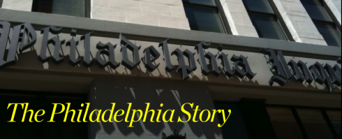
Here is the logo of the Inquirer——it almost never made it there. Oh, the memories!
Entry #4: Meeting the editors
I meet one new editor after the other.
I am happy to see so many young men and women here. The majority of those in front of me were in elementary school when we were doing the behind the scenes clean up of The Inquirer’s logo.
Everyone carries a Blackberry or an iPhone, and you see the mobile phones dotting the surface of the conference room round table. These people are connected, glancing at their mobile phone screens from time to time. I do too.
I am wondering: do these people know why I am here?
Do they know my arrangement with Brian?
What do they think?
Well, they all do know. I meet the young Ryan Davis, who is introduced as Brian Tierney’s right hand man. (Ryan is now head of Philly.com, reason for me to be very happy). Ryan and I talk a lot. He is in his 30s, and his wife just had a baby, but he has great respect for storytelling, for print, but knows that the future is all about integrating digital/mobile/print. I am going to like working with him, I tell myself.
I also enjoy my meeting with Wendy Warren, who is Philly.com editor. Came from print, but certainly has a great command of online storytelling and how it should be happening.
I get the feeling that Wendy does not feel that it is happening right at her newspaper. We talk about it. Online crew is in a different building from the Inquirer’s print crew. Not so good.
But more than geographic distance, I notice the psychological difference. I suspect that here, print is king, and online is secondary. Just a feeling, not fully explored or researched.
Entry #5: Reed is my copilot for the project
I have not told anyone in my Garcia Media team about this project.
Consequently, I have not selected anyone from our team to be my copilot here, as I usually do with each project, where we have a Garcia Media art director to work closely with me.
I have a thought. Our summer intern, Reed Reibstein (Yale University 2011) is so bright, so involved with media in its various manifestations, but with such deep respect for print——and a great knowledge of and love of typography.
If I am going to try to help the quintessential classic American newspaper in bankruptcy, my co pilot should be someone in the age group which American newspapers gave up on attracting many years ago.
I talk to Reed and tell him: Reed, I know that your summer internship with us comes to a close in late August. Would you like to keep me company with a special project? I tell him the complete story. He jumps on board in two seconds.
My first assignment for Reed: do an autopsy of Philly. com, seven days of the Inquirer, seven days of Daily News.
See what you come up with, I suggest to him.
I add: Reed, don’t forget to read up about bankruptcy proceedings, the latest on the financial woes of the paper, and we discuss it all in exactly one week.
Suddenly, 21-year-old eyes land on the 180-year-old newspaper. The work begins.
I jokingly remind Reed that this project is all about the excitement of perhaps helping an American institution. I get $1, you get a quarter, is that Ok with you?
“Yes, sir,” he says and smiles. We are on. Diligent Reed strips down each of the titles to its barest bones. His emails can be detailed, sometimes funny, and always full of discoveries.
“There are great things in that Philly.com, Mario,” he writes, “but a lot of the stuff is buried.”
“What do you mean, Reed?, ” I asked.
Reed’s discoveries: The two features of Philly.com that stand out: 1) phrequency, a “hyper-local music community” created so fans can listen to and find out about Philadelphia’s music scene; and 2) SnapGlow.tv, hosted by Cynthia Gouw.
Other features that don’t appear prominently in print are “Mob Scene,” in which crime reporter George Anastasia relates vignettes about the Philly mob—a real life “Goodfellas”; Dick Polman’s” American Debate,” a thoughtful political blog; and Student Union 34, for college students at Philadelphia’s 34 colleges. Some smaller, great features include live chats (such as one on the World Series), traffic updates, and an event calendar.
Reed’s list of what is available on Philly.com includes 38 different categories, making Philly.com a very impressive site, but one that is only infrequently advertised in the Inquirer and Daily News.
I had realized the same. American newspapers that are on the verge of being buried themselves, failing to explore the richness of some of its most youth-oriented online offerings. In the case of Philly.com, two that stand out: phrequency and SnapGlow.tv.
I am afraid the same can be said for hundreds of US newspapers where online content (other than news) is two continents apart from what is happening in print. The worse part: print never acknolwedges that any of this is there.
Early lessons for all, inspired by our dissecting of things in Philadelphia.
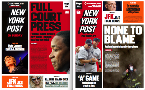
A New York Post prototype created by Al Triviño

Front pages for a proposed prototype created for the New York Post, but never implemented
In a recent post, we discussed the importance of prototyping.
Today we received some of Al Triviño’s prototypes, which will display here one project at a time. Al is chief designer for NewsCorp (based in London). Today we have two sample pages of his prototype for New York Post.
Tomorrow: Prototype for the London Sunday Times
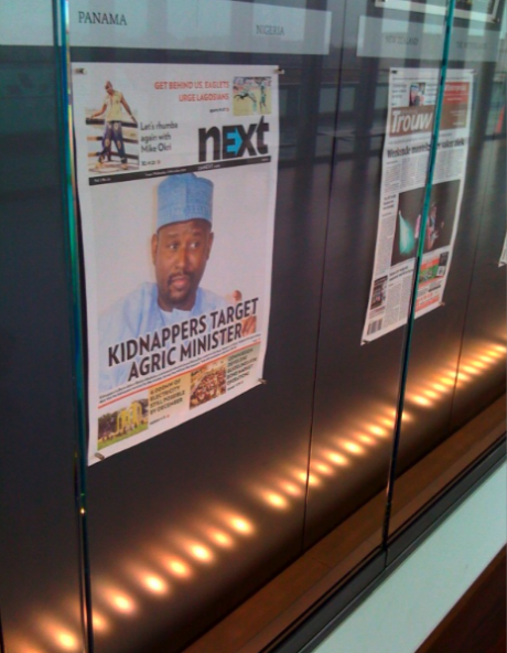
NEXT at the Newseum!

A proud Dele Olejede, publisher and creator of Next, the newest daily newspaper of Nigeria, sends this picture: A copy of Next on display at Washington’s Newseum. Congrats to all.
TheMarioBlog post #419