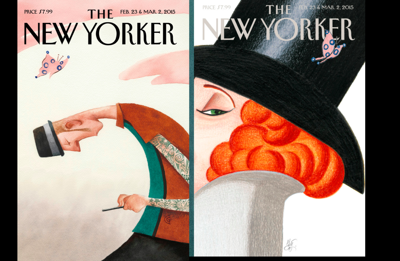
My two favorite cover concepts of the 9 that The New Yorker is using for its 90th anniversary celebration

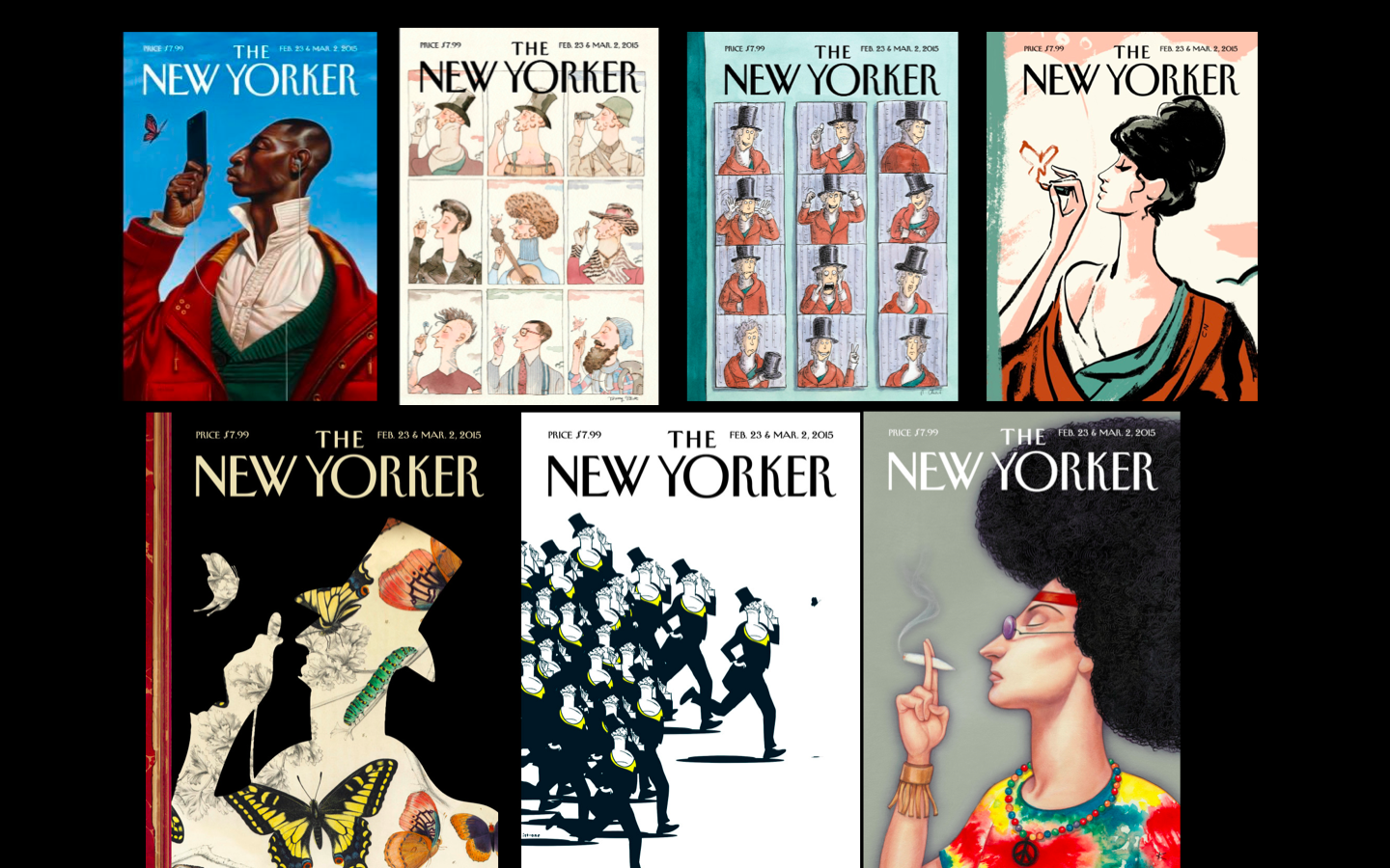
Seven of the 9 covers designed for the special 90th anniversary edition of The New Yorker
One of the most fascinating exercises one can have when art directing the cover of a magazine, or a newspaper section opening page, is when various artists in a team are given the same briefing, then are turned free to create.
The results are always amazing. I always marvel at the fact that one same story concept can have so many good interpretations. Then, of course, comes the difficult task of selecting one.
That is why I think it is such a great idea for The New Yorker team to have decided to publish 9 covers, one for each decade the magazine has existed.
While all of them are terrific in their unique way, I absolutely love the one by Lorenzo Mattoti, a different take on the dandy, and one that reminds me of that sultry movie star of another era, Marlene Dietrich.
A second favorite, a concept by Carter Goodrich, with the modern dandy wearing a contemporary hat, but totally absorbed with his iPhone.
The lesson here: when it comes to a creative concept, there is no right or wrong answer, which is why I am happy that The New Yorker team provided us with this variety of covers, all of which could stand on their own to celebrate the treasured magazine's 90th anniversary.
For more about The New Yorker covers:
Amen
True statement from Mike Davidson (@mikeindustries) VP of Design at Twitter.
