
Purchase the book on the iBookstore
“iPad Design Lab” trailer on Vimeo.
The EPUB book alert:
To all of those who are writing to let us know that you can’t buy The iPad Design Lab: Storytelling in the Age of the Tablet, in your countries, or for your tablet, the good news is that we have completed the EPUB version and it should be ready to download as soon as this week. We will keep you informed.
TAKEAWAY:: Based on initial feedback, apparently the Pop Up chapter is one of the most popular in my new digital book, The iPad Design Lab: here are some answers to your questions. AND: See all about what’s new in fall fashions in the Hugo Boss Tribune
It’s all about those pop ups
Here is a short video tour of the Bild pop up advancing the story of Felix Baumgartner, who will climb more than 120,000 feet into the atmosphere inside a capsule attached to a helium then take a free fall to earth. Video created by Frank Deville
Ever since my digital book, The iPad Design Lab, came out Sept. 26, I have received several phone calls and emails from people who seem to be fascinated with the topic of pop ups, which is covered in a chapter by that same title.
Several of you tell me that you find it difficult to do pop ups in your own apps, citing lack of staffing within the app team , or technical impediments. Still, some of you question who is supposed to come up with the idea for a successful pop up.
I understand your concerns and decided to write more extensively about pop ups in the blog today. I am also inspired by one of Bild’s exciting pop ups, published in its app Saturday, Oct. 6.
It details the story of Austrian skydiver Felix Baumgartner, who will ascend more than 120,000 feet into the atmosphere inside a capsule attached to a helium balloon. Then, with nothing but a pressurized suit and a parachute, Baumgartner will jump out of the capsule and plummet toward Earth, breaking the sound barrier on the way down.
It is the type of story that Bild does best, and we should watch how it covers it when Baumgartner takes the plunge. It is also a story that has tablet pop up written all over it.
The Bild advantages
Before we discuss the Bild pop up, let me mention up front that I am aware that Bild’s app team may be larger and more experienced than most. Bild’s talented and creative team have been the pioneers of fun and effective storytelling via pop ups for a newspaper app. That is a reason why I highlight their work in my blog so often, in spite of frequent criticism of some of my German friends and colleagues who wonder why TheMarioBlog is so obvious about its adoration of a newspaper many consider less than serious, a down market “tabloid”.
The template
The scene setter screen
The simple pop up: describing how the outfit skyjumper will wear
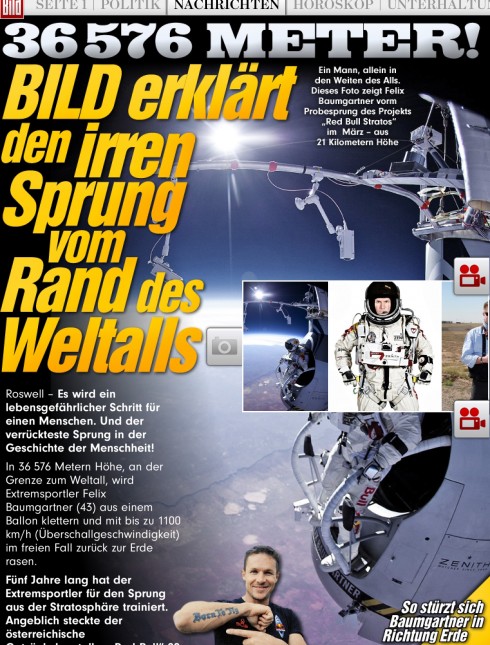
The photo gallery “drawer” of images—all photos by Frank Deville
I believe strongly that one reason for the success and the consistency of Bild’s pop up moments in its apps are, beyond planning, the use of well crafted templates that lend themselves 100% to the content that the editors have conceptualized for their pop ups.
News apps need to be as templated as one can make them. Let the content we plan, and the fun we add thru pop ups, be what changes.
Obviously, Bild has a highly templated pop unit which involves the following:
– The opening scene setter-—designer as a screen cover, the story begins here, but notice the right hand side navigator to videos, photos, etc.
—The navigator leads to a photo gallery “drawer” allowing for a display of photos via swipe gesturing.
—The video icon leads to the video clip associated with the story.
—The text is always available via scrolling gesture
—The simple pop up—-where a photo image is dissected for a series of mini stories. it is this part of the Bild template that I wish to discuss further here.
The simplest of pop ups
Assuming that you and your team still do not have the resources to do a full multi genre pop up a la Bild, you still can attempt to introduce what I call the simple pop up.
At its most basic, the simple pop up involves storytelling that is inspired by a photo or graphic which lends itself to several mini stories, as opposed to the less informative (and lazier!) traditional caption.
In today’s Bild app (above), the simple pop up is about details of the jump suit that Felix_Baumgartner will wear to execute his free fall to earth from space.
This is not so difficult to execute, enhances storytelling and keeps the user’s finger happy and engaged.
It is almost the end of 2012, news apps must evolve, gravitating towards this type of execution, one step at a time.
Pop ups do not have to be complicated.
Bild’s textbook-like examples show us the way, from simple to more sophisticated. It represents a good thermometer for the rest of us to check the pop up temperature of our own apps.
Here are previously shown Bild apps that highlight the template the Bild team uses repeatedly.
A tribute to astronaut Neil Armstrong
Marilyn Monroe: 50 years after her death
Of related interest:
The Art of the Simple Pop UP
https://garciamedia.com/blog/articles/theipad
Creating some simple pop up moments in your tablet
https://garciamedia.com/blog/articles/creating_some_basic_pop_up_moments_in_your_tablet/
Launched: Hugo Boss Tribune?
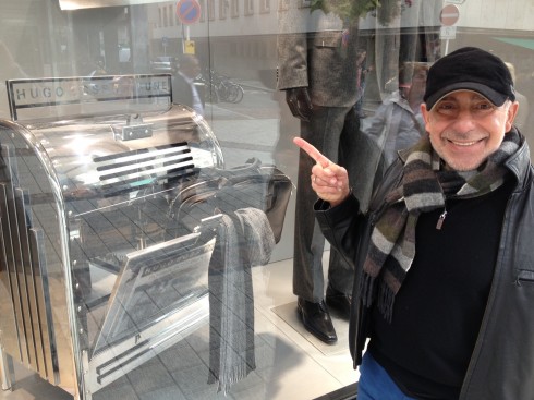
Here is the “newspaper box” for the Hugo Boss Tribune—part of the fall season window dressing in Europe for the famous brand (Frank Deville photos)
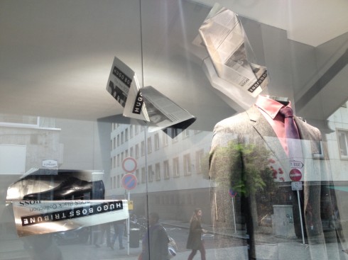
Aluminum “plates” of the Hugo Boss Tribune hang from the ceiling in the new Hugo Boss windows in Europe
This is not a real, new newspaper you may see arriving at your doorstep or mailbox, but during the weekend in Luxembourg I discovered the new Hugo Boss Tribune, a fictitious title which is part of the Hugo Boss fall fashions campaign as displayed at its many European stores.
The concept of the iconic printed newspaper as auxiliary to fashion advertising is not new, but it is refreshing to see it as part of a Fall 2012 campaign. The point of purchase newspaper box, as well as the pages that hang from the ceiling of the store window, are all in a shiny metallic silver. The pages shown are as attractive as the Hugo Boss men’s fashions displayed.
It’s clear that the Hugo Boss window dress designers could have used tablets for their Hugo Boss Tribune display, but they thought that those aluminum hanging elements would fly better as pages of the newspaper as most know it. We agree.
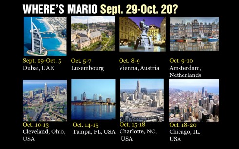
1st Middle East News Design Conference
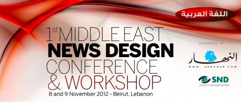
It promises to be a great program, and a historic one, too: the first SND Middle East gathering. Put it on your calendars: November 8 & 9, in Beirut, Lebanon. Sponsored by An-Nahar and SND.
For more information:
http://www.snd20events.com/conference/