TAKEAWAY: I take a look at the new Samsung Galaxy Tab and compare it to Apple’s iPad: smaller, slower, and a very different product for a different type of user. PLUS: 40 Years/40 Lessons, segment 10: the importance of staying positive even in the face of adversity. AND: Mario interview in The Moscow News
Smaller but not necessarily better


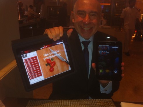
I get my hands on Samsung’s Galaxy Tab for the first time
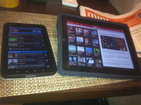
 Reading the Times of India app on the Tab
Yesterday I had my first face to screen contact with the much-discussed Galaxy Tab, the new tablet device launched by Samsung. It happened during breakfast here in Delhi, where I work part of this week.
Finally, I had a Galaxy Tab in my hand, and could place it next to my iPad, and see the comparisons.
Many in this industry tell us that it is the Galaxy Tab that will be the iPad killer, the one that will give Steve Jobs’ marvelous and popular creation a run for its money.
Too early to tell, but I don’t think that the Galaxy Tab will be an iPad killer, but it may be a strong competitor.
My review:
Samsung’s Galaxy Tab is a 7-inch multi-touch display tablet running the latest Android OS v2.2. system. The first thing that struck me as different, at least in the setting of the restaurant at the LaLit hotel in Delhi, was how slow the tablet was loading anything my fingers tapped into. What would take my iPad 10 seconds, could take the Tab 25 seconds, for example. I don’t know if others have experienced the same loading time delays.
The two tablets are distinctly different and I believe it is unlikely that someone seriously thinking of buying an iPad will be diverted to the Galaxy Tab. The design of the Tab does not compare to the more slick and utilitarian one of the iPad. The 7 versus 10 inch screen is a great differentiator for me, who find myself using the iPad more often for a greater variety of functions, such as preparing Keynote presentations, sketching concepts and pulling it from under the table during the course of a business dinner, as I did last night, to demonstrate a point. My fingers prefer the wider canvas that the iPad screen provides.
The specs: The iPad is much bigger, measuring 9.7 inches tall and 7.47 inches across. The Tab, on the other hand, is just 4.75 inches wide and 7.5 inches tall. And against the iPad’s 1.5 pounds, the Tab weighs roughly 0.8 pound.
The price: In terms of pricing the two tablets are equal. The Galaxy Tab sells for 38500 ruppes (US$855) in India, which I find comparable to the iPad. For the record, the iPad has not entered the Indian market officially, but Indians who travel abroad do get them, so they are in evidence here, from the conference room to the restaurants.
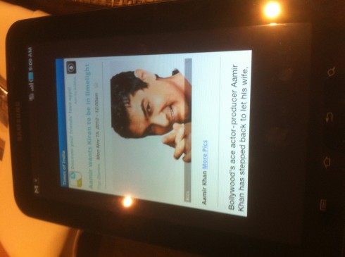
As for apps: Applications matter a lot for tablet users, without a doubt. We all go for certain apps that accommodate our specific needs and tastes. Both the Android tablets and the iOS tablets have a variety of applications, although the iPad has a lot more apps, but this is because it’s been around longer. I imagine that the Tab will accommodate a healthy apps library in the very near future. My host, Anup Gupta, design director of the Hindustantimes, had just gotten his Tab, so he did not have many apps to show me. Instead, we moved to the Times of India app, which is more like an iPhone app. In fact, the Tab reminds me of an iPhone on steroids. It has a camera, too, by the way.
It is interesting to notice that the Galaxy Tab, which is a telephone, too, is just too cumbersome to put near your ear, as you do a phone, but it is definitely smaller and easier to handle for everyday task.
I could imagine running with a Galaxy Tab in my hand (far fetched, but…), and I would never run or take a long walk carrying the bigger , heavier iPad.
The Tab’s difference: The new device supports Flash video, and it has front- and rear-facing cameras for videoconferencing (the iPad has no cameras). I think it is only a matter of time before Apple rolls out front- and rear-facing cameras on the iPad 2.0, to support, among other things, its FaceTime video chat application. That will be nice. Until then, i have my iPhone 4 to provide me with telephone/camera, so it is not something I miss in my iPad, but will be nice to have it when Apple puts it in.
The issue of usability and lifestyle: Here lies a big difference between the two tablets: the iPad is all about relaxing with it, not a tool or weapon to carry when you are in an active mode; the Galaxy Tab is more likely to be used in the trenches of daily movement. Reading my book, give me the iPad, anytime. I will take it to be dwith me and my eyes can travel from west to east nicely, a good distance; with the Galaxy Tab you do more of a sprint as you move across the tiny screen. But, I must confess, I only read a couple of stories from the Times of India on the Tab, and I have already read five books on my iPad.
What it means for us designers: We will be designing for both of these tablets, and many more to come, if experts’ predictions are an indication. I have not yet done any design work for the Tab, but I assume that this will not be simply the creation of a different grid and template to accommodate the smaller canvas. Too early to say, but I envision, based on the apps that I am creating for iPad at the moment, that reading modes would be different——the Tab appears to be more of a digest type of tablet, click and read, and less a canvas for the concept of page design on the screen, which is so exciting and possible on the iPad. However, let’s see what that experience is like when the time comes.
As it was breakfast in Delhi, where the fruits are plentiful and colorful, I can say that comparing the Tab and the iPad is more like drawing similarities between an Alphonso mango and a papaya. Both are fruits.
Interview with The Moscow News
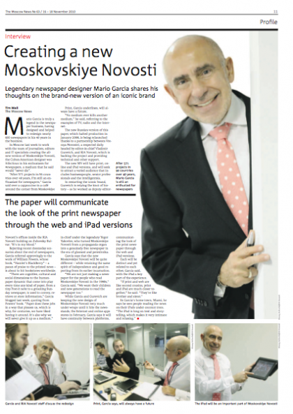
During my visit to Moscow last week, to work on the rebirth of the Moscovskiye Novosti, I was interviewd by Tim Wall, editor in chief of the English-language Moscow News.
It was a luinch-time talk about the new concept for the MN. The interview is now published.
Go here:
http://themoscownews.com/local/20101115/188205453.html
Stay focused, stay positive
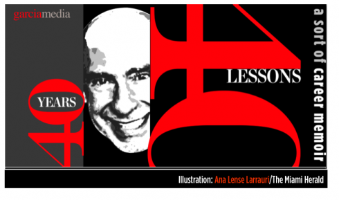

Somehow, I knew that this installment of 40Years/40Lessons would be titled something starting with a letter P.
I thought Patience.
I thought Perseverance.
I thought Positive.
Perhaps they go together, all part of focusing to achieve your goals.
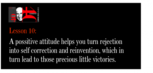
However, when forced to pick one of those three words, I settled for the one that I believe carries the most weight: Positive.
A positive attitude is the best of daily vitamins. Vitamin P has carried me through many situations where nothing in my surroundings was positive. In those moments, I reminded myself to be positive.
I have learned along the way that some people are predisposed to be positive, while others are not. Unless you live in an enclosed space with no outside contact, you are likely to meet both of these types. In every group, there will be at least one person who sees gloom, and nobody is going to convince this person that it isn’t so. It is part of group dynamics, and it happens at all levels from family discussions to project deliberations. One gloomy character in the mix I can usually handle; but, have you ever been involved in a project where the saying “misery loves company” becomes reality, and two or more participants drag you and the project down?
I have often thought that project groups should be assembled following certain criteria, the most important of which is, “everyone in this group must be open minded, forward thinking AND positive”. That, of course, is wishful thinking on my part.
I am happy that I usually see the bright side, and that I am able to NOT let the negative vibes of those that I must deal with in a project to contaminate me.
I refuse to pay attention to those who see giant defeats where I see those little victories.
The refugee lessons come handy
Sometimes I think that I forced myself to think this way as a young boy, during those difficult days as a Cuban refugee, in a strange country, feeling alone, like a fish out of water, and realizing that it was not just some temporary situation, that there was a sea separating me from my parents and all that was familiar, and that political turmoil would make matters worse before they became better.
Each day was a struggle in school, with a new language that I could barely understand, then a job collecting dirty dishes in a restaurant after school, my life upended. But I remember that what carried me through was the thought that the next day would be better. I remember clearly, sitting up in bed at night, in total darkness, but not letting the reality of the situation get me down. Each morning I would look forward to learning new words in my new language, celebrating the victory of understanding one more phrase from the teacher or a classmate, or just simply ordering stamps in the post office and the postal clerk behind the desk understanding me.
Savour those little victories
I learned early enough that it is all about small victories, not giant ones. Each day before I go to sleep I try to recall the small victories of that day.
That is the way I feel when, in the midst of a difficult project, one sees a bit of progress. So you have presented 25 ideas that you think are great, and you have covered the walls with pages that show dozens of ways of handling type, page architecture, color, but only three are worthy of discussion with the client. Don’t look at the numbers, forget the 22 ideas that are NOT in discussion, and put all your effort into those three ideas that made the cut. I don’t spend much energy in what was, devoting all of it to what could be.
Of course, like everyone else, I fight for ideas that I consider worthy of a second chance, but I don’t marry myself to ideas to the point of jeopardizing the prospects of other good ideas flourishing.
It is important to realize that there is a distinct difference between the person with the negative attitude, and the legitimate concern expressed by someone who simply does not like what you are presenting, or is giving you good reasons why it should not be considered.
Rejection often comes from those we serve: the readers. Focus groups are the biggest, most spacious rejection suite I have ever inhabited, but that is another story for another segment. (Coming soon: Test.)
Even rejection can be positive if it fuels the rocket that leads to self correction and reinvention. Rejection is negative when we make the arrogant assumption that those who reject us are ignorant and simply fail to grasp our grandiose ideas. (Any chance you are reading this, my dear President Obama?)
When positive is not on the menu
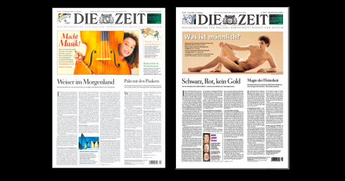
Recent pages of Die Zeit: the very visual and successful German weekly
Of course, there are those days——and those projects——when positive is as elusive as a taxi on a snowy night in Manhattan.
I remember many of those, although I do not dwell on them.
One project, in particularly, almost steered me away from the “Positive Mario” mode and into a sour mood and even contemplations of quitting, giving up, throwing in the towel and deciding that there are projects that are not meant to be, should not be, and may even be harmful to your emotional health.
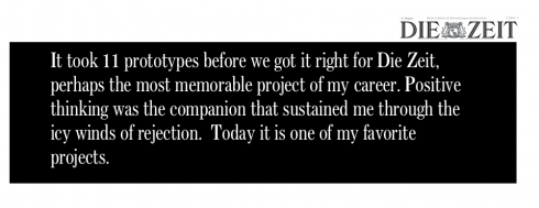
Such was the case for me with Germany’s beloved newspaper, Die Zeit.
Oh, I remember it well, the 11 prototypes. Indeed, how can one attempt to recreate 11 different concepts, facing rejection along the way. More important to the subject of this segment, who can remain positive even after four rejections, let alone 10. Yes, finally the 11th prototype cut it. Perhaps the Die Zeit editors are the ones who gave up, but not really.
The staff of this, the most intellectual German newspaper, knew what they wanted: German elegance.
Could an American designer provide it?
“Nein,” said the choir. Yes, this was a democratic process where one would present prototypes to a room with 80-plus journalists, all smart, prolific, vigilant of every word they wrote, and not necessarily very interested (at the time of this project) in visuals. Die Zeit did not have many photos, only a caricature on page one, and long articles.
I was persona non grata. It takes a special effort to remain focused and positive, or to simply cope, when you are not a welcome guest.
Coping?
Well, I remember doing longer runs around Hamburg’s Alster lake each morning, or opening the windows of my fourth floor office even in the cold winds of January, to take in the fresh air; sometimes, I turned to music—-listening to jazzy renditions by Ella, or Sarah or Billie Holiday.
Then I would return, and there would be another presentation, and, if we were lucky, a member of the board, former German chancellor Helmut Schmidt would be there, and my knees would shake a little, knowing that nothing I could present to this man could please him.
Somehow, the part of me that talks to me was actually screaming: “Mario, you are not a quitter.” That is as much positive thinking as I could muster under the circumstances.
“Keep trying, Mario.”
“One more try.”
And, so, on the eleventh try, somehow I captured German elegance, one headline at a time, one narrow column of white space here, one subtle touch of pastel hues there. Not that Herr Schmidt smiled with approval (does he ever?), but at least he said nothing; the Countess did smile.
Did I mention her?
Yes, there was also this wonderful and revered journalist on the board, Marion Hedda Ilse Gräfin von Dönhoff, who participated in the resistance against Hitler’s National Socialists, and served as editor, and even publisher, of Die Zeit for 55 years. Dönhoff was born in 1909 to an old aristocratic family (“Gräfin” means “Countess”) in Schloss Friedrichstein, East Prussia. She died in 2002.
While Herr Schmidt never addressed me directly, even when sitting across from me, Gräfin von Dönhoff had communicated her intentions and wishes for the project to me. She wrote a three page typewritten letter making her case for why Die Zeit should not succumb to too many visuals and design elements. I still keep that historic document.
Rejection is always a double pill of cod liver when it is accompanied with an arrogant attitude. Herr Schmidt, who spoke English fluently, used a translator to convey to me his feelings about the pages shown. I was not only the perpetrator of crimes of the design kind to his beloved Die Zeit, but also NOT worth speaking to in a language we both knew well.
Of course, there were more than a dozen editors/journalists of Die Zeit who wanted change, who supported me and, in retrospect, kept me from losing my way. To them, I am grateful, very espcially to Theo Sommer, former Die Zeit Editor-in-Chief and Publisher and considered one of Germany’s foremost authorities on international relations and strategic issues, He talked to me frequently and led me to the sources where I could familiarize myself with all things reflecting German elegance. I did. It paid off.
This, along with thinking positively against the icy winds of rejection coming from the North Sea, allowed me to finish the project successfully.
Ironically, it stands out as one of my favorite projects. I still feel great pride when I look at copies of Die Zeit, which, of course, has been nurtured and enhanced by marvelous art directors along the way. We planted the visual seed.
The lessons here
Those who wanted no change for their newspaper did not dislike me, just my role in the process; I had to remind myself of that as “a little victory” during the 21 months that the process lasted. Indeed, I find that people sometimes confuse rejection of their work with rejection of their person. Not always, remember that. Those were the days when a “redesign” project would take almost two years and 11 prototypes. The world travels on much faster flying machines these days.
Sometimes it takes someone outside of your comfort group to push you, to get the best out of you. As I look back at the rejected prototypes (which I have kept, of course, and always will), I realize how much better that lucky #11 prototype was. Prototype #5 had the goods, but it was too ahead of its time for Die Zeit; Prototype #8 was too much like LIFE magazine for the late 90s, how could we show that to a group who was questioning the use of a photograph on page one? We learn as we go. But, alas, Prototype #1 had all the innocence, charm and, I thought, classic elements, to wow them. Walking away from the room after that first fateful presentation to a sea of solemn-looking German faces who did not see any of what I thought was in such abundance here was the closest thing to a cobra sting.
I retreated to the men’s room to wash my “wound”, pouring very cold water over my face, looking in the mirror, and giving myself the usual 24 hours to do the crying, the wake and the burial, and then on to Protoype #2——which was so unforgettable that I have no mental clue what it looked like. It is also the one that I threw away instantly, considering it contaminated baggage I did not wish to travel with on the way to what I so wrongly thought would be one final Prototype #3.
At the end, Die Zeit was a banquet of little victories. I know that victories can be wrapped up in bouquets, like yellow tulips, to pull them close to you on those likely-to-happen days when there are no victories of any size.
An editorial page to remember
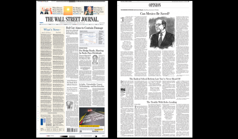
Front page and opinion page: The Wall Street Journal
Years later, I would find myself opening the windows of another building, in another city, another country, to take in the cold air.
It was time to redesign The Wall Street Journal, the ultimate voice of American capitalism. What child Cuban refugee who ever escaped from the claws of Communism and arrived in the land of opportunity did not dream of such a moment?
I felt patriotic, proud and ready for the job.
But, alas, redesigning the editorial page of the Wall Street Journal—-that was a job. So many things have been said about it, most of which it is not important to get into in this discussion.
For me, the challenge was to remain positive and focused while trying to make it, let’s say, more visual, less texty, you get the idea.
Enter the late Robert Bartley, editor of the WSJ’s opinion page for more than 30 years. Bartley won a Pulitzer Prize for opinion writing and received the Presidential Medal of Freedom from the Bush administration in 2003.
Bartley was friendly and always wore a cardigan sweater—-which is the reason that he reminded me so much of Mr. Rogers, from the children’s TV show, Mr. Roger’s Neighborhood. He also liked to dabble in page layout and carried a pica ruler with him everytime he met with me to discuss what we were doing to his opinion page.
In addition to the pica ruler, Bartley used the calculator to count the number of characters we had cut from each article. So, every single prototype of the opinion page would have a number under it, something like -540 (in good cases), or -1789 (when things were not so good).
Bartley did smile, and he was friendly and collegial, but he was demanding and insisted that we did the editorial page time after time. Each time we seem to get closer to the goal.
One must always find an escape route, somewhere to go for 15 minutes or so following a sharp rejection moment. At the Wall Street Journal, I would go out to the park downstairs, overlooking the bay, with view of the Statue of Liberty, where, on most days, I would find an organ grinder, complete with live monkey (no kidding) playing away. I would contemplate the scene, taking glances of that old lady liberty. Soon, I would have recovered and be ready for to return upstairs to the office and to the next version of the opinion page, hoping, desperately, that it would be the one to make Mr. Bartley happy.
I remember that on this particular prototype of the opinion page to be, there was an illustration of an American eagle with the top article—-indeed, it is mere coincidence that there is usually an American eagle circling around me.
My first version of the page made that eagle large and robust, a visual presence on that page. Of course, the article had something like a -1340 under it, so it did not go well with Bartley, who asked me to include more text and reduce the illustration.
This exercise was repeated for weeks.
Each time, Bartley insisted that we put the correct date when that prototype page was done; and he was meticulous to the point of making sure that each article on the page was edited properly following WSJ style.
“You never know who will get to read these pages, what hands they will fall into,” he told me in his friendly tone.
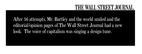
Every time, I would print the page and add it to a pile that I kept by the window. I got all the way to 56 printed, and rejected, versions of the Wall Street Journal opinion page.
And I remember telling Joe Dizney, design director of the WSJ at the time of this redesign, that I wanted to keep these rejected pages to show them to my grandchildren someday: a lesson in perseverance.
I never will. Not with those specific pages, anyway.
On September 11, 2001, two jets flew into the neighboring Twin Towers of the World Trade Center, blowing up the windows of the WSJ building. All of my opinion pages flew out, forever lost with all that we lost that day.
Not lost, however, two “little victories”: first, finally creating an opinion page for The Wall Street Journal that included the right number of characters, with just about the perfectly sized visuals that made Mr. Bartley smile; second, working with and learning from a professional of Bartley’s stature, which turned the negatives of repeated failure with one page, into that sweet little victory of “God, I finally got it”.
I was completing this segment of 40 Years/40 Lessons when I received an email from the art director with one of my current projects,the pdf of an editorial page of The Wall Street Journal attached to a note that read: “Mario, the editor wishes you to recreate the look of the editorial page of The Wall Street Journal for us.”
I know that somewhere in heaven, wearing a bordeaux cardigan sweater, pica ruler in hand, Robert Bartley sits and smiles.
Little victories are never too late. They travel fast and travel high.
The three ever important Ps
Patience. Perseverance. Positive.
They go together, all right.
Not a bad trio of qualities and attitudes to help you accumulate that necessary bouquet of little victories along the way.
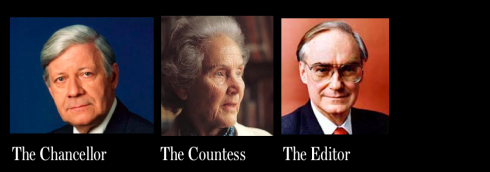
Helmut Schmidt, Marion Hedda Ilse Gräfin von Dönhoff, Robert Bartley: three unforgettable characters I met in the suite of rejection

1.Mirrors.
https://www.garciamedia.com/blog/articles/40_years_40_lessons_1—a_look_in_the_mirror
2.Refugee.
https://www.garciamedia.com/blog/articles/40_years_40_lessons_2—refugee
3.Teacher.
https://www.garciamedia.com/blog/articles/40_years_40_lessons_3—teacher/
4.Mentors.
https://www.garciamedia.com/blog/articles/40_years_40_lessons_4—mentors/
5.Consultant.
https://garciamedia.com/blog/articles/40_years_40_lessons_5—consultant/
6.Eagle.
https://garciamedia.com/blog/articles/40_years_40_lessons_6eagke
7.Abroad.
https://garciamedia.com/blog/articles/40_years_40_lessons_7._abroad
8. Books
https://garciamedia.com/blog/articles/40_years_40_lessons_8_books
9. Luck
https://garciamedia.com/blog/articles/40years_40_lessons_9_luck