
Purchase the book on the iBookstore
TAKEAWAY: This is part one of a series of five blog posts to discuss and to analyze the role of advertising in tablet editions of newspapers and magazines. We should think beyond those banners to which we have directed a blind eye, and move towards better storytelling that engages the audience with the product and the brand.
Without a doubt, we in this industry need to be more creatively aggressive in pursuing new ways of presenting advertising in tablet editions of newspapers and magazines. And, while much progress has been made in this area, especially in the past year, I confess that I am a bit disappointed that ad agencies worldwide are not stepping up to the plate as fast and as enthusiastically as they should to create ads that serve this new and popular platform to its full potential.
While acknowledging at the start that I claim no particular expertise in the field of advertising, I hope the topic will become a recurring series in TheMarioBlog. I approach this topic the same way I did when I started those iPad Labs soon after the iPad came out in 2010: with a spirit of curiosity and a desire to discover what works in this new platform and to share my discoveries with you.
In the Advertising chapter in iPad Design Lab: Storytelling in the Age of the Tablet, I referred to tablet advertising as the new frontier. I wrote:
Here is an area of news app development that offers the greatest potential for creativity—and revenue. Create ads that tell stories effectively and attractively.
That was written about six months ago. How much have we advanced since then in this incredibly significant area?
Some in roads, yes: we continue to see the most experimental advertising for newspapers in The New York Times iPad app edition, as well as in The Daily. To be honest, the greatest exploration of advertising for the tablet is in magazines: Wired, Rolling Stone, Vanity Fair, Details, Elle, Esquire, ESPN, Marie Claire, Glamour, Fast Company, Vogue (France), The Atlantic, among others.
In Canada, at the Toronto Star there is even an “Ad Lab for digital advertising innovation” to explore how advertising might work in the future in the Star’s tablet edition. A solution so far, and one that seems to work for other titles I know: a single monthly sponsor of their tablet experience. It allows the Star’s managers to concentrate on one brand, experiment with the business model as well as the creative aspects, which, in turn, may be applied to future clients.
Unfortunately, this progress is not near where it should be in newspaper tablet editions; ironically, it is here that the potential is tremendous for more revenue producing avenues via advertising.
The topic should concern all of us enough to take some action. I am hoping that my blog posts this week will be a springboard to rethinking how we handle ads in the tablets.
We should make it our goal to elevate the level of tablet advertising, especially as we begin to see tablet apps taking off and beginning to yield favorable numbers. Most recently, we have read how Cond? Nast said it’s raising the circulations of both Wired/ and The New Yorker by 25,000 each on the strength of their tablet businesses. Two years after both magazines created iPad replicas, finally the publisher is starting to see results at many of its titles.
Also, magazine publisher Future reports now selling 239,000 tablet magazines per month which earns it $1 million per month in gross revenue.
This is exactly what advertisers wish to hear. With that will come the demand for ads that are not just eyeballed, but also enjoyed and remembered.
Most common use of tablet ads
Let’s begin with some examples below which I consider typical of what one finds in most newspaper tablet editions today: the sponsorship ads, banners that lead to usually full screen (often static) ads, or, as in the case of USA Today, efforts to tie ads to specific content, but with an e-commerce orientation.
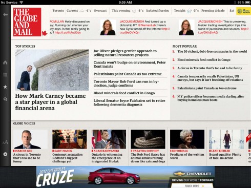

The Globe and Mail: banner ad and where it takes you

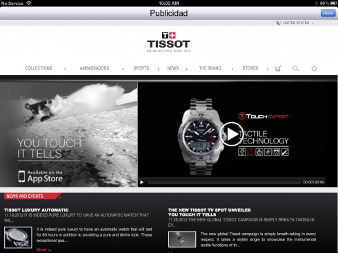
El Pais: It is a traditional “ear” right of logo, not a banner per se, and it leads to a page with video
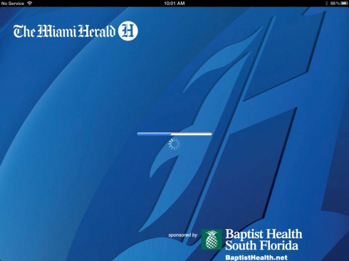
The Miami Herald: sponsorship ad on opening page
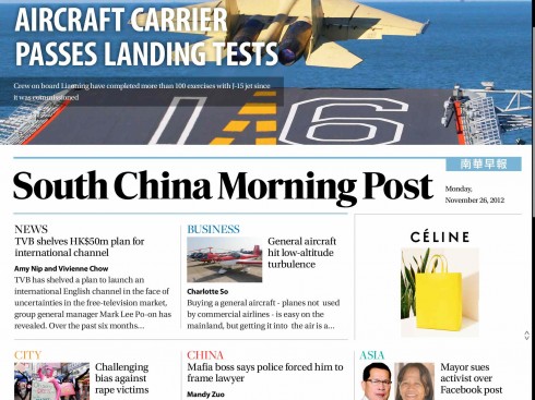
South China Morning Post: rectangular click and go ad for Celine (right of screen)
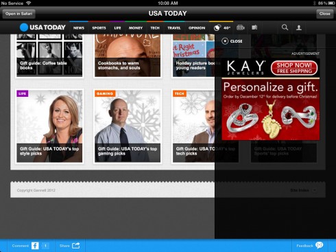
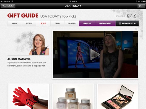
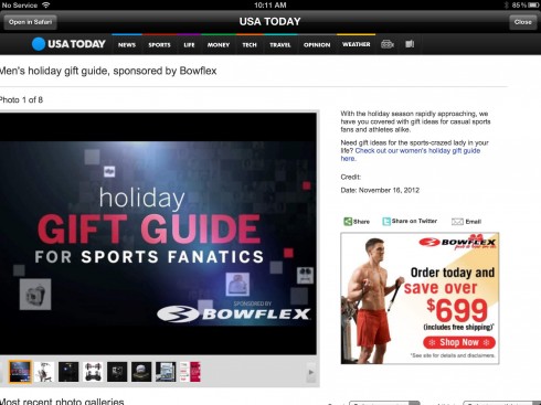
USA Today: Ties ads to “gift guide” suggestions by its editors


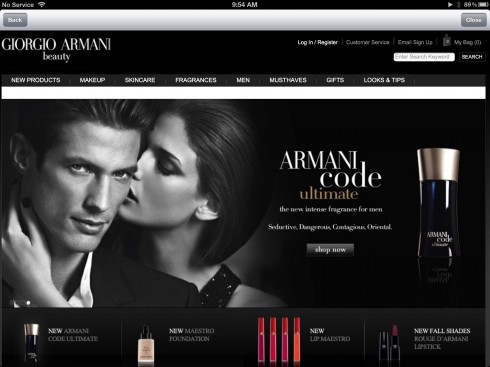
TIME Magazine: a three-stop Armani ad that leads to shopping cart, but there is no storyline here.
What is a good ad for the tablet?
So, let’s start with a definition of what makes for a good ad in the tablet?
In my view, it is advertising that tells a short, self contained story about a product, one in which the product itself is prominent but not as prominent as the story that is created around it.
This will almost immediately eliminate the type of “in your face” advertisements that we see in other more traditional media like newspapers, magazines, online and television, of course.
Out goes the banner ad, to which most users are turning a blind eye.
Out goes the rectangular ad with an image: many of these stopped being viable even online a long time ago.
Out goes the television video ad—the tablet is NOT television.
In fact, out goes the ad as we have always known it.
In comes an ad that does the following:
-Captures the imagination of the audience with a story.
-Invites engagement and interaction
-Allows for linking and sharing
-Synchronizes well with editorial content of a particular publication
-Is content based: storytelling guides the process
-Visually blurs the line between the look & feel of the publication in the app and the ad itself
In order to accomplish the goals above, we must also engage in a total rethinking of how we on the editorial side approach advertising, starting with a more proactive role.
We simply cannot sit and wait for the advertising agencies to create tablet ads that do the job. We have a job of educating to do that involves three levels: the advertising agencies, the brand managers, our own advertising/marketing departments.
These are the issues that I would like to explore as part of the iPad Ad Lab series starting today and running through this week.
A conversation with Roger Black about iPad advertising
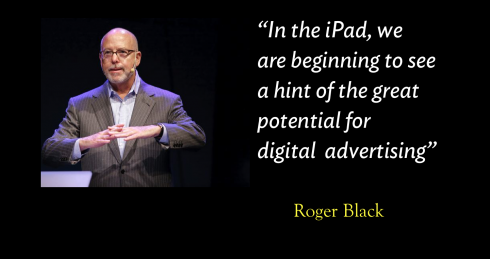
In fact, I have recently had a conversation with my friend and colleague Roger Black, of Roger Black Studio, about a possible collaboration to create some model of tablet ads that we think could serve to inspire people in the industry.
Roger, too, agrees that the tablet offers great potential to explore advertising revenue:
Printed newspapers continue to distribute “free-standing inserts,” those little catalogues for Home Depot and Target, and it must be bringing in revenue. I pick them, although I skip those ugly bundles of coupons. But evidently someone is using, or they wouldn’t keep printing them!
Web sites never figured out how to capture that business. Mostly what they do is run little box ads with links to the merchant’s web site. But now on the iPad we are beginning to see a hint of the great potential of digital advertising. As Mario says, when done right, the ads can tell stories that grab your attention, lead you to absorb sales information and ultimately take you to a digital shopping cart.
I asked Roger if he has seen this type of ads appearing in any tablet editions.
The first place I saw this happening was Sporting News, a Treesaver hybrid HTML/iPad app, which I helped design. The publisher there, Jeff Price, got Toyota to run interactive full-screen ads on the iPad. They led to mini sites (designed for the iPad size) that let you build your own Camry. If you put in your e-mail info, the dealer would arrange a test drive.
Toyota’s agency, Saatchi, played with the form a bit. In one Toyota ad, when you swiped the page, the background behind the car changed to show different locations. They used swiping to introduce a panorama. This was a unexpected use of the tablet—where you don’t have spreads. I’ve started thinking about ads which work like flip books, that move as you swipe. And if you add CSS transitions, the animation can be enhanced.
Other advertisers followed. Recently Avis ran an ad on a number of apps with a picture of a car. The ad invited you to “shake it up.” Using the gyroscopic feature of the iPad, which Apple frowns on, an animation isstarted which reassembled the vehicle, Transformer-like, into a different rooms. Kind of fun.
Storytelling is key to great tablet ads
Let’s think for a moment of the brain activities that are involved when we get information from a tablet: we see, we react, we touch, we interact, we get involved, we share, we move on.
It may all begin with a simple click, but that click is not enough if it does not have the ability to engage us. Yet, in my many meetings and workshops I sense that advertising managers are well versed in reciting the mathematics of clicks. Those numbers are good to describe the metrics of reception, but mean nothing in terms of the realities of engagement.
From early times, engagement has come from a good story. Great advertising campaigns have always involved good stories, and, more often, good slogans, as anyone who is a fan of the popular TV series Mad Men knows well.
If those Mad Menof the popular TV series were doing tablet ads they would spend most of their time weaving a mini story about the brand in the ad, then would come the slogan, as an outgrowth of the story.
For Cartier in The New York Times this month, the slogan is Winter Tales. Notice that it is more of a book or magazine title than a slogan in the more traditional sense. We will discuss this wonderfully crafted ad later.
It is easier to write advertising campaigns that highlight the qualities of a product than it is to create a story that creates a mood and a sense of personal engagement between consumer and product. It is here that we will need to train the most skilled storytellers to create these ads. It may not be enough to be an “advertising copy writer” as we know it now; we may be looking for writers for whom weaving a story together comes naturally, inspired by a brand and a product.
While we already know that people come to our newspapers and magazines to be surprised with plenty of discovery, we need to extend that notion to the ads appearing in our tablets as well.
That renders a lot of what we currently see as obsolete, advertisement that is one click away from oblivion, where users click on the X to eliminate the ad more often than on the image for which the ad is intended. We click on those x’s the way we may clear the cobwebs out of our head when walking into a dark attic, because, truly many of those repellant ads exist in a dark attic of what was.
This week’s series is intended to reverse the trend.
Coming up in the IPad Ad Lab series
Tuesday: Kill the banners
(why banners do not belong, clicks to oblivion)
Wednesday: Rules of engagement
(how can we make them stay and not hit the x at the top of the box)
Thursday: Those comfy advertising suites
(Showcasing some who get it right)
Friday: Taking a proactive role for better tablet ads
(tips for those of us on the editorial side, for the ad agencies, and for the brands)
Of special interest today
The clutter problem on news websites
http://www.garciainteractive.com/the-clutter-problem-on-news-websites
First paragraph:
The biggest problem I see with news or other high-content websites is clutter. Clutter is never good anywhere, let alone a website that is supposed to be engaging readers and passing along information, especially in this day and age when users are scanning for the elements that are relevant to them or offer value.
The EPUB version of book is HERE:
Now available: The EPUB version of iPad Design Lab: Storytelling in the Age of the Tablet, ready for download via Amazon.com for Kindle:
http://tinyurl.com/8u99txw.
Take a video tour of iPad Design Lab
“iPad Design Lab” trailer on Vimeo.
Read the Society of Publication Designers’ review of The iPad Design Lab here:
http://www.spd.org/2012/10/must-read-ipad-design-lab.php

Keep up with Mario Garcia Jr. via Garcia Interactive: helping transform online news since 1995.
www.garciainteractive.com
Here’s a gift you don’t have to wrap!

It’s official. The Christmas/holiday shopping season is here.
Here is a suggestion for someone on your list, the digital book iPad Design Lab: Storytelling in the Age of the Tablet. No need to stand in line, no need to buy wrapping paper. Just send it to someone you think might enjoy a book about this magnificent new platform that is the tablet, and how to maximize its potential for storytelling.
Here is how you can get the book:
The original version of the book is the multitouch textbook version available on the iBookstore for iPad (iOS 5.0 and up):
https://itunes.apple.com/book/ipad-design-lab/id565672822. This version includes video walkthroughs, audio introductions to each chapter, swipeable slideshows, a glossary and a sophisticated look and feel.
Apple only sells multitouch textbooks in certain countries at this time, unfortunately. Copies are available in at least the following countries: Australia, Austria, Belgium, Canada, Finland, France, Germany, Great Britain, Greece, Italy, Latvia, Luxembourg, The Netherlands, Poland, Portugal, Romania, Slovakia, Spain, and the United States.
For those in other countries and without an iPad, we have made the book available in a basic edition for other platforms. This basic edition includes the full text of the original, along with the images and captions, but lacks the other features such as audio and video. It is available on the following platforms in many countries:
Amazon Kindle: http://amzn.to/SlPzjZ
Google Books: http://bit.ly/TYKcew
Scribd: http://bit.ly/PQTwla