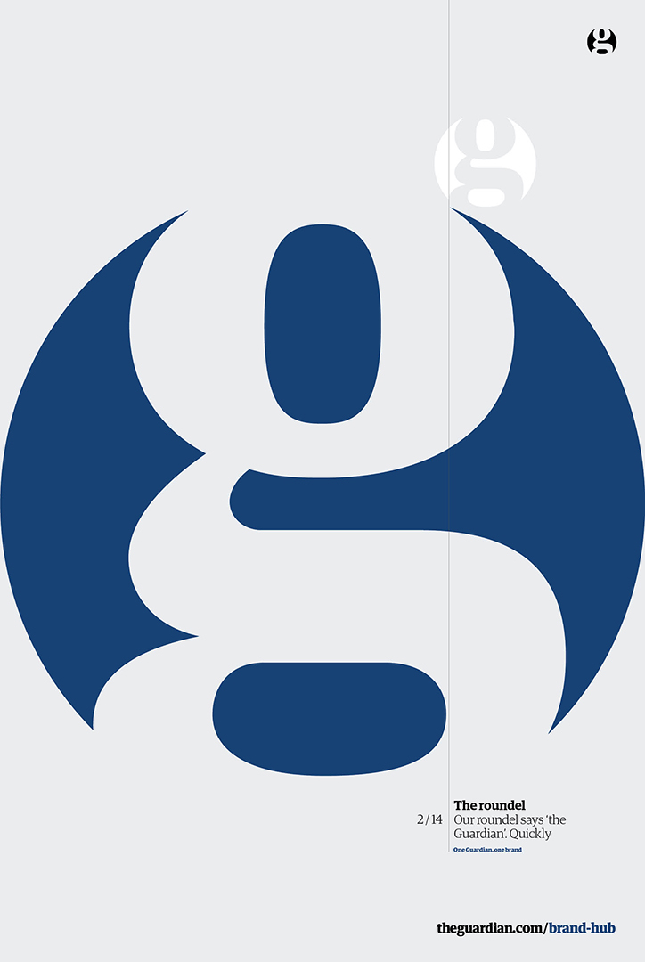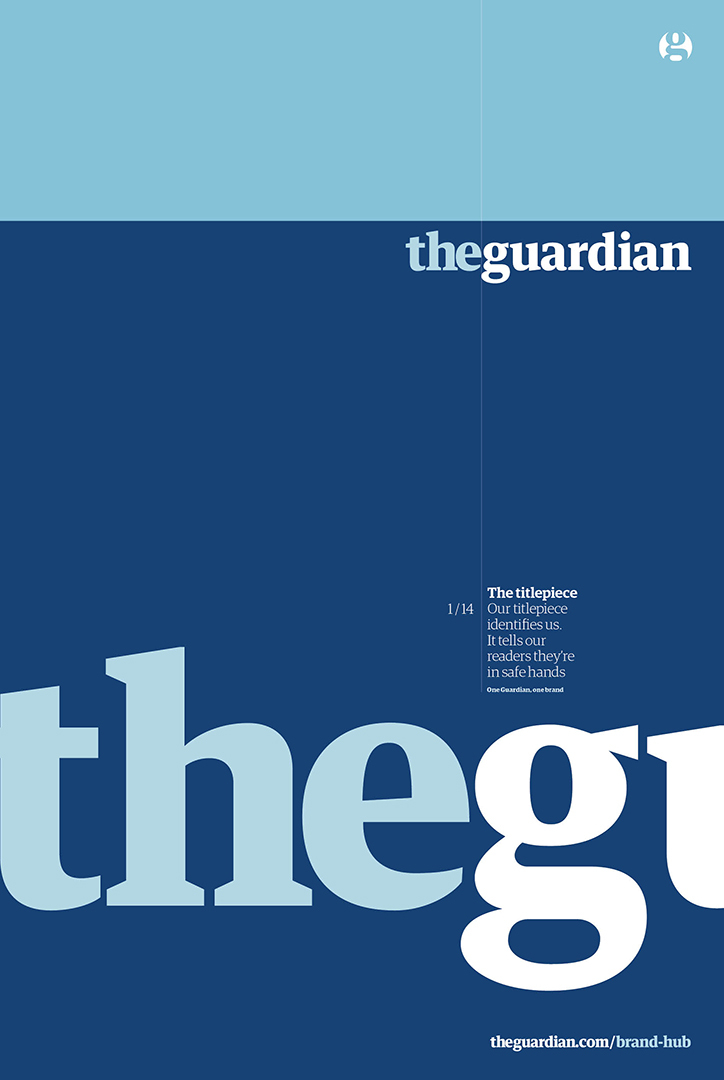

Posters show the new Guardian brand guidelines

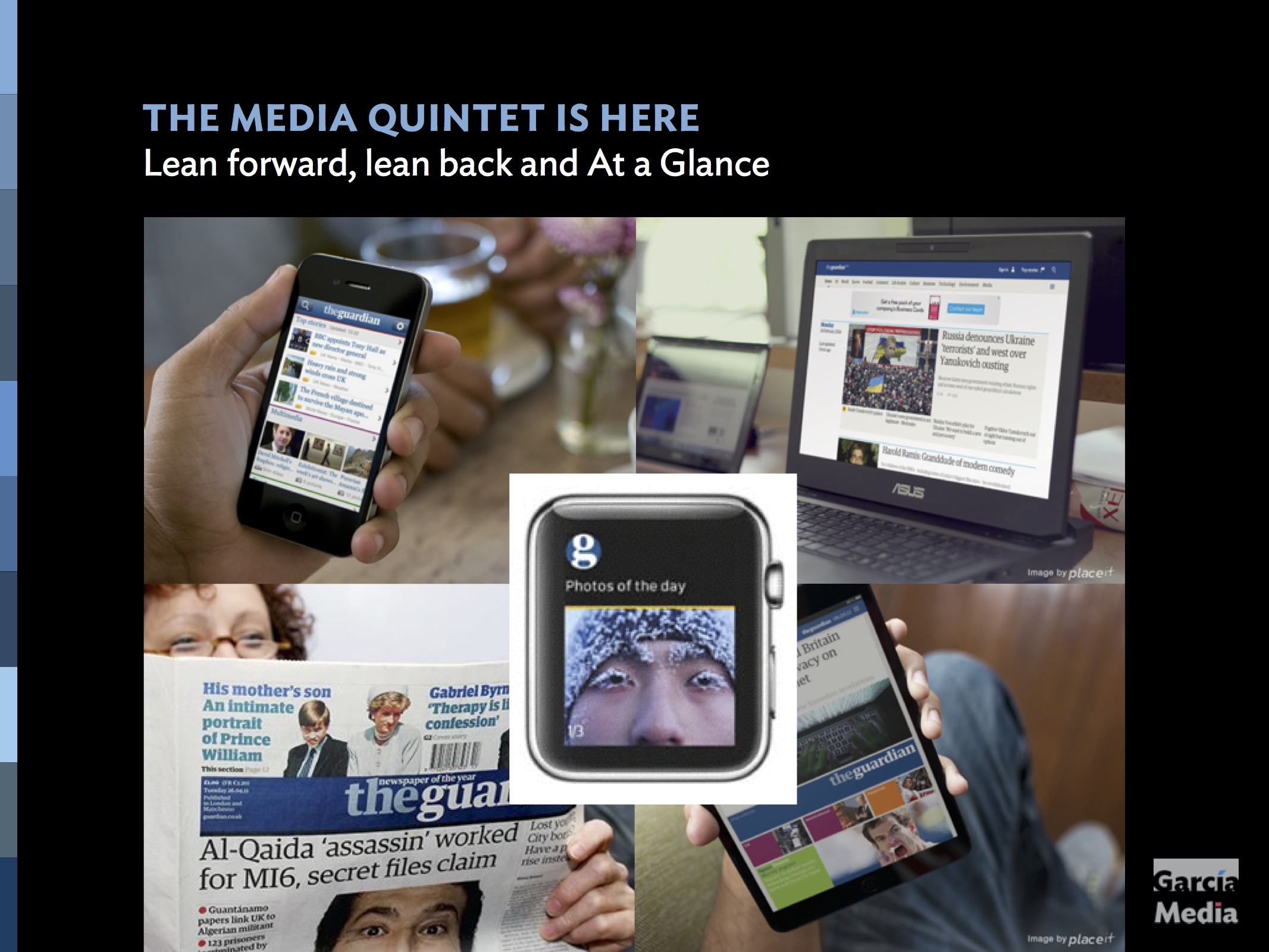
In my own presentations I show the brand unity of The Guardian across platforms
The Guardian has just released their brand guidelines to show how a common design language works across various platforms and sub brands.
The Guardian is a great example of a multiplatform newspaper title. It stands out for its storytelling, whether on the Apple Watch, online, tablet or print.
Guarding its image, and how that familiar brand is presented, is key to users enjoying their Guardian experience.
A brand is perhaps one of the most valuable assets that a newspaper has. Expanding and extending that brand across various platforms is key to making sure that loyal followers find themselves within the familiar, while introducing new elements of the brand to those coming to sample for the first time via digital platforms.
Now The Guardian has just released their brand guidelines.
It is a great textbook example of how take a newspaper brand beyond the traditional masthead and across platforms, from the smallest to the biggest.
For The Guardian it is not just about various platforms, but also businesses and sub brands.
Here is how Chris Clarke, deputy creative director at The Guardian, describes the branding exercise:
“Our identity therefore isn’t just our masthead – it is a rich kit of parts that resonate in our brand DNA. From our smallest articulation the roundel, to tonal colour theory for different accents of content.”
It is important to have a creative director in place who becomes the sheriff for the brand and how it is utilized.