Updated Sunday, August 23, 2009, at 06:24 EST to include Jacky’s Picks from Bild Am Sonntag
TAKEAWAY: Our Pure Design download is Tab versus Broadsheet: the debate continues .ALSO: Download The Impact of the Compact PLUS: Screens inching their way on to print AND: More examples of Zaman’s opinion pages designed to convince

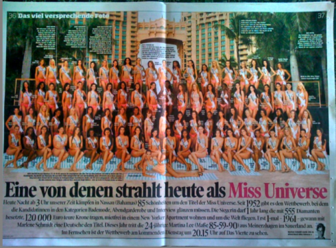
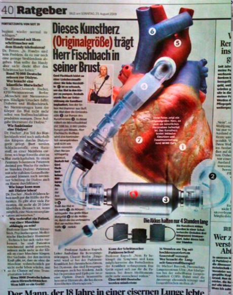
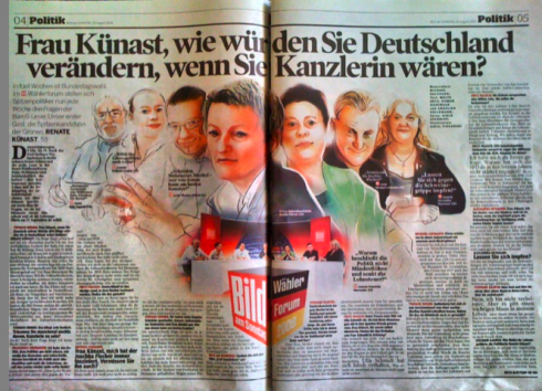
This Sunday, Jacky’s picks from Bild Am Sonntag took him to the beauties first: a double page portrait of all the contestants in the Miss Universe contest, now taking palce in Nassau, Bahamas, with final choice of the next Miss Universe tonight. In addition, Jacky went for a graphic of an artificial heart, complete with all the details about how such an organ works. Finally, Jacky was seduced by a beautiful color illustration depicting various political figures as Germany prepares for elections soon.
Who is Jacky?
Jacky belongs to Frank Deville. The Luxembourg-based pooch is an “avid reader” of the German newspaper, Bild Am Sonntag. Every Sunday Jacky picks stories and interesting graphics in Bild Am Sonntag , the German newspaper.
A first for advertising: screens inside printed magazine
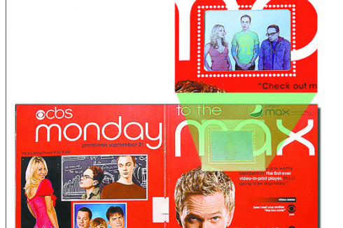
We know that screens are everywhere, and now the fact that our eyes cannot escape screens becomes more obvious as we can sample the first screen inside a magazine.
So now, the synergy cycle is complete: pages that became screens now reverse the process with screens that come visit the printed pages.
The first such adventure comes via television network CBS, which will run video advertisement in some copies of Entertainment Weekly magazine, using a new form of insert to increase interest in its shows. Complete with a miniature screen, the insert—-about 2 inches by 1.5 inches—-holds 40 minutes of television show clips and an ad for Pepsi Max soda.
An added bonus for print, I guess. This is, I am sure, only the infancy of what will perhaps grow as a popular and revenue-producing way of attracting younger readers to print. Advertisers will be watching the results of this experiment closely.
For related article:
http://www.nytimes.com/aponline/2009/08/19/business/AP-US-TEC-TechBit-CBS-Print-Video-Ad.html?_r=1&scp=3&sq=CBS%20screen%20advertising%20in%20magazine&st=cse
Pure Design download: Tab vs. broadsheet: the never-ending debate
The debate is as current in 2009 as it was in 2002 when Pure Design was published. The only difference? Now most publishers are convinced to move to smaller formats, but it becomes a matter of technical questions (can our existing press handle the change, especially to a Berliner?) and also not altering advertisers’ familiar formats in the midst of an economy that, although recovering somewhat, continues to be a thorn on the side of newspaper managers everywhere.
How have my views changed?
I think that NOT every newspaper needs to make an immediate change to a tabloid—-although I continue to think that the more compact size is easier to handle and definitely preferred by readers of the “always on” culture. In the present climate for our industry, perhaps there are more pressing issues than a mere format, such as defining the role of print in a digital news world. That to me, deserves more attention and energy, than the size of the page we print whatever our definition of news may be.
The Impact of the Compact
Elegance meets commentary
–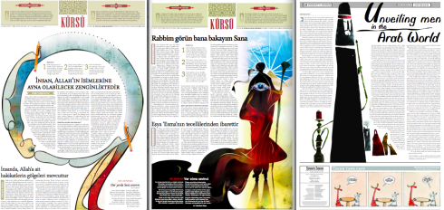
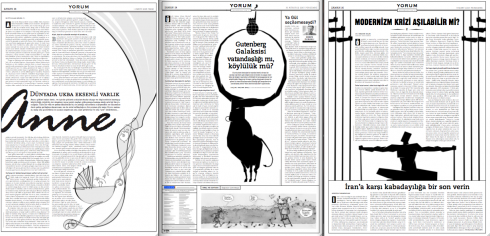
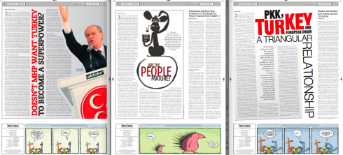
These opinion pages from ZAMAN, the Turkish daily, were contributed by Miguel Gomez of Gulf News (Dubai). He is right: they show that one can use typography and illustration to make these text-heavy pages attractive.
One of the most joyous tasks in the midst of a redesign of a newspaper is always the design of those of the opinion pages.
Usually, there are no advertisements to block the way, or to keep us from creating the type of page architecture we want.
White space, which may be impossible or banned in other areas of the newspaper, is usually allowed here.
Opinion pages offer an opportunity to let the type dance on the page—-make that a waltz!
Because they are mostly text driven—-as they should be—opinion pages offer a great opportunity to incorporate strategies which prove that one can design almost exclusively with type, and still create a thing of beauty.
Workshops in Berlin, Toronto, London
Robb Montgomery reminds us that it is, indeed, back to school season. In that spirit, his non-profit organization, Visual Editors Foundation, announces three fall seminars coming up in Berlin, Toronto and London.
The workshops deal with everything from video editing to new media.
The scheduled seminars are:
September 7-11
KircherBurkhardt is sponsoring a series of video editing, social media and multimedia seminars in Berlin.
October 5-7
The Toronto Star is sponsoring a series of one-day new media seminars.
October 26-29
Beamups is sponsoring a Camp Video Journalism workshop week in Central London.
Pure Design: Download entire section: Type
Download entire first section of Pure Design: Words
Now that I have fully presented the first of six sections of Pure Design on TheMarioBlog, I am offering the entire initial section, “Words,” available for download—all 33 pages of it. This may be useful for those of you saving or printing out Pure Design and will be done following each of the remaining sections. At the end of our journey through words, type, layout, color, pictures, and process, I will publish the entirety of Pure Design in one file.
WAN’s World Trends 2009 Report

The 2009 edition of World Press Trends from WAN/IFRA is now available. I always like to review this report for its complete information on global circulation, advertising and online trends in our industry. All countries in the world where daily newspapers are published are covered in the publication.
This year the WAN/IFRA folks have decided to publish a print version but only make the book available on pdf.
Those interested go:
http://www.wan-press.org/forms/wpt2009.html
Follow me at www.twitter.com/tweetsbydesign
Follow the Marios

Two Marios. Two Views.
Follow Mario Jr. and his blog about media analysis, web design and assorted topics related to the current state of our industry.
http://garciainteractive.com/
Visit Mario Sr. daily here, or through TweetsByDesign (www.twitter.com/tweetsbydesign)
In Spanish daily: The Rodrigo Fino blog
:
To read TheRodrigoFino blog, in Spanish, go:
https://garciamedia.com/latinamerica/blog/
TheMarioBlog posting #336
TheMarioBlog posting #340