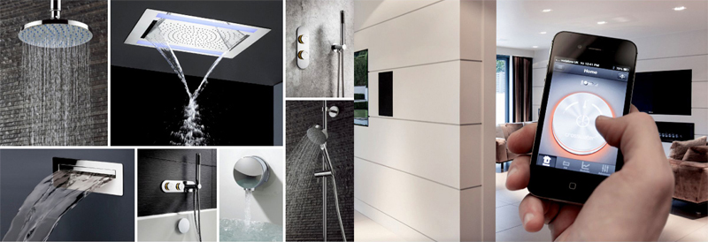
Highly sophisticated technology has arrived for operating your shower. Not always the easiest to use, however.
My 1929 bathroom in New York City is as minimalist and simple a user experience as anyone can design.
Last week I was scheduled for dinner with a good friend who happens to be a pilot, a Captain for Lufthansa airlines, who flies the big jumbo Airbus 380, yes, that full double decker bird who can carry 526 passengers and a crew of 21. Must not be easy to take off and land that monster of an aircraft.
Because he is German and punctual, my pilot friend alerted me that he might be running a little late as he had “shower” problems. He said he would tell me all about it when we met.
And he did: the Captain was staying at a five-star, big name hotel in Miami, Florida, which is where our encounter took place. But, as he got into the shower in his hotel room, he realized that perhaps getting this shower to work was a bit more complicated than flying the A380. I know I am exaggerating here, but, it is just to make a point. Like the Captain, we all have faced the ultra sophisticated showers in hotels or other places that require a manual, an engineer and even the concierge to make them do what they are supposed to do: open up, provide you water a temperature that is comfortable to your body's specifications and that it closes properly when you are through with your shower.
The Captain had to step out of the shower, still dry, call for help and so on. A bad user experience, for sure.
I kept thinking about this in relationship to my own shower at home. I live in a 1929 co op building in the Upper East Side of New York City. I love my bathroom, which is one of the few in the entire building which has not been renovated to today's standards.
My shower? Take a look here: two handles, one for Hot and one for Cold. Never fails me. Did they have a better idea in 1929? Not sure. And there are a lot of showers that I envy when I see them at a friend's house or at a 5-star hotel somewhere in the globe. But, I, too, have stood in front of a shower totally lost as to what to do, or have suddenly activated the scalding hot water, making me jump back for safety, and mad in frustration.
So, when we talk about user experiences for our mobile devices, let's think what is intuitive. Less is best. Let the content be sophisticated. The user exoerience should emphasize common sense.
My friend the Captain was eventually moved to another room. He had his shower. We had our dinner. And I got a blog post out of it.
That's a good user experience for you.
Digital Design Challenge Conference at Columbia University, Oct. 17-18

Still time to join this conference
http://about.poynter.org/about-us/events/poynter-digital-design-challenge
A Project to Create New Visual Models for Digital News Publications
Sponsored by William R. Hearst III
Join us in October as we address the design challenges of digital news. In a unique two-day event, you’ll hear industry experts address the reasons for success and failure of the look and feel of news on the web and in apps. And you’ll meet the designers who will tackle these challenges in a unique project that launches with our October event in New York.
Roger Black, who directs the conference, explains it here: