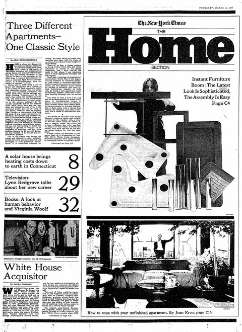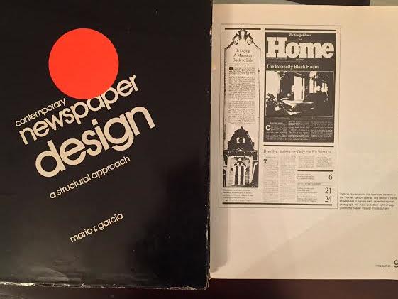


A page of the HOME section of The New York Times as displayed in my 1981 Contemporary Newspaper Design textbook
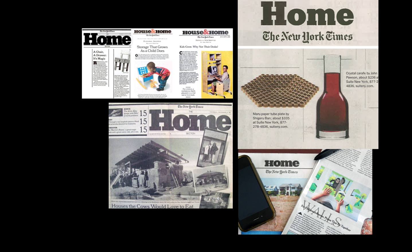
A recent piece in The Times about the end of the Home section refers to how many readers are wondering what The Times will be like without the Home section. The contents of the existing section will end up finding homes in other Times sections.
But I, for one, will miss Home, which always provided us with a variety of stories about home design and architecture that are tough to find in other similar publications.
I also remember including the Home section in the first edition of my book, Contemporary Newspaper Design (1981).
For 1977, the Home section was an inspiration to a new wave of art directors and designers finding their way in newsrooms where design was not a word mentioned often.
The Home section definitely inspired us. Among its visionary moments:
—The Home section introduced the concept of “big” to the Times — starting with a logo that was 200 times bigger than the biggest headline the Times would use on page one, even for a disaster story of major proportions, such as the sinking of the Titanic.
—It introduced big numbers to a navigator on page one.
—It introduced the Center of Visual Impact concept for its lead visual piece, an item 5 times bigger than anything else on the page.
–Furthermore, it made lifestyle trends and their coverage a respectable part of the Times' coverage, a fact that newspapers globally adopted at home.
We will miss the Home section, and look forward to seeing how its readable and trendy content will find new homes via other Times sections.
Of related interest
Visual Storytelling

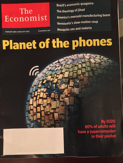
The Economist does it again with one of its efficient, interesting and communicative covers. Not much needed to tell the story here. Just the right headline and illustration. Inviting and seductive.