This is the weekend edition of TheMarioBlog and will be updated as needed. The next blog post is Monday, Dec. 17
TAKEAWAY: It’s clear vision ahead for The Economist’s marketing campaign PLUS: Responsive design seems to be the way for 2013 AND: Mixed bag of weekend reading


For those who consider The Economist a visionary publication, apparently the magazine’s marketing department sees it the same way. Two of their marketing campaigns lately reflect the idea of “clear vision” for The Economist.
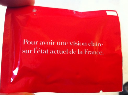
In France, where the global brand The Economist is making a grand entrance, part of the strategy to lure people to the brand are these towelettes to clean the lenses on your eyeglasses. The message on the back of the red packs reads:
To have a clear vision of the actual state of France
(Pour avoir une vision claire sur l’état actuel de la France}
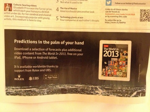
In addition, as part of its promotion for its annual The World in 2013 app, described as a ?“tour of the future”, where the UK based weekly presents a collection of predictions, while identifying and exploring issues that its editors consider as likely to shape the year ahead and not just in the world of finance, but also politics and science. The Economist dwells on the idea of what one sees in the magic ball.
We personally see more success for The Economist as it continues to expand globally and to attract new readers, while retaining the existing ones, through superb content that is intelligently presented across platforms.
Indeed, The Economist appears to be a visionary publication, and not just simply because its marketing department says so.
Responsive is catching on
The term responsive design has become a catchphrase in 2012, but the concept of responsive design is likely to find its ultimate coronation in 2013.
The Economist’s Lean Back 2.0 blog reports:
“… at the Association of Magazine Media (MPA), the industry association for magazines, publishers gathered to learn how they might refocus parts of their digital strategy on websites, making them responsive across devices in the process. Time.com, New York Magazine’s ‘The Cut’ blog and Glamour.com have all recently completed responsive web redesigns and shared some best practices and lessons learned.”
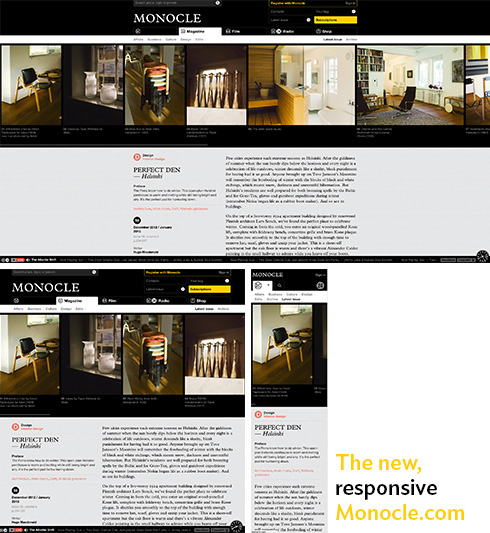
Another magazine making the move to responsive design recently is Tyler Brûlé’s Monocle. The new design takes strong cues from the print edition—the black and yellow colors, the icons for each section, the Plantin and Helvetica typefaces—but, as web designer Naz Hamid tweeted, “The new Monocle.com feels like the web rather than print on the web.” The most interesting detail might be how the website repurposes the many photographs taken to illustrate each story: A scrolling photo bar at the top.

Three views of the same article on the new Monocle.com
While responsive design works wonders for the actual look and feel that extends a brand across quite different platforms, it is the user who benefits the most from the advantages it offers: one look extends across the every screen, but, in addition, no need to pinch and zoom on mobile devices, which some users find annoying.
One more caveat here: I am a firm believer that, while responsive design is a digital technique, the principle of adapting the same design philosophy for each platform should be applied to the print product as well. This is something we experimented with in Austria, during the Mobilista project at the WirtshaftsBlatt.
https://garciamedia.com/blog/articles/mobilista_workshop_4_relating_to_the_audiences_needs/
The future of TV is the iPad?
Looks like in 2013, the iPad, which we refer to as a lean back platform, since research shows that many users prefer to take off their shoes and relax with their iPads in the evening, will be even more of a lean back platform.
We base this assessment on a William Powers and Tyler Brule?—-is this one from a fan at a book signing party:
“I couldn’t wait for her to come out with the book,” she said, “I wanted something to hold in my hand.”
That is what the power of disconnect is all about, connecting physically with the book and its contents, while not necessarily connected in the digital definition of the term.
With fans of print like that one, print is, indeed, going to be eternal
ASelf-Taught Cook, Best-Selling Cookbook
http://nyti.ms/Rpx6bJ
The End of Pasta?

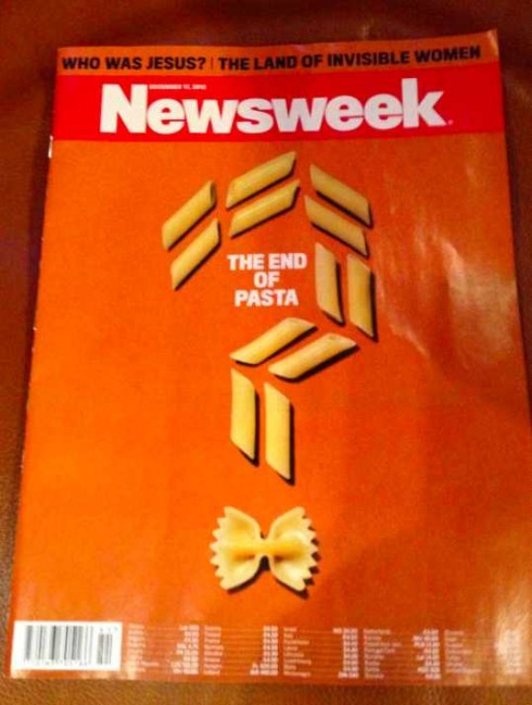
Here is this week’s Newsweek cover for its International Edition
We are all aware that the print edition of Newsweek in the US has its days counted—-till Dec. 31. The newsmagazine will continue to print its international editions.
This week’s cover in the European editions has the headline: The End of Pasta? We are aware that food is like religion to many Europeans, especially pasta, but, a cover story?
I did a double take when I saw it and wondered if that is the type of cover stories that will keep this publication relevant, regardless of geographic distribution zones.
Curiously, in the United States this week, Newsweek’s cover story also asks a question and, in fact, it is a story about religion of the real kind: Who was Jesus?
Perhaps Newsweek needs to stop asking questions on its cover, and to start providing some answers.
Meanwhile, while in Poland this week, the managers at the Ringier Axel Springer in Warsaw told me that the Polish-language Newsweek edition is a big hit, with circulation rising, and one of the most successful titles in their stable of publications.
Of special interest this weekend
People Tries to Boost Subscriptions by Selling a New iPhone App
http://allthingsd.com/20121213/people-tries-to-boost-subscriptions-by-selling-a-new-iphone-app/
Highlight:
This is the kind of app that will be very useful if you want to keep track of everything Rihanna says on Twitter, and everything People.com says about her (and other famous people). But it won’t do you any good if you like to use Twitter for other stuff, like telling people what you had for breakfast, or tracking revolutions in Egypt, or anything else.
Take advantage of our iPad Design/Ad Lab workshops

Do you want to take your brand to the next level by creating a tablet edition? Garcia Media can help. We now offer one- to two-day iPad Design Lab workshops on demand to jumpstart your presence on this exciting new platform. We also offer iPad Ad Lab workshops to develop engaging advertising models for your app. Contact us for more information.

Purchase the book on the iBookstore
The EPUB version of book is HERE:
Now available: The EPUB version of iPad Design Lab: Storytelling in the Age of the Tablet, ready for download via Amazon.com for Kindle:
http://tinyurl.com/8u99txw.
Take a video tour of iPad Design Lab
“iPad Design Lab” trailer on Vimeo.
Read the Society of Publication Designers’ review of The iPad Design Lab here:
http://www.spd.org/2012/10/must-read-ipad-design-lab.php

Keep up with Mario Garcia Jr.. via Garcia Interactive: helping transform online news since 1995.
www.garciainteractive.com
Here’s a gift you don’t have to wrap!

It’s official. The Christmas/holiday shopping season is here.
Here is a suggestion for someone on your list: my digital book iPad Design Lab: Storytelling in the Age of the Tablet. No need to stand in line nor buy wrapping paper. Just send it to someone you think might enjoy a book about this magnificent new platform we call the tablet and how to maximize its potential for storytelling.
Here is how you can get the book:
The original version of the book is the multitouch textbook version available on the iBookstore for iPad (iOS 5.0 and up): https://itunes.apple.com/book/ipad-design-lab/id565672822. This version includes video walkthroughs, audio introductions to each chapter, swipeable slideshows, a glossary and a sophisticated look and feel.
Apple only sells multitouch textbooks in certain countries at this time, unfortunately. Copies are available in at least the following countries: Australia, Austria, Belgium, Canada, Finland, France, Germany, Great Britain, Greece, Italy, Latvia, Luxembourg, The Netherlands, Poland, Portugal, Romania, Slovakia, Spain, and the United States.
For those in other countries and without an iPad, we have made the book available in a basic edition for other platforms. This basic edition includes the full text of the original, along with the images and captions, but lacks the other features such as audio and video. It is available on the following platforms in many countries:
Amazon Kindle: http://amzn.to/SlPzjZ
Google Books: http://bit.ly/TYKcew