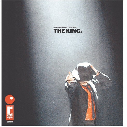
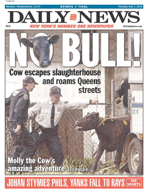
Here is Loud Volume


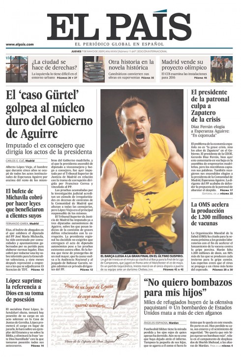
Here is Comfortable Volume


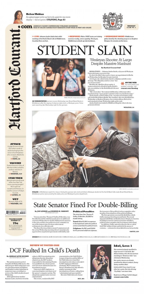
Here is a whisper

Whether your page/screen is loud, comfortable or just a whisper, there is a place for all three. However, like rhythm, volume should be carefully calculated, and not all sections of a publication should have the same volume. Where does one apply it?
1. Determining the size and boldness of headlines is the first step. To me, the first consideration of volume lies with size and boldness of headlines, since there are more headlines than photos in a newspaper or magazine. Very big and bold headlines convey force, loudness and a presence. Not all publications may be ready to convey that volume.
2. Determining the size, color and thickness of headers at the top of pages is next. When we use a 230-point font for the word ARTS, and crowns the page with it, then the volume for the page is set. Nothing else has a any chance of competing with the heaviness of the top of the page.. This may be the type of loud volume in the wrong place, which drowns out the sound of the rest of the page.
3. Determining the size of photographs. When a photo is too large, too dark, or too colorful, the elements around it suffer.
Play volume on your pages or screen designs as you would your iPod, not too loud, not too soft, just enough to get the message across.
TheMarioBlog posting $255