The Christian Science Monitor, one of the most respected newspapers in the United States, has announced that , after a century of publication, it will abandon its weekday print edition and appear online only. John Yemma, the Monitor’s editor, adds that a weekend magazine will be added.
Indeed, the model of the future. I have no doubt in my mind that others will follow the Monitor’s example, beefing up their online operations, and making decisions as to what to keep in print.
I see a rise in weekend magazines and more supplements with specialized content, but very strong online news operations. This will allow for effective and dramatic cost cutting, while maintaining the journalistic backbone of the newspaper. In addition, we will see new platforms develop more fully, such as the mobile telephone, video and webcasts. Storytelling will see dramatic, but positive, changes.
In one of our recent blog postings, we quoted from William Powers’ presentation to the WAN 11th Readership Conference in Amsterdam about the subject of “Print is Eternal,” and what the Monitor’s move shows us is that, indeed, print is eternal, but perhaps not daily, as far as newspapers are concerned.
In case you missed it:
https://www.garciamedia.com/blog/articles/print_is_eternal_but_it_needs_to_focus_content/
Looking at the “weekly” edition:
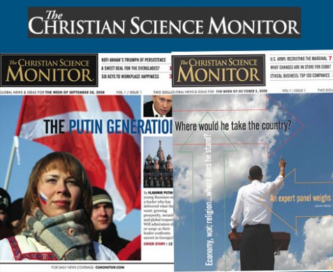
The Monitor’s website shows sample pages of what will become its weekly edition.
Two things stand out:
Content strategy –we see an effective attempt at projecting commentary and analysis into the future, with headlines that indicate so, communicating that the story will help the reader to understand the complexities of an issue in the news.
An explanation in the prototype explains:
??
Each issue will go beyond the soundbites and superficial analysis to provide clarity and context on crucial issues. The Monitor’s weekend edition will arrive for weekend reading, when readers have more time for thoughtful, longer-form stories.
Here are some headlines from the prototype—notice the use of “question heads” or those that provoke the reader by implying interpretation:
Why a growling Russian bear does not signal cold war’s return
Obama: where would he take the country?
Now, Kenya’s real test
Deep Trouble for the bluefin tuna.
The Design: Here is where I am somewhat disappointed. At least the prototype shown on the Monitor’s website seems a bit primitive in terms of style, somewhat clunky in its use of page architecture, and not truly what one would expect from a product that is taking this huge leap into what is definitely the future. I was hoping for a an overall look and feel that was less 1965. But, as we all know, prototypes can either be one-of-a-kind gallery showcases impossible to realize, or simplistic and cold, but with the potential to grow into things of beauty.Here we are hoping for the latter. The Monitor’s prototype is a textbook case study of content that is superior to its packaging. In addition, it will be interesting to see——as part of the Monitor’s laboratory as they go into this new model—-how well the online edition’s look and feel, which is, after all, its daily face, will correspond with the printed weekend product. Challenging and interesting times ahead for the Monitor, and for all of us watching and learning from it. Believe me, this is only the beginning of what will certainly be a long procession of newspapers in all circulation categories that will come to terms with the realities that already face us: no printed product can compete with the time advantage of online editions for breaking news, but, alas, we will seek solace in the cozy environment of a good printed product that embraces us with good reads ands help us understand the world around us. Fireplaces and good wines will never go out of style, neither will that printed newspaper that we love so much, except we will want it less often, to savour it more.
![]()
To view the Monitor’s prototype on line:
http://www.csmonitor.com/announcement/WeeklyPrint/?image=1
For more information about the Christian Science Monitor:
http://www.nytimes.com/2008/10/29/business/media/29paper.html?_r=1&oref=slogin
Getting ahead of the news
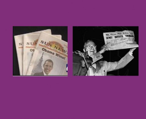
The New Mexico Sun News is an alternative newspaper that comes out bi-monthly. Since their next edition would be after the U.S. Election, the editors decided to make a guess, proclaiming the candidate they support, Sen. Barack Obama, the winner. In this case, print is, indeed, eternal, as the 10000 copies of the edition were snapped quickly by collectors. The Sun is not the first newspaper to get ahead of the news. In 1948, the Chicago Daily Tribune proclaimed Dewey the winner over Truman. The front page is one of the most eternal ones ever published!
La Tribune: a new focus, Berliner format for the Google generation
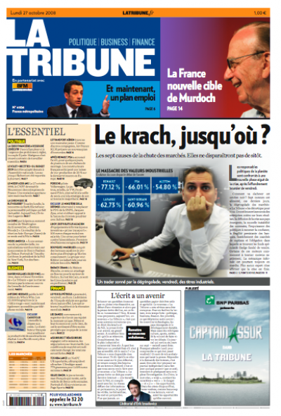
Here is the front page of La Tribune for Monday, Oct. 27th, first day of the new formula, in Berliner format, with a new navigator on Page One.
Other pages to be shown here as they become available.
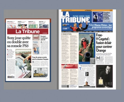
The old and the new La Tribune front page
Serious does not mean boring
I remember my first meeting with La Tribune’s director, Valerie Decamp: it was a lunch at a plush, but quite busy, Paris restaurant. The tall and talkative Valerie, whose newspaper trajectory had brought her to La Tribune from the free newspaper, Metro, knew exactly what she wanted, and how she wanted.
“I want you to make La Tribune very lively, colorful, full of energy, and full of news, analysis, and topics that the readers have not seen elsewhere, that is what I want,” Valerie told me two minutes after we met.
Knowing what the management wants is, indeed, the first step in what you know will be a successful project: a manager who is focused, knows direction, target audiences, and has no preconceived ideas that a “financial daily” has to be boring.
Valerie talks fast, and she wanted the project to move fast.
Fast it was. We began around May, launch of the new-formula La Tribune is Monday, Oct. 27.
Enter the new art director: Eric Beziat
One of Valerie’s most effective moves was to hire Eric Beziat as art director. Together, Eric and I met frequently, both in person and in cyberspace, to create the look that you see here.
Every successful design needs an editor who contributes ideas, and who is sure of what he wants: we found this in La Tribune’s new editor, Erik Izraelewicz,
Highlights:
Larger format: At a time when so many newspapers go smaller, La Tribune’s strategy was to go to the Berliner format, from a standard tabloid. I am an advocate of compact, of course, but in this case, the idea is to allow for each of the sections to stand out. “We want to make a dramatic change that is visible to our audience,” Valerie told me as we discussed the larger format.
New branding: Gone is the old La Tribune logo, in the Bordeaux color with white letters. In is a logo with a blue background, but “attached” visually to a navigator to the best “surprise” stories of the day.
New typography: The type combination now involves Verlag in its various weights, but with an emphasis on boldness rarely seen in traditional finance/economics dailies. Chronicle, an elegant serif font, is used as a secondary font, to bring elegance and contrast to each page.
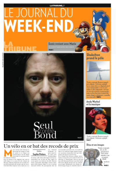
Color palette: We tested orange before we went for blue, but it was decided that it would be good to have blue as the daily color, and orange for Le Journal de Weekend.
Efficient navigation: Perhaps the most reader-friendly element of this rethinking of La Tribune is the Page One navigator, called L’Essentiel, and that is what it is. Borrowed from the highly successful and efficient What’s News from The Wall Street Journal, it summarizes in a few lines, the top stories that are MUST READ for each day.
Advertising innovation: The new La Tribune will experiment with ad positioning. Already many of these ads have been sold ahead of time, including “silent ad” on Page One navigator, plus interesting display of various strategies as shown here.
Personally, I am extremely happy and pleased with this new formula for La Tribune. Readers will appreciate the fact that this new La Tribune offers something for everyone. Those readers who want to read La Tribune in two or three seatings during the day, will have a great navigator to guide them; the ones who would like to sit down and read more in-depth, will have excellent content to analyze. Visually, the new La Tribune offers more graphics to help readers understand complex stories. For a generation of Google surfers, the ones who want everything now, this new formula of La Tribune has it all—-the newspaper for the Internet generation, but with the seriousness, depth and reliable content that they have come to expect from a brand like La Tribune.
Everybody wins.
Offering advertisers different options
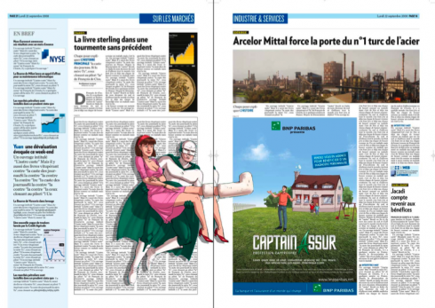
Inside pages: rhythm and labels that say “click” for topics
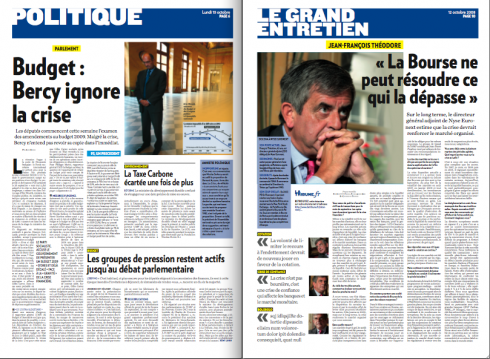
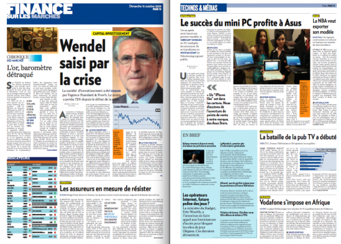
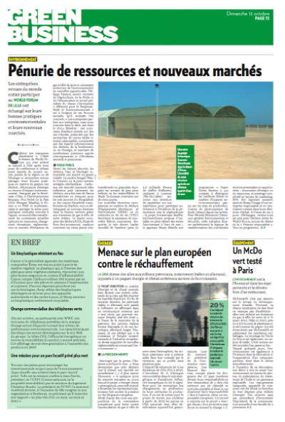
A page about the business and environment
Le Journal de Weekend: more magazine approach
![]()
For the video of La Tribune’s advertising of its new formula: ?
http://fr.youtube.com/watch?v=_bB1VTrXuLc
For Mario’s “editorial” on today’s first issue of the new La Tribune (in French):
http://www.latribune.fr/entreprises/communication/publicite—medias/20081026trib000302948/le-journal-de-la-google-generation.html
http://www.editorsweblog.org/newspaper/2008/10/france_la_tribune_to_relaunch_next_week.phphttp://www.editorsweblog.org/
Knight Foundation calling
Did you know that November 1, 2008 is the last day anyone with a good
idea can submit an application to the Knight News Challenge?
The worldwide competition offers up to $5 million and seeks innovative
ideas for a digital news and information projects, including:
Improving local online news; bringing Web 2.0 tools to local
neighborhoods; publishing platforms to support conversations in
specific geographic communities.
Remember, there are just four rules for applicants to follow:
1. Use or create digital, open-source technology as the code base.
2. Use news and information to serve the public interest.
3. Benefit one or more specific geographic communities.
4. Be innovative.
For the first time, the contest offers more than fifty coaches
standing by online in the ‘“News Challenge Garage” at
garage.newschallenge.org to help innovators apply.
Last year’s winners received prizes ranging from $15,000 to $876,000.
They included individuals, philanthropic organizations and for-profit
businesses, such as the Bakersfield Californian newspaper. Ten winners
were from the United States, and six were from Canada, England,
Lithuania, South Africa, Zimbabwe and Russia.
For more information and to apply visit www.newschallenge.org.
![]()
In Delhi, India, a day of presentations to editors and designers.
TheMarioBlog posting #130