Update #2, Thursday, Sept. 9, 13h, Delhi time
TAKEAWAY: It could be Hindi, Hebrew, Arabic or Greek——the challenges are present when one designs a publication using a non Latin (Roman) alphabet. My work with the Hindustan is fun and reminds me that culture, language and alphabets may be different, but the basics of design are the same.
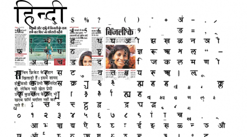
It is a question I get often: how do you manage to design a newspaper or magazine when you don’t know the language in which it is published? A more complicated question: how do you manage to design a publication that uses an non-Latin (Roman) alphabet? Incidentally,the Roman alphabet, is the most widely used alphabetic writing system in the world today.
Not easy is the answer to both questions. But, it is easier to design in a foreign language where the alphabet is familiar. Tougher to do the design when the alphabet is not, as is the case with my current work in India, with the Hindi-language daily, Hindustan, published acroos a vast region of central India, expanding through five heavily populated areas. Number of readers who come to their Hindustan daily: 12 million.
I may add that they are loyal to their newspaper, love it as it is, and are quite conservative with any changes that we might propose. But we try.
First, the challenges of designing in Hindi , the official language of India and the most widely spoken of India’s scheduled languages.. According to Wikipedia, Hindi is the name given to various Indo-Aryan languages, dialects, and language registers spoken in northern and central India, Pakistan, Fiji, Mauritius, and Suriname. Standard Hindi is one of the 22 scheduled languages of India, one of the official languages of the Indian Union Government and that of many states in India. Historians place the birth of Hindi after the turn of the 10th century.
This project is in its second phase, so we produce pages and we look at content strategies to enrich what is already a favorite among its readers.
Obviously, English is our language of communication in the project room, but I sit there as the editors/designers turn to Hindi for some of their discussions——the same thing I do when I am in Swedish, Italian or German newsrooms. When something important comes up, the conversation turns to English, and we all participate. It is not as complicated as it appears.
Typographically, however, is where the difficulties arise. I have had that logo master, Jim Parkinson, work on a revamped logo for Hindustan, and it is great work in progress. I turn to the locals for consultations about how each character fits, the style of bold verus light versions of the fonts available (let’s put it this way, there is not a catalog of thousands of Hindi fonts). Overall, however, design is design; space and distance are important equalizers visually, regardless of language or alphabet; we look at the overall look and feel of each page, the weight of the headlines, the place of hierarchy.
So many things are universal in newspaper design, that the language and alphabet become secondary.
One important consideration beyond language is culture: the Indian readers like their pages packed with content; white space is out of the question and one must simply resign himself to that, and not insist on its presence (hard as that may be). I find myself telling creative director Anup Gupta: isn’t that page too loaded?
“No, Mario,” he answers. “The Hindi reader wants it all in, remember!”. I do, and we move on to the next packed page. This is the challenge, to look at the page as the locals view it, with no westernized notions of what good design may be.
Good design is that which works for those consuming it and using it, whether it is a lamp, a chair or a newspaper.
In that sense, the alphabet and language become important but secondary distractions.
A part of me likes the fun challenge of having to look at a page from a different perspective.
Ah, almost forgot to mention one fascinating fact about working in Hindi: there is no such thing as using all caps in this language. Many editors and designers I know would consider that to be a blessing!
Monkeys: the follow up
In our blog post yesterday
we had an India postcard item about the lagur monkeys, used to scare away those monkeys that terrorize citizens in the streets of Delhi. Well, today’s newspaper reports how ‘Monkeys spread terror in East Delhi,” including an attack on a woman who was taken to hospital.
For the complete story:
http://www.hindustantimes.com/Monkeys-spread-terror-in-East-Delhi/H1-Article1-597890.aspx
The iPad moves past the PC?
(We could almost headline this segment: The little non-computer gadget that could!)
The iPad is gaining steam, saya an analyst, cutting into sales of every PC but the Mac
http://tech.fortune.cnn.com/2010/09/08/pc-pain-is-apples-gain/?source=yahoo_quote
Analyst: Business Use of iPad Sends Sales Soaring (NewsFactor)
http://apple-news.findtechnews.net/analyst-business-use-of-ipad-sends-sales-soaring-newsfactor/
TheMarioBlog post #626