TAKEAWAY: How refreshing, while window shopping in Luxembourg, to see that a hip, cool store aimed at the young chooses to create a whole “window dressing” theme around a fictitious newspaper called The Metropolitan. AND: The New York Observer goes broadsheet
Celebration of print: The Metropolitan


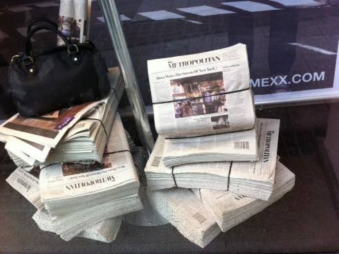
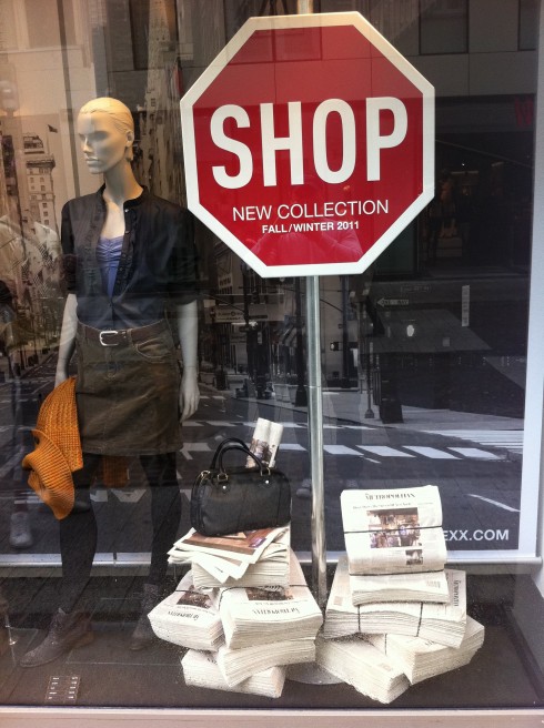
Window of Mexx store in Luxembourg (Photos sby Frank Deville)
Take a look at these bundles, hot off the press, as Mexx stores develop their new Fall/Winter 2011 fashion campaign around a newspaper called The Metropolitan, seemingly in a tabloid or Berliner format with very small headlines that appear to be set in Bodoni—-how iconic of a retro newspaper can you get?
However, the good news is that bundles of printed newspapers can be seen as selling to a clientele of primarily young adults.
Our hat off to Mexx, and make that a paper hat made from the pages of The Metropolitan!
Celebration of print 2: Viva le Berliner!

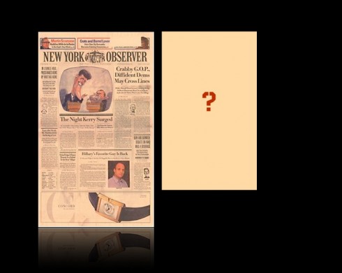
Beginning August 24, The New York Observer will be printed in what it describes as a mini-broadsheet format, which is, in essence, a Berliner.
The mini-broadsheet is a shorter, narrower version of the traditional broadsheet, the format of The Wall Street Journal. The Observer switched to the tabloid from its original broadsheet in 2007.
It is worth clarifying here, that the WSJ has the width of a Berliner, but it is longer than a Berliner, which is why the New York Observer is referring to its version as a mini-broadsheet. Other sources have told me that, indeed, the Observer will be a Berliner, so it remains to be seen.
Officially, the Observer press release about the matter says that there will be few design changes. However, one cannot simply squeeze a broadsheet newspaper into a Berliner—or narrower—format, so I am sure there may be changes, from the size of headlines and photos to the presence of the Page One, but we will have to wait till it comes out.
In my view, it will probably follow the design style of other famous Berliners such as The Guardian (UK), or Le Monde (France). But, again, it is now almost 2012 and the Berliner format has evolved, and if I were doing a Berliner with the type of content that The New York Observer carries, I would first get away from the busy “daily newspaper” look that does not fit well for a weekly, less so for a Berliner-style weekly. I would use the front page for one major story that would get everyone talking, and a super navigator to the best of the inside.
It will be interesting to see what they do, and we will be watching with anticipation.
Meanwhile, there is plenty to celebrate here, since the Berliner format offers a more attractive and inviting canvas, and perhaps it is what USA newspaper publishers need to see to start considering that smaller and narrower format for the many big broadsheets that are long overdue for change.
The major celebration, however, is the fact that the New York Observer rethinks itself, charges forward and does it without fear of experimentation.
Reporting this week from Kuala Lumpur, Malaysia
This week finds me and our Garcia Media art director, Constantin Eberle, working with the team of the New Straits Times in the Malaysian capital, Kuala Lumpur. I will post TheMarioBlog daily during my usual morning schedule, but because of time differences, it will be evening for those in other parts of the world.
For a view of the Garcia Media printed projects’ retrospective

https://www.garciamedia.com/blog/articles/garcia_medias_print_projects_a_retrospective