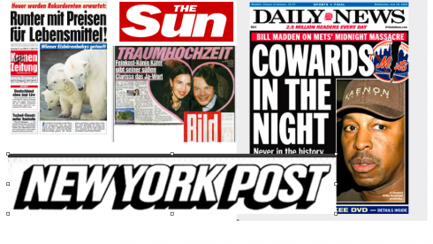
TAKEAWAY: There is much to learn from the sense of surprise and excitement of the popular press
We sit al fresco at the top of the Salzburg Nachrichten Presse Haus in picturesque Salzburg, a postcard of a city with mountains punctuating one’s every view. The young reporter from the SN sits by my side, and I am thinking that I was doing interviews such as this, in sunny Miami, long before this journalist was even a beep on anyone’s radar.
His question is a smart one: why do boulevard newspapers seem to be doing so much better in Austria than the more classic, traditional ones?
Boulevard translates “tabloid, yellow press” here. The prevailing thinking is that if a daily is “boulevard”, it is not serious, the information is not credible, and the photos are already too big!
My answer: The boulevard editors I have known in my long career have three characteristics in common:
1. They know their audience well and focus on serving it.
-1.They are passionate about catering to that audience.
-1.They don’t pretend to produce their newspaper for anyone other than that specific audience. This may not always be the case in more “traditional, “respectable” newspapers, in which so many editors edit not so much for their readers as for themselves, their peers, and , in some cases, their old and beloved journalism professors.
This is not to say that I admire sensational newspapers which carry unverified stories, retouched and rearranged photographs, and which center their coverage around rumor and innuendo.
However, I am a student of the “boulevard press” . For example, I dissect the Sunday edition of Germany’s Bild Zeitung (www.bild.de) every time I get a chance, and what do I see?
!. Systematic chaos: yes, from start to finish, one visual and journalistic theme. Loud, in your face and very photographic, but unequivocally Bild Zeitung fare.
2. Hierarchy: no chance anyone will doubt where to look at first (try that 350 point head across two pages), but interesting surprises both visually and in content with small “meeting points” that delight readers –a little box here, a circle there, the one paragraph set in a WOB (white on black).
4. Surprises, visual and otherwise. The editors here are masters of the mini story—-the three liners that tell you why a famous model got kicked out of a British Airways flight. Twelve lines is all we need on that one, and pass my next cup of green tea, please. Or should that be my next beer?
I suspect that in 20 years, no editor will sit anywhere and say WE are a serious newspaper, and NOT like those boulevard papers out there.
“Boulevard press” is NOT part of the reader’s vocabulary.
I predict that in the future, the term will be totally eradicated, and visually speaking, the line that separates the styles of one newspaper from the other will be more 2-point than 24 point.
WE all have much to learn from the visual excitement, the sense of surprise, and the focus that editors of these popular dailies bring to their products.
And, publishers, it is not necessary to START a new, breezy, small format, “happy” newspaper in your own turf to offer your readers the excitement and the surprises. Start by incorporating them right into that newspaper that you are so proud of—-yes, the one that is 100 years old and you wish it to be 100 more at least.