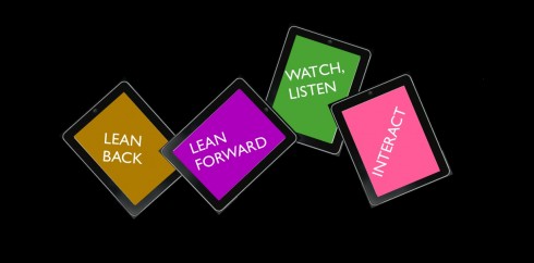
TAKEAWAY: Who says that a news app cannot have it all? Well, first we must find out what ALL is. Users wish to have a tablet experience that allows them to lean forward, lean back and get as many of their senses involved as possible. Some tablets are already aiming to please!
Components of that perfect news app
Only two weeks ago I rejoiced when my grandson Frankie’s pre-school teacher, Mrs. Pabon, allowed me to see Frankie’s first attempt at writing his name. Each of the five letters in Frank had a different shape or slant, and one could tell that my dear Frankie had struggled with each, but, oh, the satisfaction of seeing his full name there that first time. Not to mention grandpa’s pride. I asked my daughter Ana, Frankie’s mom, what it would be like for Frankie to be able to write his last name (poor kid!) : Barravecchio.
“Oh, well, Dad,” she said. “We don’t have to worry about that for a long time. This is enough progress for now.”
I feel the same way as we work day to day designing and developing apps: we deal with the pride of each little victory, and we don’t worry much about tomorrow. Part of what makes the current times so exciting for us working with the development of apps is the fact that we are, like Frankie, discovering, experimenting, putting ourselves out there and learning as we go.
This is why I was so pleased to read a piece in The Guardian by Frédéric Filloux, in which he deals with a timely and extremely important subject, which he refers to as “encapsulated editions”—-and which I always refer to as “editioning.” (Others may call it “curated editions.”)
By whatever name, what we are discussing here is the care and devotion that effective news apps need.
First, someone who decides that the uniqueness of the platform must be exploited: this is not a page turning experience (although there may be some of that, of course). Filloux clearly reminds us that with “PDF-shovel” editions, the result is unsatisfactory: “broadsheet newspapers that are six times larger than an iPad screen, 80-page magazines loaded with ads that you must painstakingly leaf through.”
“Certainly not the right template for the future,” he adds. Or even for the present, I dare add myself.
The app that does it well
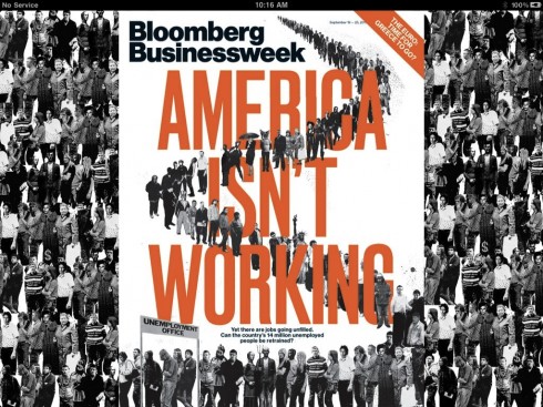
Bloomberg Businessweek: a magazine app carried out with sophistication, and almost perfection
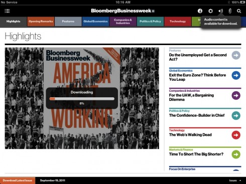
Simple sophistication does it: a horizontal navigator that is color coded, easy swipes (no scrolling here)
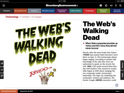
Opening of the Technology section; functionality prevails, a reminder that this is 1/7 articles, 1/3 pages
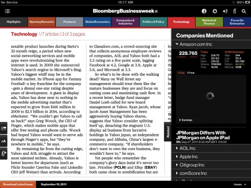
Utility: hit the related pop up window to right of screen; get a listing and info on all companies listed in an article
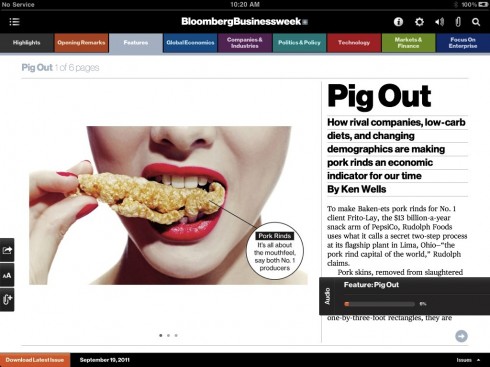
Click on the related bar and get audio for this story
So what makes the “done with care” apps stand out?
Filloux’s piece is all about Bloomberg Businessweek’s app. It invests in design and it has video intros from the editor and art director to explain to us what is on every issue and why. Photos are typically commissioned, not stock, and thus fit well into both print and tablet designs. In addition, he writes, there is leadership; choices are made about the content and about the images. There is a connection to the rest of what Bloomberg has to offer. And the price is right at $2.99 per month.
Obviously, not everyone out there has the human or financial resources to start with an app in the style of Bloomberg Businessweek, but it provides a model for us.
Only this afternoon in Kuala Lumpur, Malaysia, in the newsroom of the New Straits Times, I stood with a group of editors, art directors, designers and technical people as we discussed the next version of the NST’s tablet edition. Users of the NST”s tablet edition, who already like the existing product, are asking for a PDF of the printed newspaper to be added to the tablet edition. So did users of the Gulf News of Dubai, and it seems to be a pattern that repeats itself.
So, while I agree with Filloux that a PDF shovel edition is NOT the answer, I also know that, at least for daily newspaper apps, it is desireable, not too difficult to accomplish and it pleases a large component of the existing users. I imagine that in the future, with a more distant-from-print generation of users, the PDF will go the way of the horse and buggy. For the next five years, at least, it is a good idea to offer the e-reader option.
In addition, we already know that even though the tablet is the ultimate “lean back” platform, used primarily in the evenings, users want to be able to jump into “lean forward” position at a moment’s notice and be updated with the news. So total encapsulation—or escape—is probably not what a generation of always connected people desire. Again, as designers we must provide the Top News track as well.
But, most importantly, we must curate, we must make the tablet talk, the pop ups enhance the story, the various senses get aroused.
Indeed, you may say that the tablet user wants it all, but why not? Lean forward, lean back, meditate and/or interact.
It makes our jobs as designers/editors more challenging, and, like my grandson Frankie with the spelling of his first name, we must look at it with the curiosity, excitement and sense of discovery of the four year old.
This, too, is enough progress for now.
More on Bloomberg Businesseek’s design
BizWeekDesign’s Flickr account: http://www.flickr.com/photos/bizweekdesign
Eye Magazine story: http://www.eyemagazine.com/feature.php?id=194&fid=877
Of special interest today
– With promise of audience growth, Facebook pulls news organizations within its walls
http://www.poynter.org/latest-news/media-lab/social-media/147219/with-promise-of-audience-growth-facebook-pulls-news-organizations-within-its-walls/
– UK: ‘We wanted to make ourselves more Facebookey’, says Guardian
http://blogs.journalism.co.uk/editors/2011/09/23/we-wanted-to-make-ourselves-more-facebookey-says-guardian/
USA Today’s Twitter account falls victim to hackers
http://news.cnet.com/8301-1009_3-20111422-83/usa-todays-twitter-account-falls-victim-to-hackers/
– Magazine execs psyched over color Kindle
http://www.crainsnewyork.com/article/20110925/MEDIA_ENTERTAINMENT/309259971
Today’s pop up

Bild’s app tips us about the 100 best wines one can find in the supermarket!