TAKEAWAY: The WAN/IFRA conference in Prague, devoted to the 2015 Newsroom closes today. I was a keynote speaker yesterday and offer highlights of my participation here. Of special interest: FUTUROOM, an almost perfect prototype for the newsroom of the future
Highlights of the conference
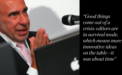
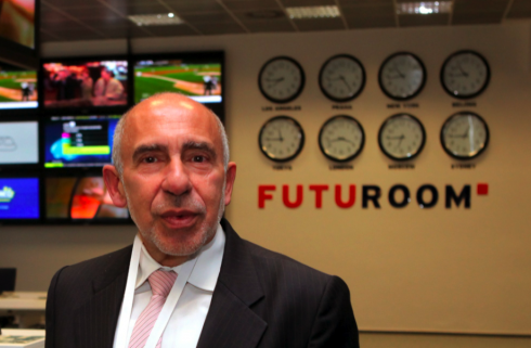
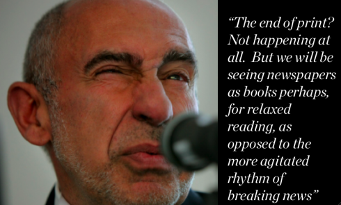
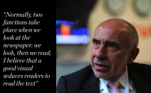
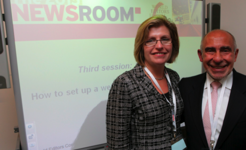
With WAN/IFRA’s Martha Stone (my former student at the University of South Florida), now Director/Shaping the Future of the Newspaper
All photos courtesy of Ond?ej Besperát/PPF Media, Czech Republic
Mine was a whirlwind visit to Prague and to the WAN/IFRA Conference where I keynoted the afternoon session titled: Visual journalism: the rise of non-narrative news.
I shared the session with Robb Montgomery, consultant and founder of Visual Editors.com, and Joerdis Guzman Bulla, art director of the award winning Welt Am Sonntag of Germany.
This was a session where visual journalism was presented as a multiplatform storytelling form of expression. Both Montgomery and Guzman Bulla emphasized the importance of visual journalists who move across the platforms. Many examples proved the point.
For me, my visit to the conference included three particular highlights, which I wish to share:
Highlight #1—The dialogs over coffee
We all know that the best part of these conferences is usually the coffee break, the quick exchange of valuable ideas with colleagues.
I found myself having a delightful conversation with Santiago de la Mora, Google’s head of print content partnerships (based in London), and Xavier Vidal-Folch, adjunct editor of El Pais of Madrid.
This conversation was about the timely subject of how Google and traditional newspaper houses can connect synergies. And, of course, the conversation turned to ownership of information, and how both parties can benefit from how such information is presented and paid for.
My take on this, and a message to De la Mora: I think that there is great potential for Google and newspapers to form profiteable and exciting partnerships, but Google perhaps needs to come closer to newspapers and learn how newspaper editors think.
Highlight #2: FUTUROOM
FUTUROOM is an interesting concept for anyone interested in the future of media. Based in Prague, this FUTUROOM is a newsroom like I had not seen before. No walls, no divisions according to print or digital, and an environment in which news/storytelling can prevail without the usual obstacles that we find in more traditional settings. It was interesting to see the signs hanging from the ceiling, in lower case: watch dog, investigative, etc.That is as close to “partitions” as anyone could come. Let’s keep an eye on FUTUROOM.
Highlight #3: The Robb Montgomery Movie
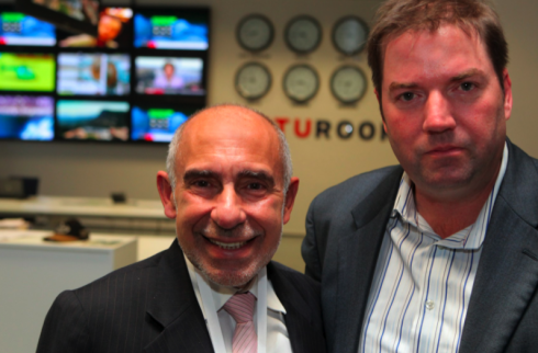
Meet the director: Robb Montgomery and me in the middle of the FUTUROOM set.
Well, Michael Moore,
move over. Now Robb Montgomery is actually making a movie about our industry in crisis (I told him I prefer to call it an industry in transition).
So Robb put me in the film, thank you. There he was, in the middle of the FUTUROOM —-our set——setting up the tripod, and adjusting a mike on my lapel, and shooting questions at me.
Here is how Robb describes his movie project:
I have been filming interviews with journalists around the world to document this uncertain period in journalism’s history and I have a vision to direct a feature-length documentary film. I have some great interviews made already and the film will be produced by Visual Editors as a grant and public-funded project. Why? Because VizEds is a 501(c)(3) charity and can appeal to funders with a unique pitch. One part historic marker in time, one part jobs program and one part educational. Already have some strong interest and I hope maybe you can help me get the project noticed for people who like to support this kind of effort.
The plan, says Robb, is to get enough money so that he can hire out of work journalists to contribute scripts, stories, photos and more to help tell this story from the inside out.
There is so much to report and film is a great medium to reduce a multi-year event like this in powerful and concise story.
It’s a three-year project and I think I am lucky to have a unique position and global network of journalists and publishers to who will want to take part.
I am quite interested on how the rest of Robb’s movie develops, and will update you here.
In Zurich: The story behind Tages Anzeiger’s redesign
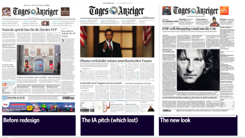
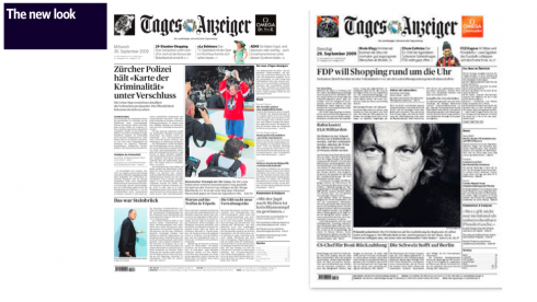
The new design of Tages Anzeiger shows good use of navigation on Page One
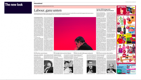
Soft pastel colors are used as background for headers across inside pages
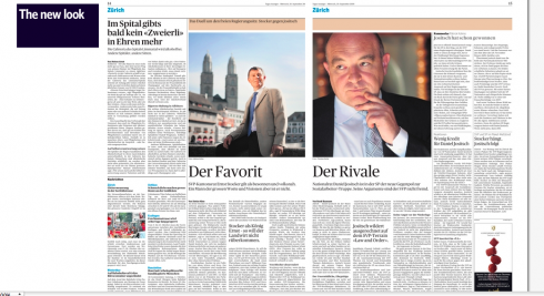
Accents of white space, classic typographic, the typical correct style characteristic of German-language newspapers
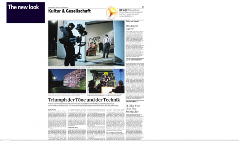
Rather smallish headers for openings of sections, such as Culture.
“The beauty of a lost project”
I read and re read the quote above from Oliver in an email to me. I bet many designers out there reading this can echo the same thought: that one prototype that you loved so much, admired for all that it had to offer, then saw shot down in five minutes in the executive room. The beauty of a lost project: something to think about.
All of us in this business know that much happens on the way to the launch of a newspaper, magazine or website’s new look.
If someone was writing a musical version of how “design” projects begin these days, it could be titled The Pitch. That is usually where the process begins.
The Pitch is that pivotal moment when we go out there and, like dancers at a Broadway audition, do our best to impress, to put our golden idea(s) across and to convince the jury in charge of “casting” that WE ARE THE ONE, to echo the famous line from A Chorus Line.
Today we are delighted to share with you the story of a pitch and a model that did not quite make it. The jury did not think that the presentation by Information Architects, a firm of young designers with offices in Zurich and Tokyo, constituted the “singular sensation” that they were probably looking for.
Oliver Reichenstein , of Information Architects, tells the story of the pitch he and his team put together, which you can read on the IA website. However, I have exchanged some mails with Oliver as I was fascinated by how candid his narrative is.
Sometimes you win, sometimes you lose
Normally, we pitch, we wait, we get the news. If you win, you prepare your team, get ideas down on paper immediately and plan your first visit to kick off the project.
If you lose, I don’t know about you, but I give myself 24 hours to do the wake, the funeral and the burial—-time which I spend analyzing WHY the pitch from our side did not work. That is it. No lamenting. No swimming in a poisonous soup for a long time. Move on. Sometimes you win, sometimes you lose. It was not meant to be, and this closing may open an opportunity to do a more exciting project (usually this more exciting project appears in the horizon shortly after YOU lost that pitch!).
Oliver’s story about The Pitch
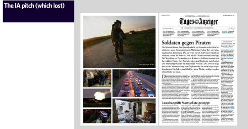
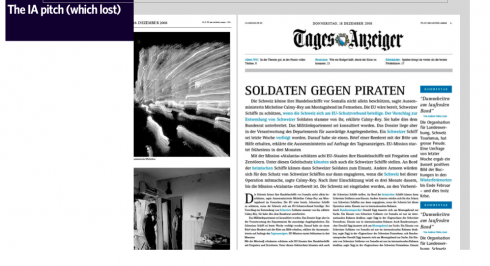
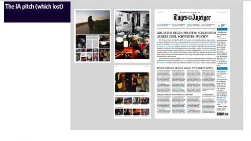
All of these front pages thrive on the use of type and narratives, with photos appearing on a separate page: the newspaper as book?
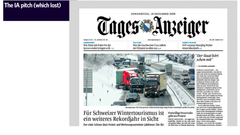
More conventional front page treatments, with photos
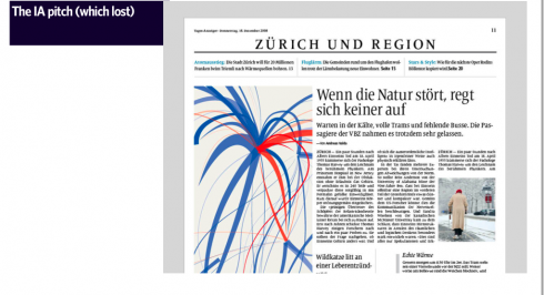
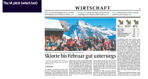
Here are proposed section openers
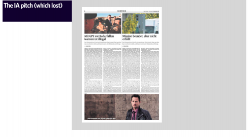
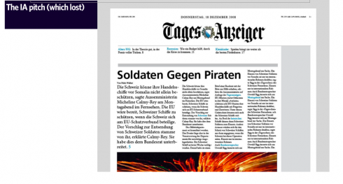
Inside page where better story structuring could have made the paper more distinctive and functional
I must mention that one of Oliver’s concerns going into the pitch was that his firm is best known as designers of websites, so this was a rare and unique opportunity for IA to make an incursion into print design. But Oliver knew that he had to work extra hard to convince his audience that, yes, IA could also do print.
Strategically, the toughest part was that our own brand was so clearly positioned on the interactive end, that I had to put everything on one card:
“We can’t do exactly what the print guys do, but we can do it well enough and we provide a better user experience and we are on brand!” I told them that “our design won’t win design prices.
The ADC club won’t like it. But it will win new readers.”
Dealing with conservative editors
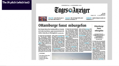
A scanner could jump over the blue lines in the text and get the substance of a story: an idea ahead of its time?
One of Oliver’s team’s most innovative ideas was to use “blue” lines in the text of stories. A scanner could go around the blue color text lines and get a quick idea of what the substance of the story was.
I got an indirect hint early on that I would probably not get through the rather conservative board if I present the designs with the blue links. I still went ahead, because I knew that I couldn’t compete with the pro agencies on old school paper aesthetics. I knew that I was competing against the best type people in Switzerland. I had to go my way.
Frutiger to the rescue
I took in account that some would try to impress the judges with custom type faces. I was prepared for that. By using the life oevre of Adrian Frutiger with the classic Frutiger (Next) and the recently released incredibly beautiful and easy to read Frutiger Serif that comes with a perfect x-height for news paper type, I could say: “No one can beat Frutiger’s oevre with a self-made type.”
Oh, touching THE LOGO——a no no?
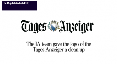
The IA team decided to use their brand expertise to do a “clean up” of the newspaper’s traditional logo, as seen here
We all fantasize about taking that logo that has been there 300 years and doing “something” with it; then we are told in an authoritative tone: “don’t go there”; then we try some, anyway, just for fun, or for therapeutic reasons. And then the OLD logo prevails, and life goes on.
Oliver and his team are young—-very young—-so they tackled THE LOGO:
By using my know-how working at a brand agency for four years I’d try to impress them by being on brand and improving the logo at a level of delicacy and branding professionalism that in that circle of competitors only we could deliver. I was counting on other agencies trying to naively reinvent the logo which would be a fatal mistake with a traditional and widely loved news brand as Tages-Anzeiger. You can always count on the vanity of print designers.
Vanity of print designers? Is that what Oliver said?
Stupidly, I failed mentioning my branding background at the presentation, so the logo work didn’t come across as solid as I hoped. The reaction felt more like: “Ah yes, they did that pretty well, those digital boys!”
The newspaper as website?
Here Oliver does what we all do when we don’t shine at a pitch: we recount adversities leading to the pitch. My flight had too many crying babies; I did not get that glass of champagne with dinner the night before; my knees hurt from too fast a run, and so on.
Truth of the matter is, nobody knows what makes one model win and another go straight to the bottom drawer in your studio. Fate. Karma. Lack of sleep. Lack of champagne. All of these factors can affect the outcome.
I was so tired (long flight, working on the presentation on the plane), that I talked about the paper as if it were a website.My boys gave everything they had. I gave everything I had. The ideas for the redesign have been growing in our back yard for quite some time. So, conceptually we were ready.Technically, it was one marathon. We had to make sure that we were aware of all the rules to make sure that we didn’t break any rules involuntarily. We all went through tons of literature, to make sure that we really really knew what we were doing. Naturally, the decision makers probably felt that this design is not one that believes in the future of paper for a daily paper. It was set up as a bridge into the future. A solid raft not a Titanic. That was another emotional negative.
And Oliver is quick to praise the excellent design produced by the winning designer:
And then there was Tom Menzi’s original design: Which next to our heavy dark on brand design looked just really fresh and light and new.
My own views on this project
Nobody knows the full story behind the scenes, I have written about this many times.
But we can all evaluate what is there already.
About the new design of the Tages Anzeiger:
I believe that this is a very clean, elegant TAges Anzeiger. Is it totally new and innovative? No, but that is no requirement, it is only material for discussion in design blogs. The new TA is functional, navigates readers well to the inside, and the text is easy to read, and large enough for readers of a certain age. I think that the headers for new sections could be bigger, and have more life in them.
I also find that color plays a very secondary role, but this is Switzerland, and pastel colors are the rule (think Alps).
The Information Architects’ model that failed to win the pitch
I have studied many of the pages Oliver and his team prepared.
Here we have a combination of innovative design with some clear examples of a certain naiveté about how print editors think, which is probably what caused them the job.
If, however, we look at all those front pages with wonderful TYPE ONLY treatments, we see that the IA guys were thinking newspaper of the future here. I notice that they had many wonderful front pages with mostly type, played big and almost as illustration, then evolved into the usual front page with the big horizontal photo.
It is in their front pages that we can see ideas such as I usually discuss: the book concept for the daily newspaper.
Why they failed?
Their project was more artistic than journalistic. Once you get through the incredibly innovative use of type on those front pages and inside, you realize that the team did not pay much attention to story structuring, to differentiating one type of story from another; some photos did not have captions (yes, I know that maybe you meant to put them in, but REAL MACHO print editors will hang you for that on the spot—-no captions? You are not a journalist, you are just another pretty face designer dressed in black. Presto. Finito. Gone. I am not kidding here, by the way.
In addition, I think that all the energy, innovation and creative effort that went into those front pages, unfortunately, did not follow through on inside pages, which, by the way, pale by comparison.
But there is SO MUCH to admire in the work of IA, such glorious use of creativity mixed with innocence that makes their project shine.
Indeed, Oliver, there is a place for this model. There will be some courageous editor out there who will take it and run with it.
But, for starters, do some more work wtih story structures, and….don’t forget those captions.
Thanks for sharing your story with us.
To read Tages Anzeiger’s own account of its redesign (in German):
http://www.tagesanzeiger.ch/zuerich/region/Sinnlich-und-serioes-Das-ist-der-neue-TagesAnzeiger/story/19712832
TheMarioBlog post # 384