This is the weekend edition of TheMarioBlog and will be updated as needed. The next blog post is Monday, October 8. I will be reporting from Berlin, Germany.
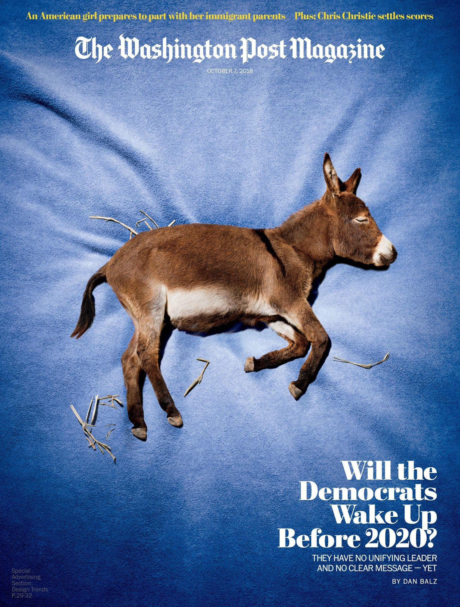
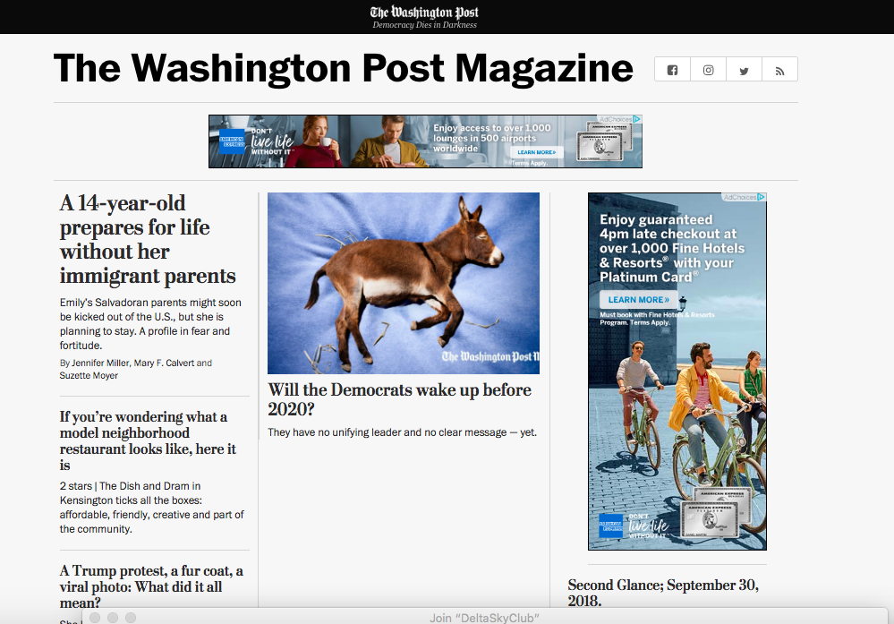
By now we are used to frequent changes and visual surprises coming out of the talented design team of The Washington Post. This week, The Washington Post Magazine relaunched its print and digital product, introducing new features, a redesign of the print magazine and a new, bold digital template. As Post Magazine editor Richard Just, put it:
“The magazine has seen enormous digital growth over the past year, as our long-form storytelling has drawn in more readers. With this redesign, we are aiming to bring more journalistic creativity to the magazine’s front section and to create a look—both in print and online—that is adventurous and elegant. Our long-form pieces will now have a distinctive online design—one that is visually connected to the rest of The Washington Post but also gives the magazine an identity of its own.”
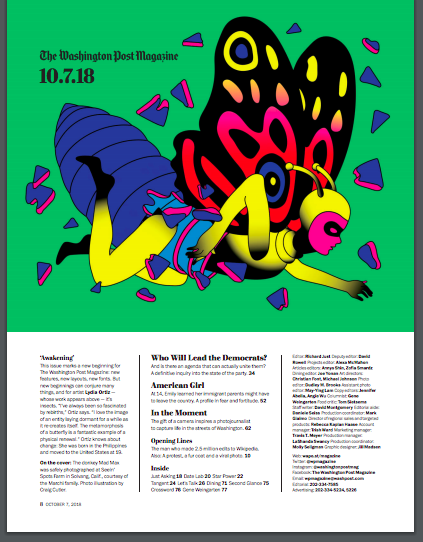
Here is the new cover:
New and revamped features in the magazine include:
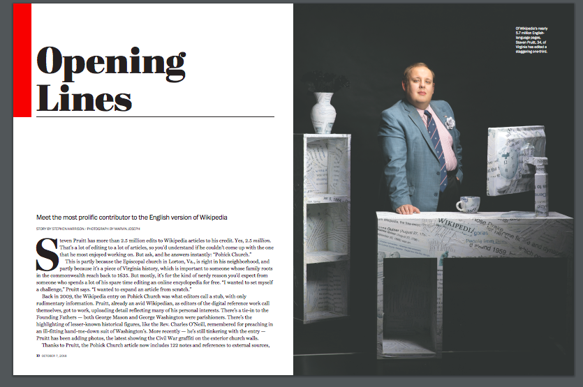
· Opening Lines: Every week, two short-form narratives will relay quirky or unusual stories about interesting characters, events and trends.
· Let’s Talk: Every three weeks, the author of a recent magazine story will interview someone who posted a critical comment on their piece.
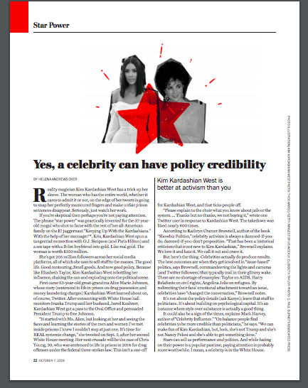
· Star Power: Appearing once every three weeks, this column by Helena Andrews-Dyer will chronicle the intersection of D.C., politics and pop culture.
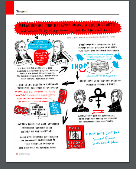
· Tangent: This illustrated feature, also appearing once every three weeks, will start with a recent political or cultural phenomenon—and take readers through a series of tangents about connected events, often historical.
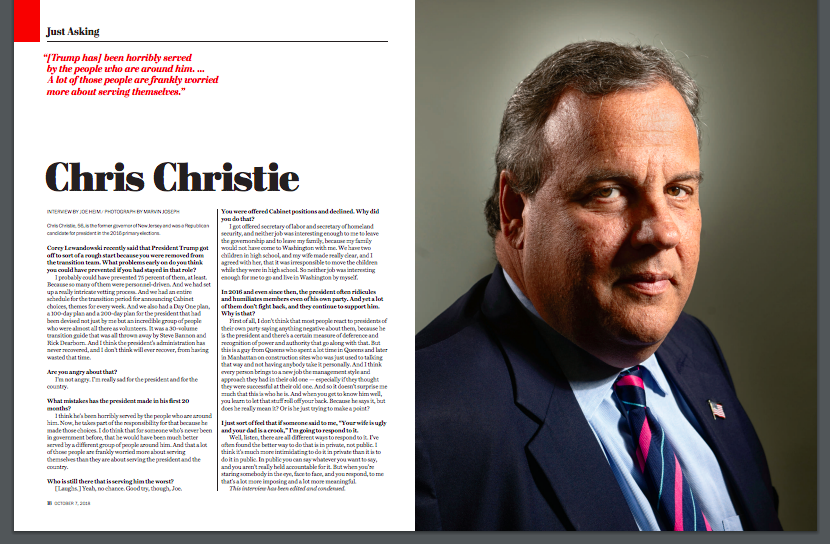
· Just Asking: A weekly Q-and-A feature will expand to a full spread to allow for more striking photography.
· Plus, a weekly illustration on the table of contents: Eight artists will rotate throughout the year, creating stand-alone illustrations that make statements about Washington, the season or the news.
What’s new with the design?
New design features include:
- New fonts and an expansion of the Postoni family. Adding Postoni Display Black, Black Italic, Ultra and Ultra Italic used exclusively on the magazine, both in print and online.
- Weekly illustration and table of contents. Eight artists will rotate throughout the year, creating illustrations that are relevant to Washington, the season, a holiday or something in politics or culture. Each will name their art and, in a paragraph that will run alongside the art, explain why they conceived it and what the topic means to them.
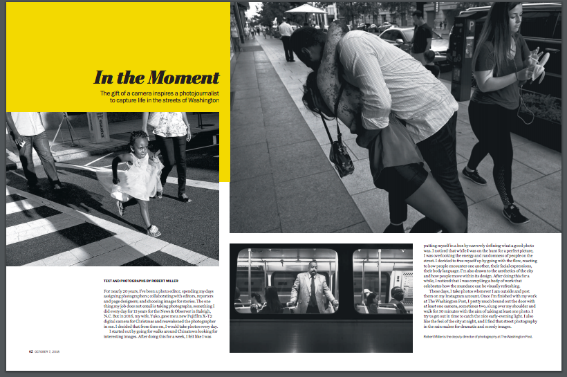
- Outtake. In this rotating photo feature, the magazine will showcase a full-spread, Washington-based photo that is extremely visually striking, along with an expanded caption.
Photography also plays a key role:
Editor Just added this:
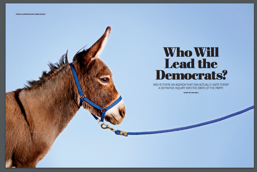
All of this is presented in a new print design, brilliantly created by The Post’s Suzette Moyer. We have also revamped the look of our long-form articles online, creating a bold presentation that is distinctive to the magazine. And we are redoubling our commitment to publishing photography that not only complements our storytelling, but also tells stories of its own.
Whether it’s a long story or a short feature, a beautiful photo or a striking illustration, we hope each week you’ll find something in the magazine that can take you away from the perpetual crush of Washington news — giving you the space to learn or laugh or think about our city, our world and the times in which we live.
A conversation with designer Suzette Moyer
I chatted with Suzette Moyer, Design Editor of The Post, about this project. Here is the dialog:
Mario: What were some of the discussions concerning what type palette to use for the Post Magazine?
Suzette:
Building on the typography we were already using at The Washington Post, we looked to the Postoni family to make the magazine bolder. Design director Greg Manifold and I worked with Type Network for several months to add the black and ultra to our already existing Postoni Display. These heavier weights will be used exclusively for the magazine. We also added color and stronger visuals to the book.
Mario: As a design director overseeing the project, what were your goals in terms of the look and feel of the magazine?
Suzette:
We aimed to take a more visual look at the magazine’s shorter features and long form stories. Instead of using many photos or illustrations in an 8,000-word piece, we will be using fewer – but smarter – visuals.
Several new features were added to the front of the magazine. “Opening Lines” targets stories about Washington, D.C. and the politics surrounding it. Fun, quirky photos accompany this feature. “Star Power” is a column about the intersection of D.C., politics and pop culture. And our illustrated feature “Tangent” takes readers on a tour of recent and historical developments in politics and culture.
Designers Christian Font and Michael Johnson are experienced art directors collaborating with Dudley Brooks, the deputy director of photography, to make the magazine presentations stronger. Along with the editorial team, we hope to build and get better each week.
Mario: How about the approach to the design for digital?
We wanted our digital and print presence to communicate in the same way. We worked with the Post’s product team to develop a template that carries through the boldness and typography for our main stories. We are also working with our visually-driven Google Amp Stories team to showcase visuals such as the Tangent feature and photo essays.
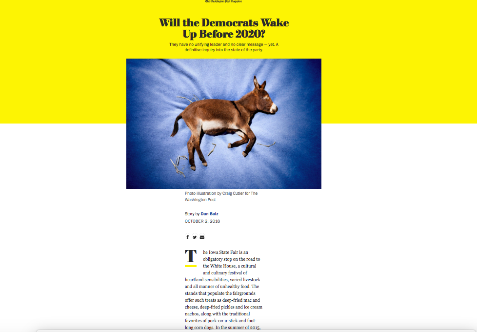
The digital version
Take a look at how the stories appeared in the digital edition:
Covers we love
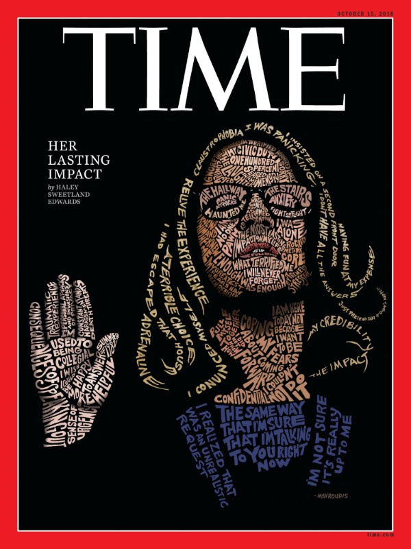
Phenomenal. Creative. Thoughtful. The power of visuals in this cover of the just out TIME Magazine. “Using words and phrases from Ford’s testimony, San Francisco-based artist John Mavroudis recreated her likeness by drawing each letter by hand,” TIME writes.
From here and there and everywhere
Guardian Weekly to relaunch as glossy news magazine
New-look publication will have slightly increased cover price and greater focus on design
With a little help from his Dad: The New York Times exposes Trump’s finances
The Times published its story about Trump family tax dodges on Tuesday afternoon. More than 32 hours later, it still wast he lead story on NYTimes.com. By the way, this report was so popular that The Times will re-run it in its print editions of Sunday, October 7, in case you missed it.
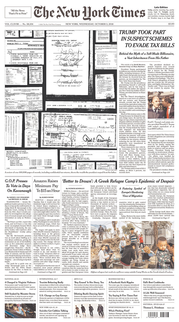
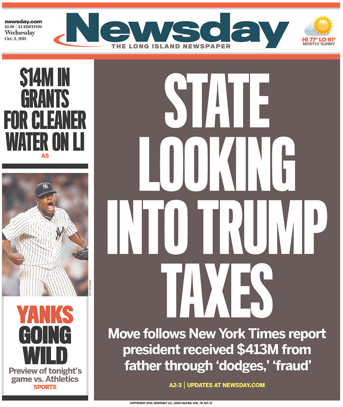
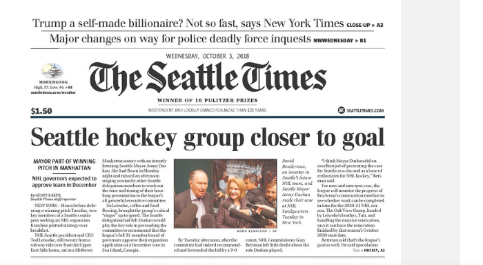
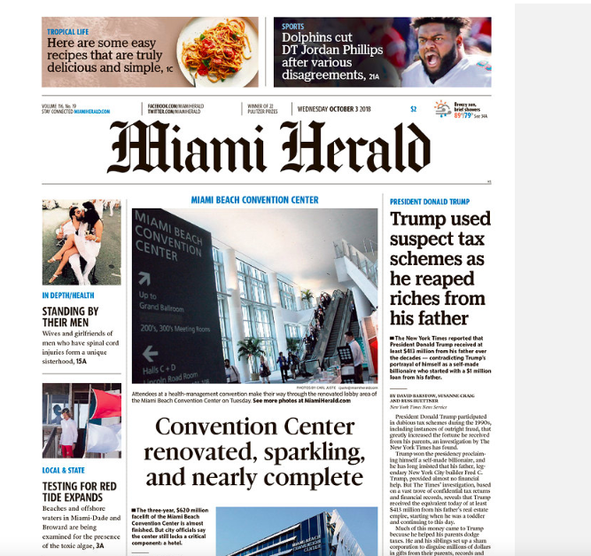
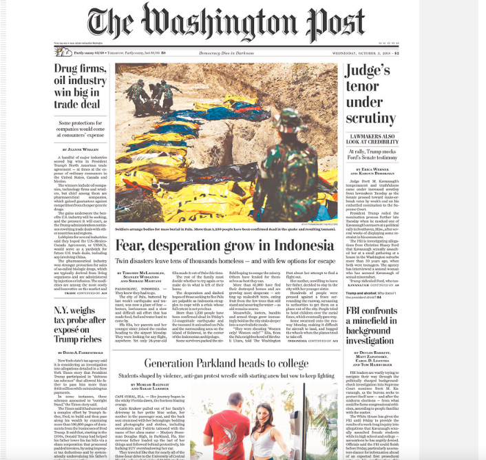
In addition, newspapers around the US mentioned the Times story and many carried at least a headline about it on their front pages. Take a look:
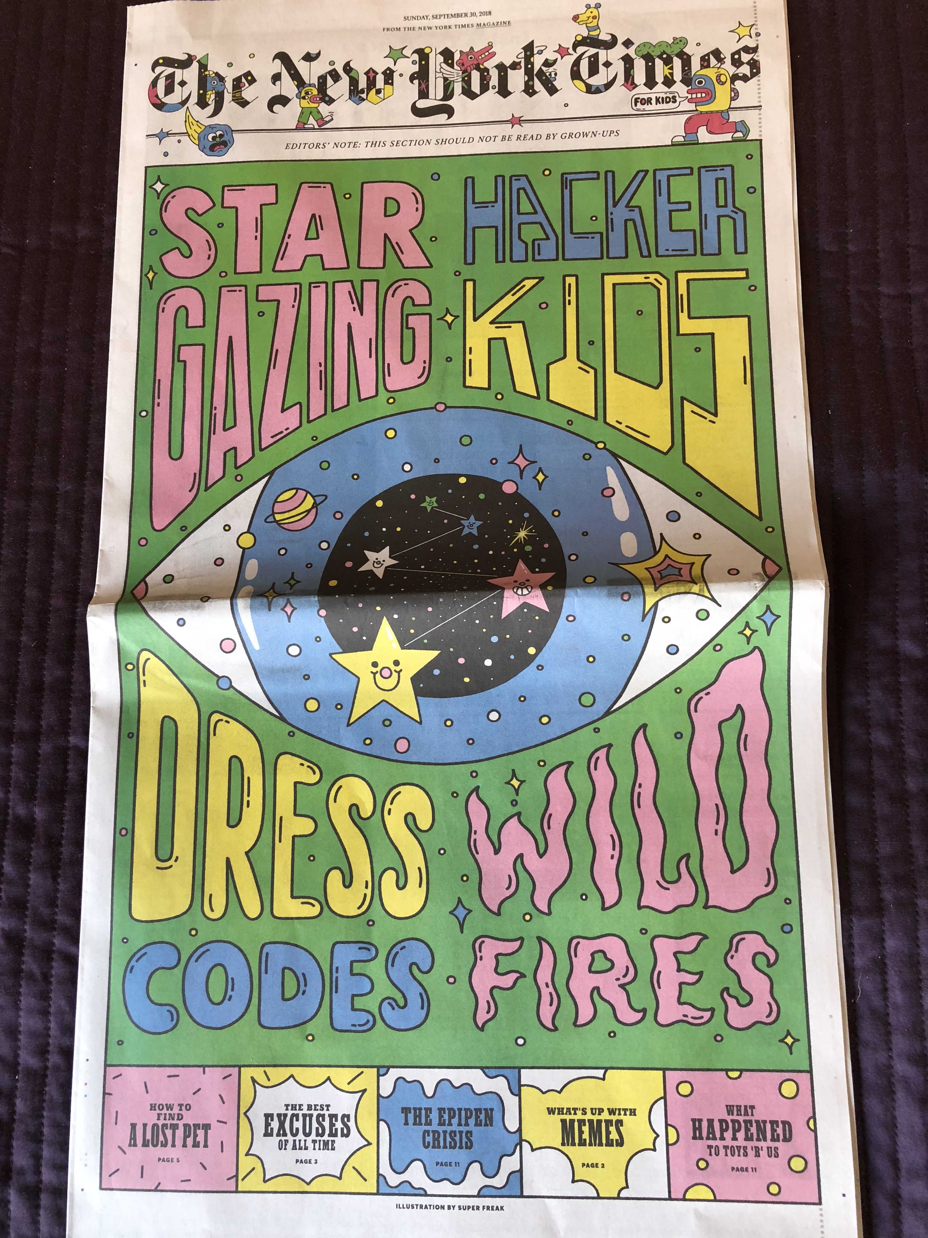
A new edition of The New York Times’ Kids Supplement
Always fun to flip through these pages.
TheMarioBlog post #2923