I keep an eye on whatever that mega talented and experienced magazine art director, and friend, Robert Newman, posts via social media. So I was happy to see a recent Tweeter entry where he highlighted the “best magazine covers of 2019,” as picked by a selected group of art directors.
It is an annual ritual for Folio Magazine to invite some of the top designers from around the industry to get feedback on their favorite covers. There is plenty of diversity here, from photo driven covers, to type attacks, to covers that serve as navigators to the inside. Here is an illustration from the Newman Tweet:

Newman picked this cover as his favorite:

He justified his choice here:
The May cover of Good Housekeeping was my favorite of 2019. I actually could have picked any of a half dozen GH covers from this year; they were that good!
Designed by creative director Melissa Geurts, photographed by Mike Garten, with prop styling by Lis Engelhart, this cover is so smart, so spirited and so engaging, that it brings a smile to my face every time I look at it……. I thought it was fun, smart, engaging and modern without being too obviously dependent on technology to create the image. In fact, if you look closely, it’s a really simple cover, with a nice photograph and very basic type. It was smart in terms of the brand, which I assume is trying to project a somewhat cooler and younger attitude, without being too cool and young. Most importantly (to me), the cover looked like it was produced by people who were having fun making their magazine, something that I think is all too rare in this “digital first” day and age.
One question for Bob Newman

the cover of a magazine today?

Mario: As more magazines develop and expand their digital offerings, and as fewer people probably buy magazines on newsstands, how do editors and art directors conceptualize covers these days. Are they thinking print or mobile as they go about art directing the cover? Have you noticed changes in the creative process of designing the magazine cover?
These days, an increasing number of magazines (including mine, This Old House) aren’t even sold on the newsstand, or are sold only in very select places. And I think you’re going to see a lot more of that in the next few years. In one big sense, that has liberated magazine makers from the tyranny of keeping sales at a certain level month after month. Everyone thinks mobile/digital first, so of course there’s always interest in designing a cover that has the potential for social media and other online heat, but my sense is that now a primary focus is on making a cover that creates value for the magazine as a brand, and as an object. From a purely newsstand point of view, the price of the average magazine has gotten so high that you have to convince the potential buyer/reader that it’s worth her money (and time). I think it’s interesting (and a good trend) that some magazines have been experimenting with different cover inks, sizes and paper stocks in an effort to make the individual issues feel more of a precious object. There’s certainly more creativity on covers, especially among news, politics, and opinion magazines. You can see that everywhere from The New York Times Magazine to The Atlantic to Time (sometimes) to smaller publications like The Baffler. And just as the indie magazine publishing scene has been leading the way in creating new publications for previously ignored audiences, they also are showing that all those layers of coverlines are totally unnecessary, and that’s moving into the bigger consumer magazines. I’m looking forward to many less coverlines and much simpler, graphic covers in the coming years. In terms of how the creative process has changed, I think that the emphasis on social and online means that cover designers and editors realize their work needs to elicit an immediate response, that the image and main coverline are primary, and everything else is unnecessary. Overall, I think that’s good news and a welcome change.
My two favorites from those that made the cut:


These are both simple and convey the idea of the story instantly. I remember seeing the New York magazine outside my door in New York City and quickly picked it up. Instant seduction.
Isn’t that what magazine covers are supposed to do?
Read the full article here
https://www.foliomag.com/face-up-best-magazine-covers-2019/?oly_enc_id=5356C3997323G3Z
Start the year with The Story
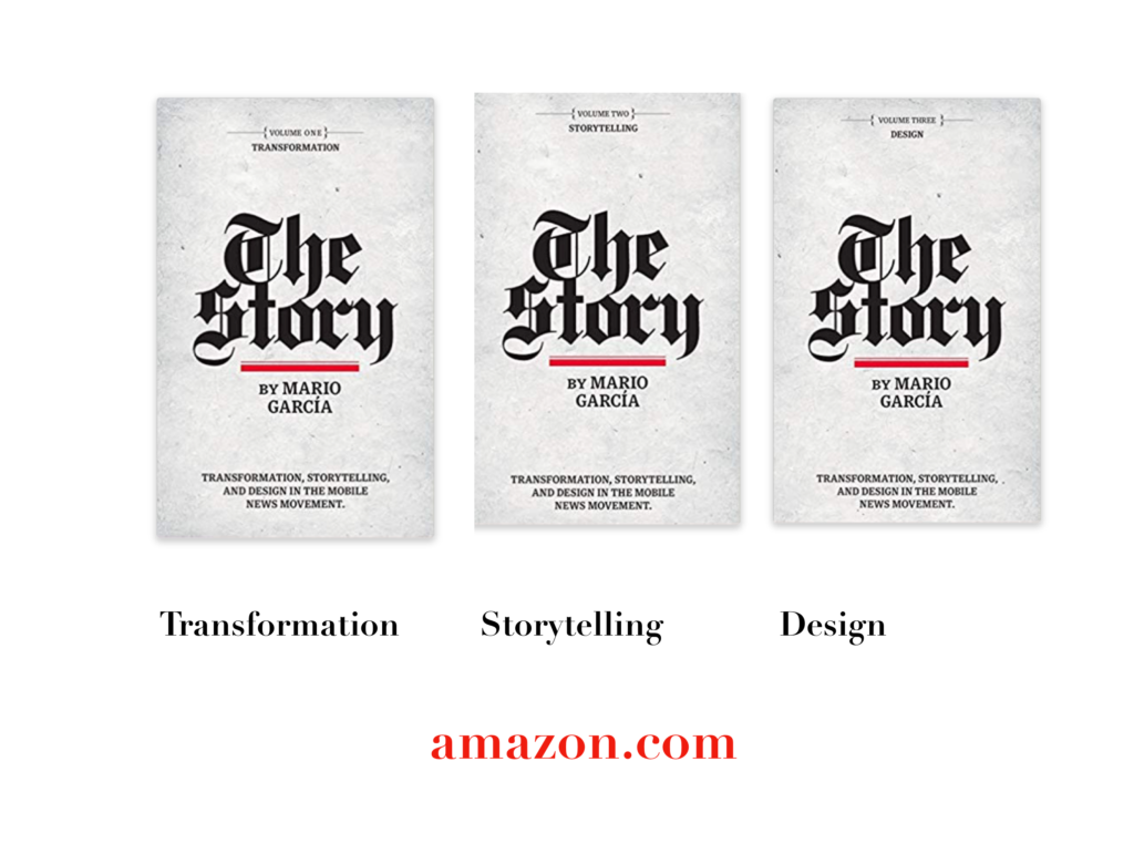
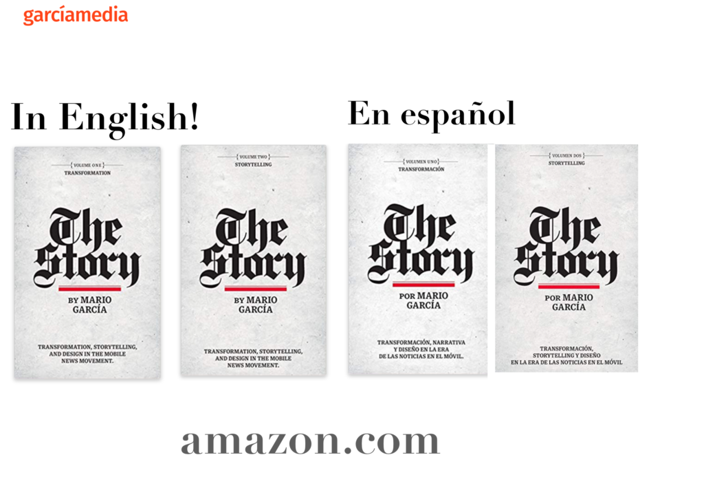
A good read to start the year 2020: The full trilogy of The Story now available–3 books to guide you through a mobile first strategy. Whether you’re a reporter, editor, designer, publisher, corporate communicator, The Story is for you! https://amazon
Mario’s speaking engagements
March 13, 2020
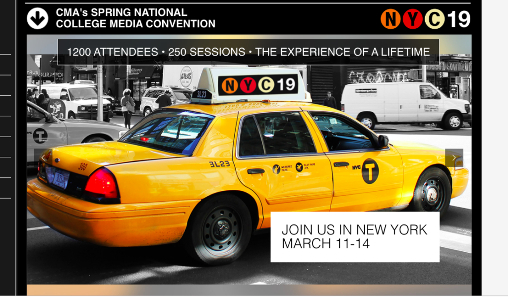
Keynote presentation at the National Media College Association Spring Convention, New York City, NY
March 27, 2020
Keynote
New York Press Association (NYPA), Saratoga Springs, NY.
TheMarioBlog post # 3189