I first got the print version of this elegant photo essay , Perpetual Motion, in The New York Times. It was part of my Sunday print package of the Times, which I start getting Saturday. Immediately after seeing it, I was curious to see how such display of vintage photos from the Times’ archives would be presented digitally. I had to wait till Sunday morning to see it.
The print edition, all black and white, is a photo album with great images, all about dancing in the New York of another era. There is hardly any text here, as many of the photos stand on their own. Notice that there is ample (no, make that generous plus) use of white space.
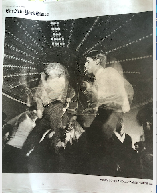
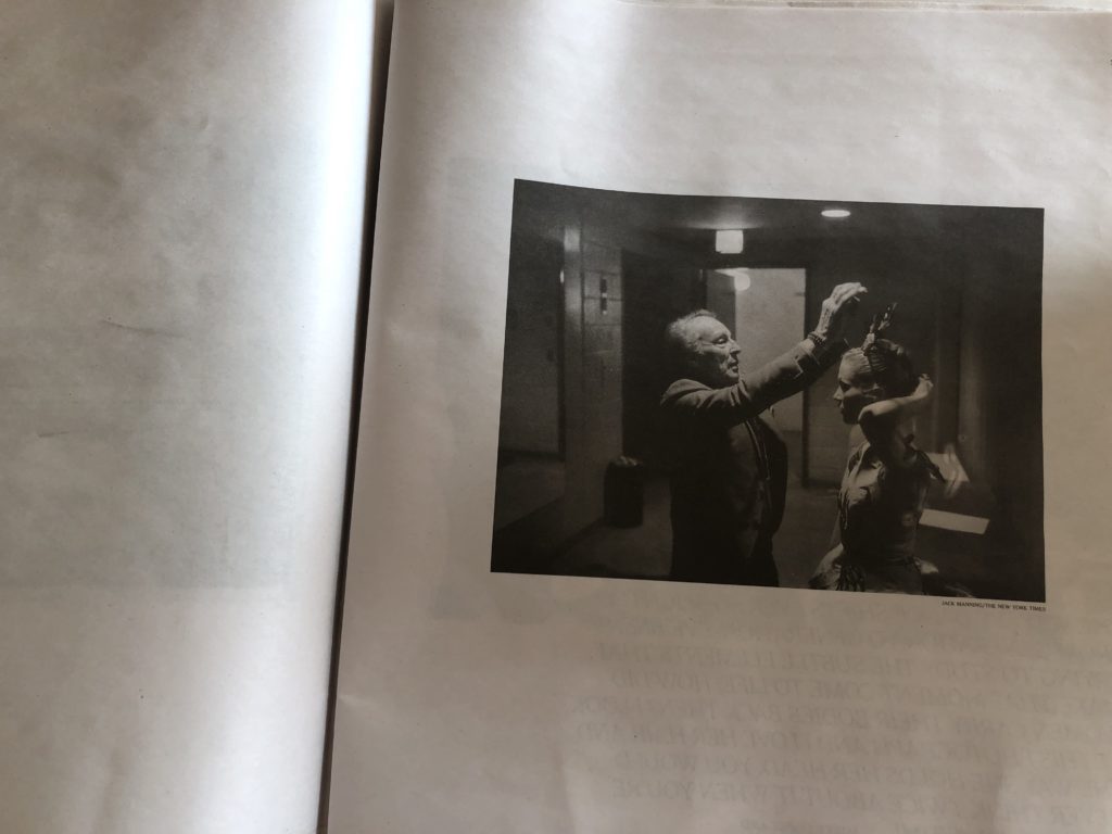
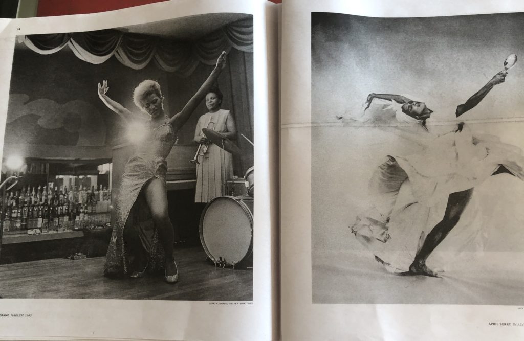
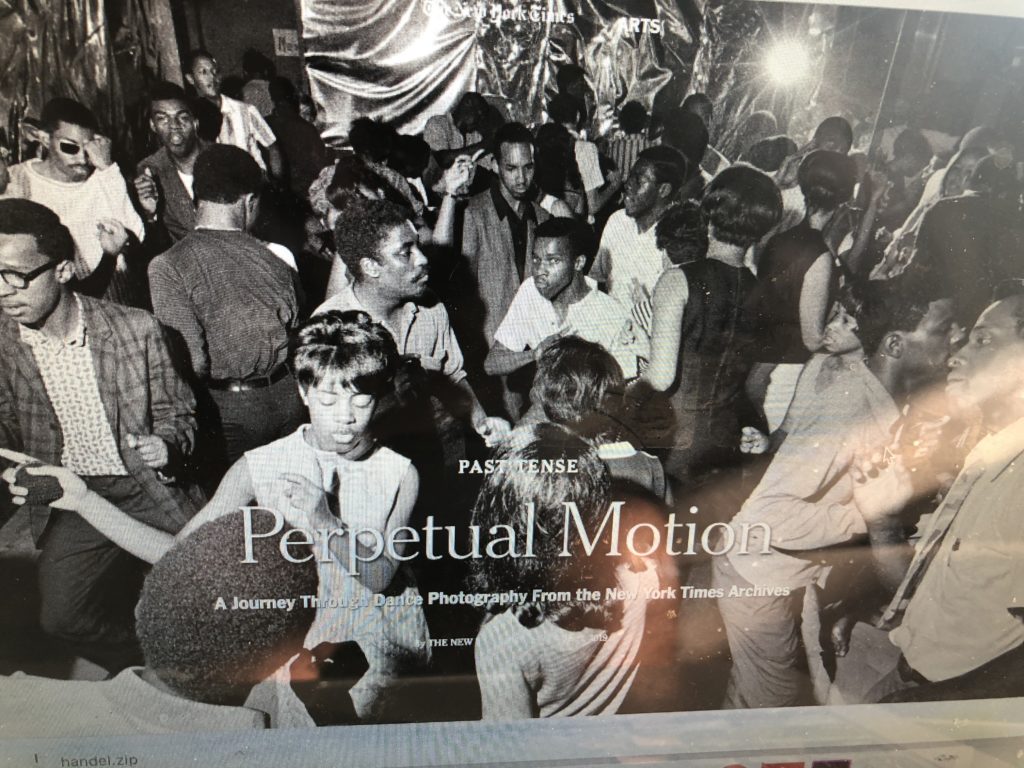
Here is how the same photo essay appeared on the screen of my laptop. An identical representation and photo, except that the print edition contains no headline up front, which the digital editions do. There may be good reasons to just let the cover photo speak in the print edition, which we can flip through to see all the photos. In digital, and, specifically for mobile, the reader needs more than an image to guide the process.
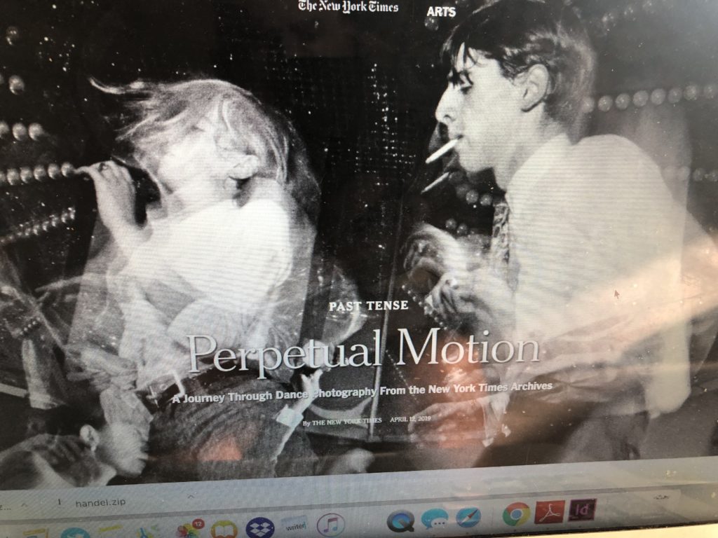
This headline information appears on page 2 of the printed version. Here is how the images fill the screen on the laptop version, since the “cover” image is not just one, but a series which automatically appear on that home page of the supplement.
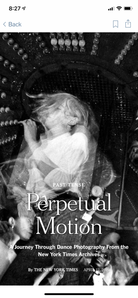
The mobile version
When I turned to my iPhone, this is how the story appeared:
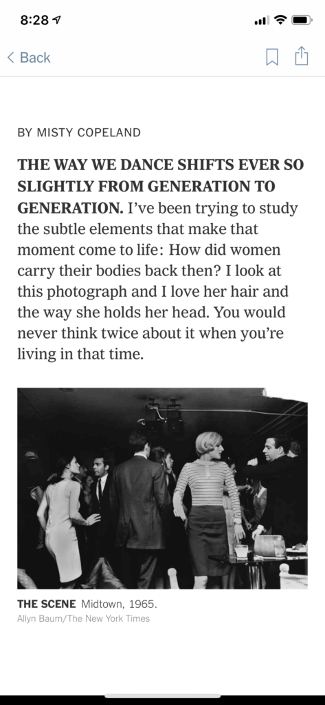
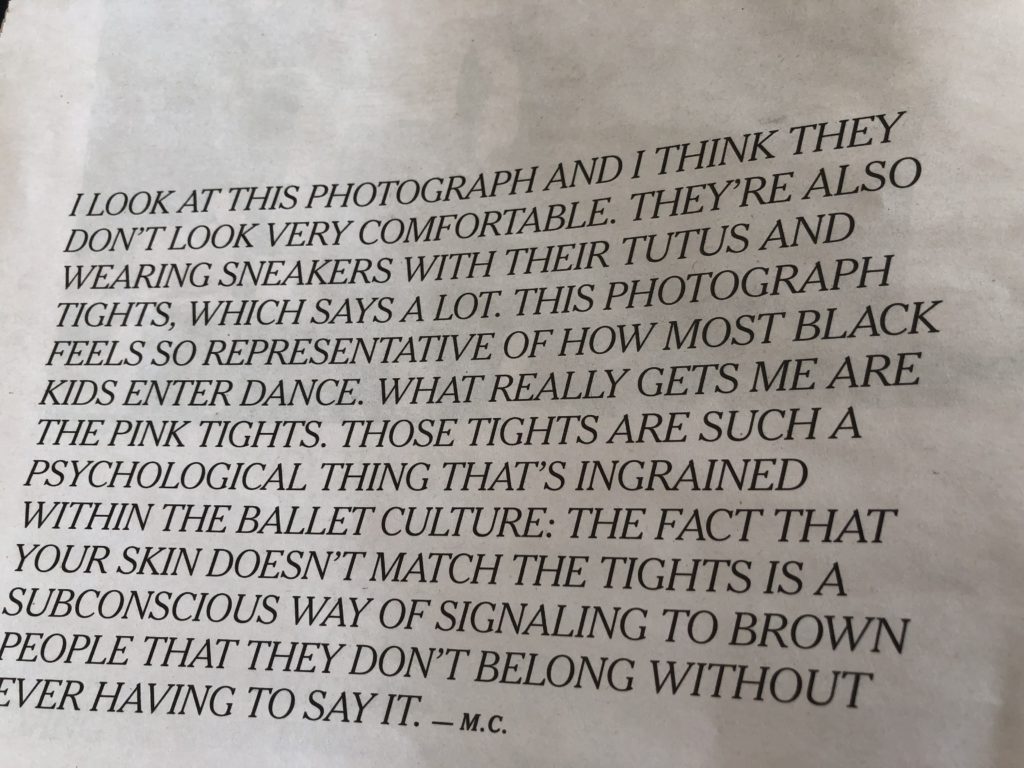
The type palette
Notice that the print version of this supplement uses text in all capital letters and italics, surrounded by plenty of white space.
The digital version, however, is set completely different as we see below:
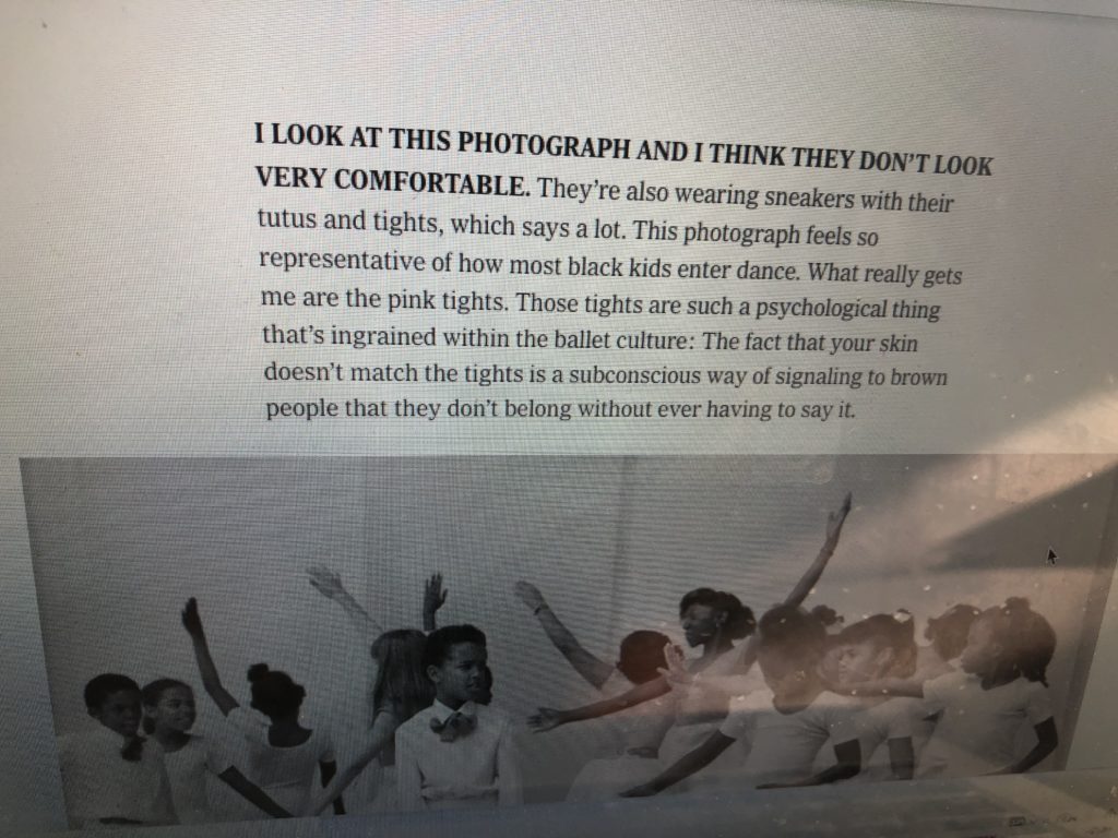
Obviously, the digital version alternates between all caps and caps and lower case style letters and seems easier to read than the all caps treatment for print.
My take
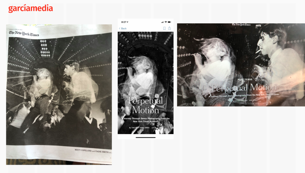
I like how the look & feel of this photo essay carries through across platforms. I am curious to know which came first as part of the planning. In a perfect world, the team planned for how the photos would appear on the smallest canvas—mobile—-first, then go from there. However, it is all very possible that the process started with a print project which transferred well to the other platforms.
Pre-order The Story
The newspaper remains the most powerful source of storytelling on the planet. But technology threatens its very existence. To survive, the Editor must transform, adapt, and manage the newsroom in a new way. Find out how, pre-orderThe Story by Mario Garcia, chief strategist for the redesign of over 700 newspapers around the world.
Order here:
https://thaneandprose.com/shop-the-bookstore?olsPage=products%2Fthe-story
An interview of interest
http://www.itertranslations.com/blog/2019/3/11/fd60ybflpvlqrgrpdp5ida5rq0c3sp
TheMarioBlog post # 3032