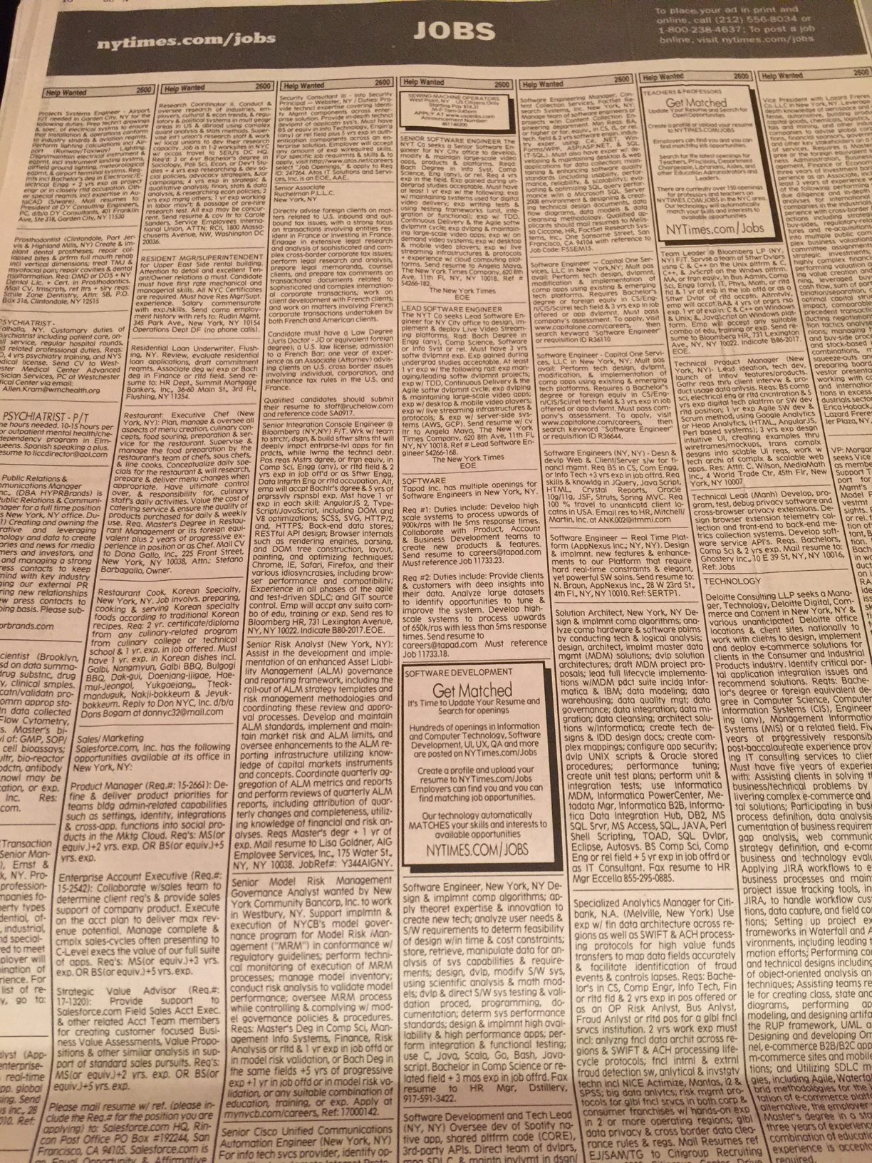
I admit that I have been living in New York City already five years, and getting the print edition of the Sunday Times during that time. It was this past Sunday that, for the first time, I noticed the Jobs Classified pages, all three of them.
It is a sea of gray. Take a look!

I thought that classified pages had, for the most, disappeared from US newspapers. And if they are going to look like this, they should. I imagine that very few people turn to these pages to look for a job in the digital age. If they do, however, it will be a major challenge to get through the small (agate) type, with a monotone of only one weight for the font chosen. There is no bold, no all caps, no italics, no color, or anything that will help break these units and allow for the eye (and the finger) to move from one ad to the next.
It’s no wonder I never noticed these pages for five years. Of course, I am not presently looking for a job. If I did, however, I would probably not have the inclination to struggle with the typographic obstacles here.
Although, I do remember reading somewhere, decades ago, that the reason classified pages used agate (small 6 point type) is because the people looking for a house, a job or a used car, wanted the information so badly that they would struggle with the small type.
In 2017, I wonder how many will struggle. Some obviously do or the New York Times would not have these pages in its Sunday edition.
Mario’s Speaking Engagements
Nov. 16-19, WAN IFRA Latin America, Buenos Aires, Argentina

April 18-19, 2018-–Newscamp ,Augsburg, Germany.
May 26, 2018 —Associacion Riograndense de Imprensa, Univesidad de Santa Cruz (Unisc), Brazil

June 3-6, 2018—The Seminar, San Antonio, Texas.

Our digital transformation workshops

If you would like to find out more about our workshops for digital transformation, email me: mario@garciamedia.com
I will be happy to answer your questions and provide more information. Our workshops are offered in both English and Spanish.
