While much is said about the possible end of the home page, what, with many users coming in via social media to read one article, get out and never visit the home page, it is interesting to see all the work and effort that The New York Times’ digital team is putting into what some describe as “the most significant redesign in the Times’ digital history.”
Not that the average reader will probably identify the changes instantly, as they are subtle, but substantial.
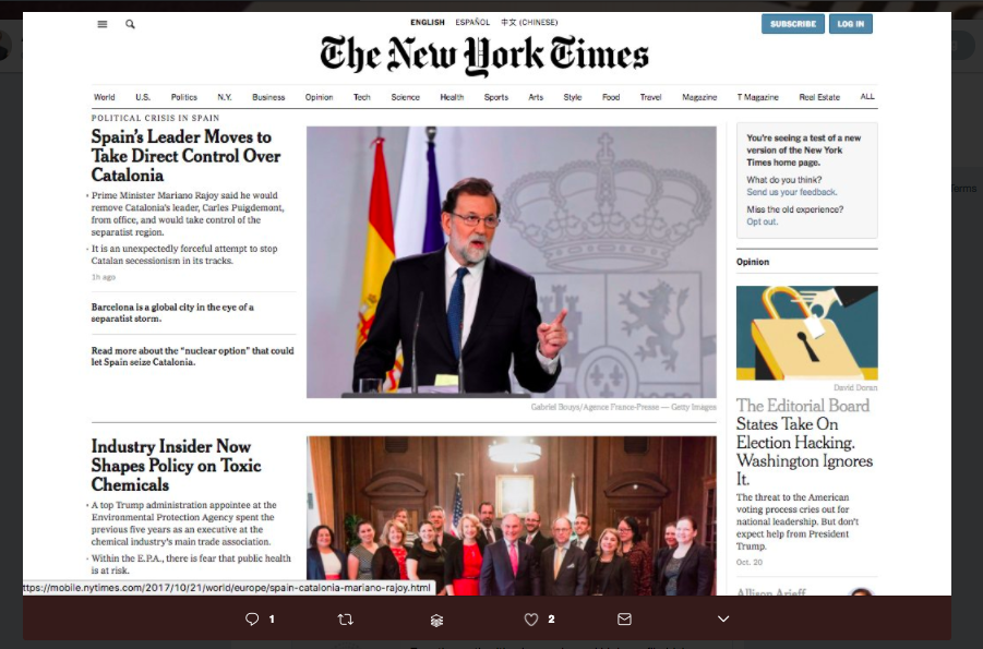
I happened to come across a screen image of the beta version that The Times has begun sending to some subscribers, via Tweeter, where colleague Andrew Losowsky, Project Lead, Mozilla’s @coralproject , posted it.
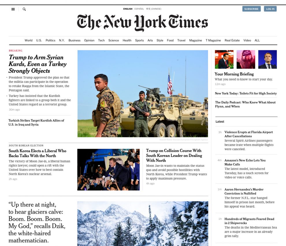
AT first I had to do a couple of double takes to realize what the changes were. Of course, the look and feel, the typography and the grid are rather similar to the existing one, but, on closer look a couple of things are obvious:
- This is a less congested, more relaxed home page.
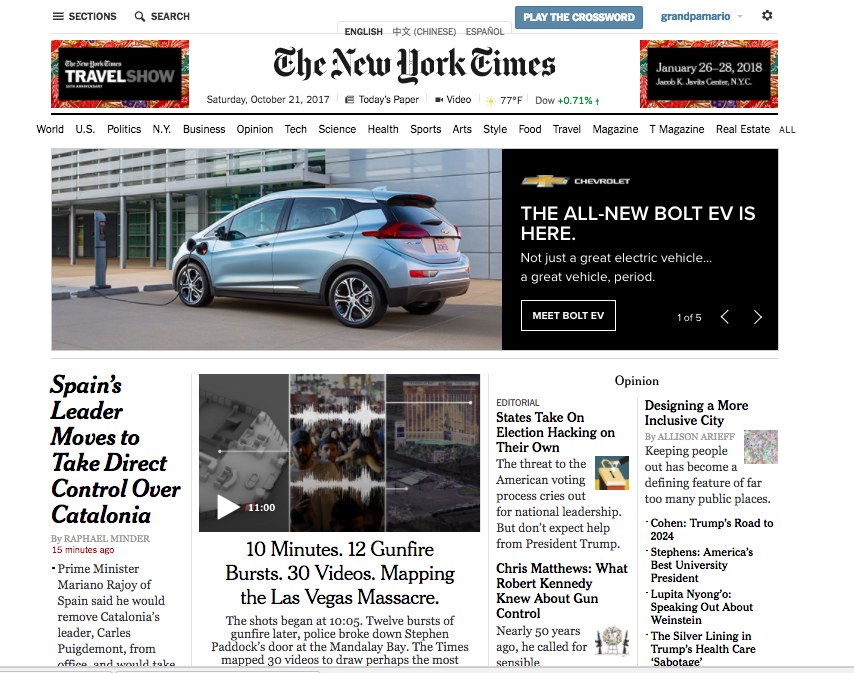
- It still offers the sense of hierarchy that The Times has gotten us used to, but the Opinion section has been demoted (it ‘s no longer at the top of the home page). Instead, now we have the Morning Briefing. We also have The Daily Podcast, and a column of headlines under The Latest.
These are welcome features, especially a more inviting and less busy homepage, something we try to incorporate in our own work. Ironically, the home page is going through the same “growing” pains that print has. WE no longer break news in print, so we see that front pages are more magazine like in look and feel, and content display.
Similarly, we are getting our breaking news by the second on the screens of our phones, not necessarily on our desktops or laptops. The Times is obviously capitalizing on the success of its mobile apps and bringing elements like The Morning Briefing to its home page. Structurally, I see a vertical grid that is definitely inspired by how we get the news on our smartphones.
Here is the proposed new home page for the Times (Sunday edition)
Here is the beta version for a daily homepage:
Here is the existing home page:
A piece on Nieman Lab offers great insights into the redesign of the Times’ website, so I suggest you read it:
http://www.niemanlab.org/2017/06/newsonomics-the-new-york-times-redesign-aims-to-match-the-quality-of-its-products-to-its-journalism/
Our digital transformation workshops
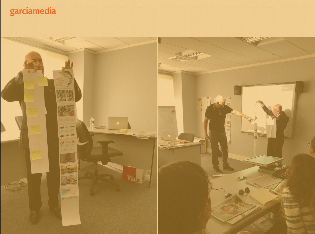
If you would like to find out more about our workshops for digital transformation, email me: mario@garciamedia.com
I will be happy to answer your questions and provide more information. Our workshops are offered in both English and Spanish.
Mario’s Speaking Engagements
Nov. 16-19, WAN IFRA Latin America, Buenos Aires, Argentina

April 18-19, 2018-–Newscamp ,Augsburg, Germany.
TheMarioBlog post #2721