The Times is testing its proposed new home page with a new design. The test is with a small group of readers since last year. According to the Times’, these are the changes in the makings:
Seamless experience: Whether you visit on your phone, tablet or computer, you’ll now see the same groups of stories across all of your devices each day.
Easier to use: Our editors will group similar stories together to give you more context about topics in the news.
Helpful for following your interests: We’ve organized our home page so that, over time, it becomes easier to find the things you want to read most. Our editors will choose the most important and compelling stories each day, and we’ll supplement those selections with pieces we recommend for you, based on your interests.
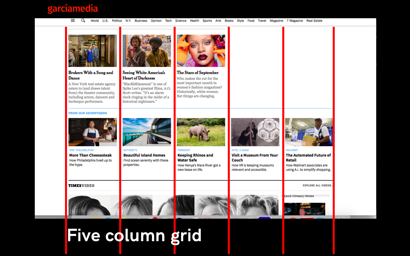
I have been looking at the new design, and, in my view, the more visual change is in the grid itself, the number of columns. Indeed, the home page is less cluttered, as if we get away from that Yahoo 1992 look. It is calmer upon entering.
Let’s take a look through these images.
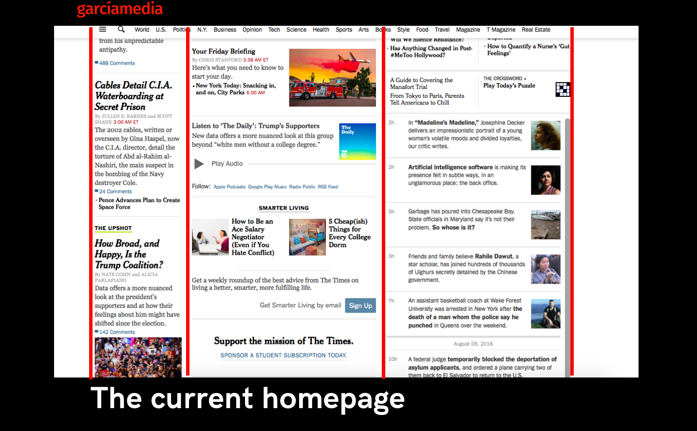
Here is the existing website, a bit crowded, and with all the headlines displaying much the same size headlines.
While I am aware that this limits the ability of the design to emphasize hierarchy, I have always thought the same of the size range of headlines in the print edition of The New York Times, where all stories seem to have the same importance, unless there is a major event to cover, in which case usually the headline extends across several columns.
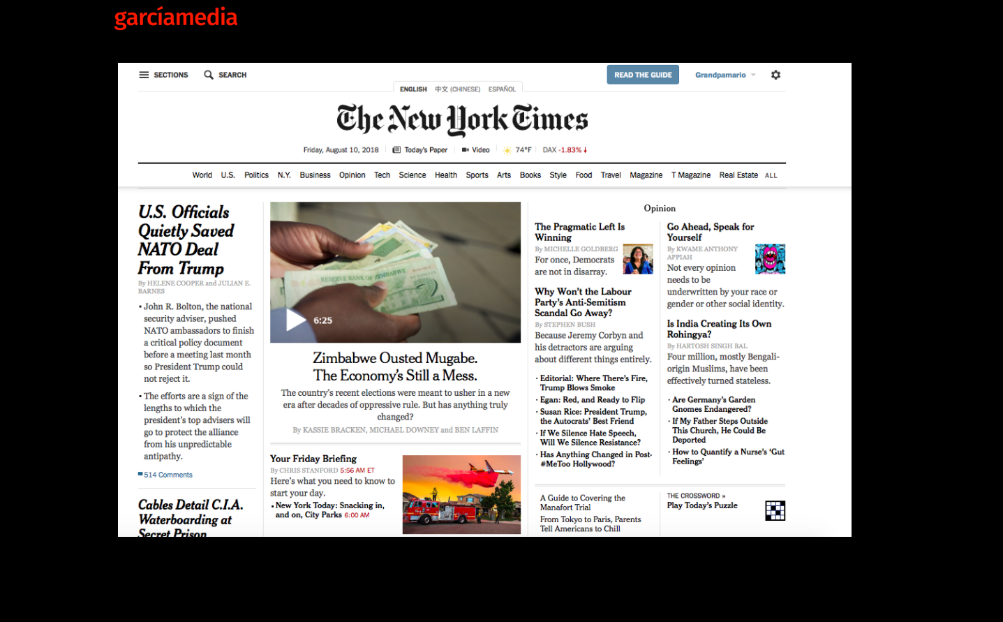
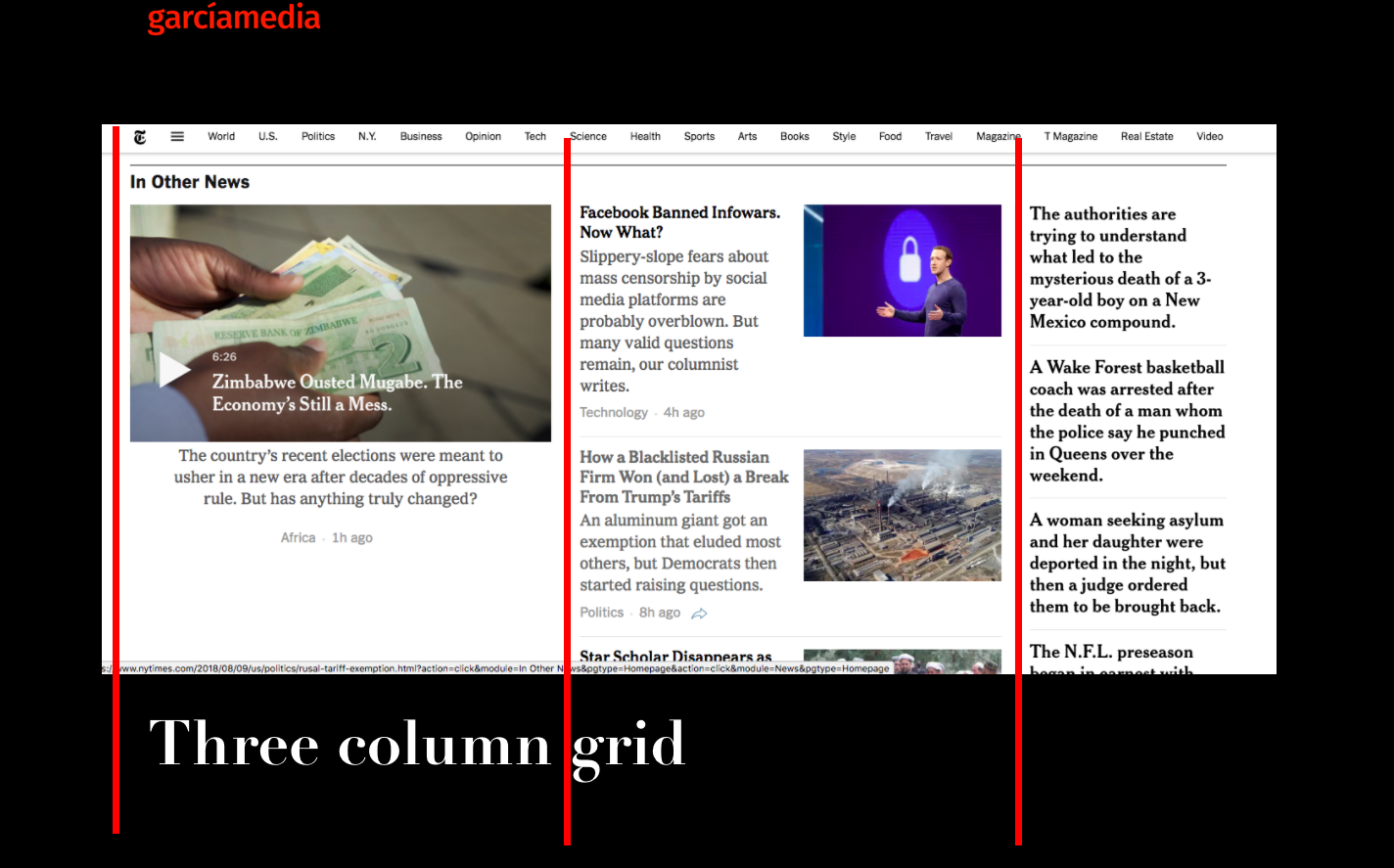
The current home page displays a three-column grid.
Here is a typical New York Times print edition front page, and the sizes of headlines do not vary much either.

Now the proposed home page improves on the grid, and the fact that it looks less cluttered, while the headline sizes are still showing not a noticeable degree of size change.
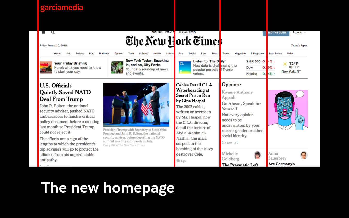
We see wider columns and more variety in grid configurations, from wide to narrow, in the new design.
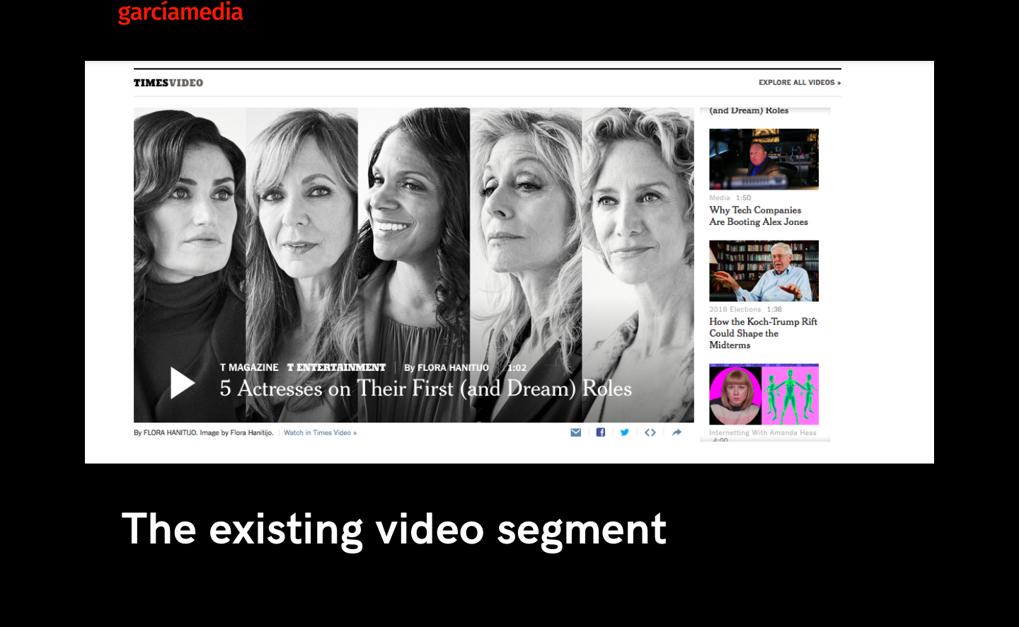
Missing in the new concept is a favorite mine in the existing, which is the segment to display videos, as we see here. In fact, I could not very easily find where videos would be displayed in the design.
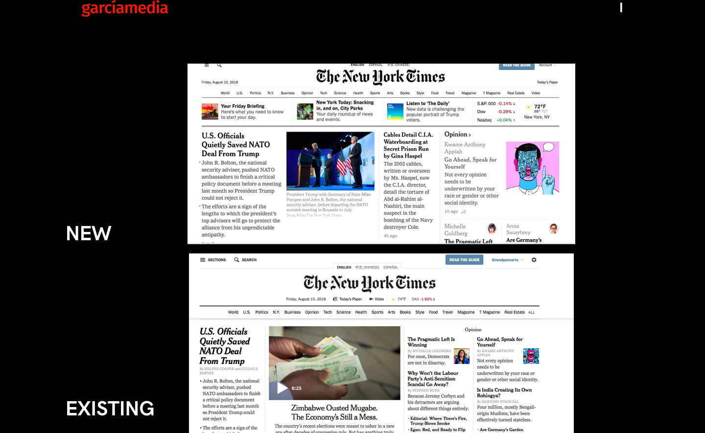
The new and the existing: What’s new?
I would call what I see in this transformation: Redesign Light.
One good feature is that there is a full five-column illustrated navigator to the entire site as we scroll down.
Overall, not very dramatic change, but some positive use of more white space and less clutter.

Mario’s Speaking Engagements
October 6, 20, 27–King’s College, New York City
The Basics of Visual Journalism seminars

October 25, Eidos Media Keynote, New York City

Garcia Media: Over 25 years at your service
