Introducing students to the typography and color essentials of designing anything falls into two of my favorite subjects to teach.
It’s natural: Everyone is exposed to typography and color, so when the conversation turns to those two subjects, we all come prepared with a lifetime of exposure. Then, voilá, students begin to see the system behind good use of type and color. Suddenly, it makes sense why a certain color is repeated, or why a designer picked that weight of Caslon for a certain headline.
I always like to relate the lessons to something very current, and so today I will begin by showing this new cover of New Yorker with illustration by Christoph Nieman.

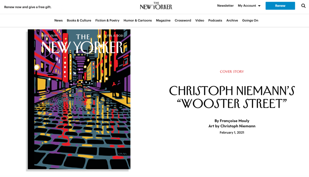
Why this is good: The cover is one of those that we would like to turn into a poster to frame and exhibit in our familiar surroundings, with colors to lift our mood and engage the eyes. Purple and yellow make for a delightful combination, effective here also because it is not a combo we see often.
A font we like….
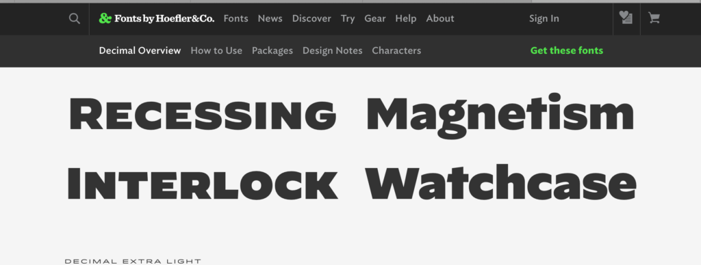
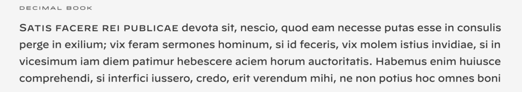
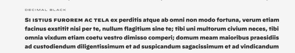
From the Hoefler collection: This is a new font from Jonathan Hoefler and his team. Looking for a robust sans that is elegant and that plays so well in caps and lower case. See the word Magnetism above.
I like these two weights specifically:
For more information:
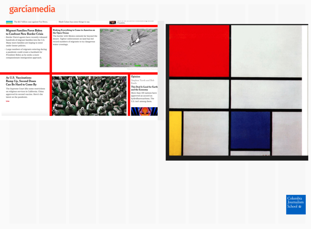
Inspired by Mondrian
While discussing grids: I always remind the students that inspiration is everywhere. When it comes to grid configuration, I usually turn to the master Dutch painter, Piet Mondrian, who created some fabulous work to inspire dozens of grids for digital and mobile, Here is a sample grid that a student turned in for her assignment, and I have noticed that this grid could have been inspired by Mondrian.
https://en.wikipedia.org/wiki/Piet_Mondrian
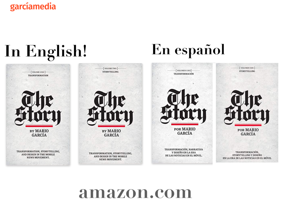
Professors: get your review version of The Story on time for fall classes
As an academic, I know the importance of having the right tools to advance our students, especially on the important subject of mobile storytelling. Please drop me an email if you would like to sample The Story in its digital edition: mario@garciamedia.com
Start writing or type / to choose a block
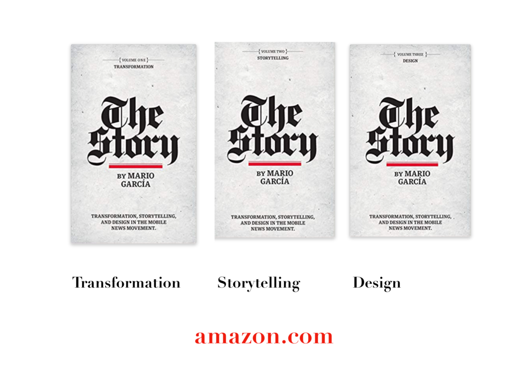
The full trilogy of The Story now available–3 books to guide you through a mobile first strategy. Whether you’re a reporter, editor, designer, publisher, corporate communicator, The Story is for you! https://amazon
TheMarioBlog post # 3270