This is the weekend edition of TheMarioBlog and will be updated as needed. The next blog post is Monday, October 22.
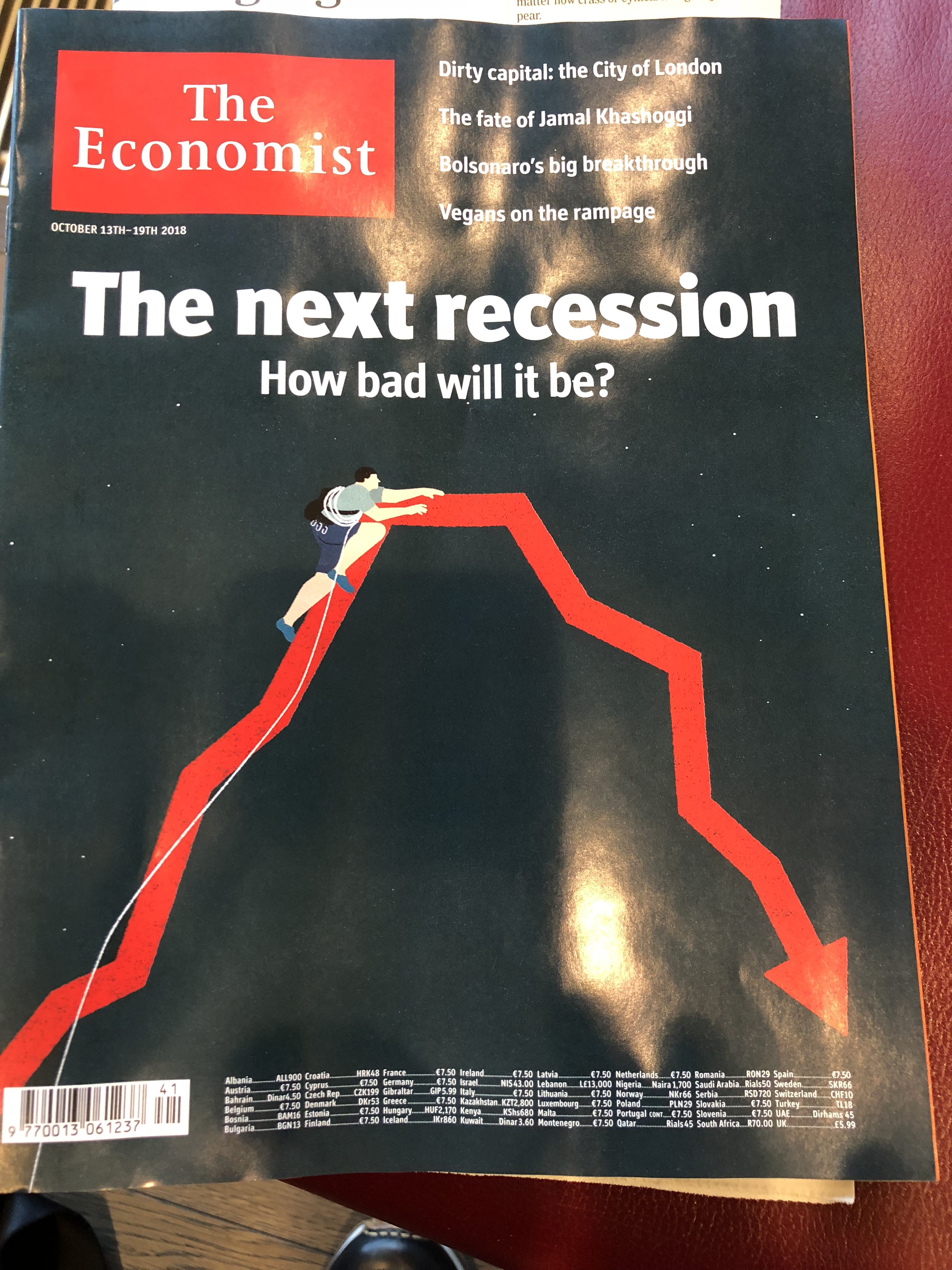
The lead piece for The Economist this week is about the recession that may come.
It is sort of a scary read, especially if you go by our economic news in the US, which continues to be one of the strongest in the globe.
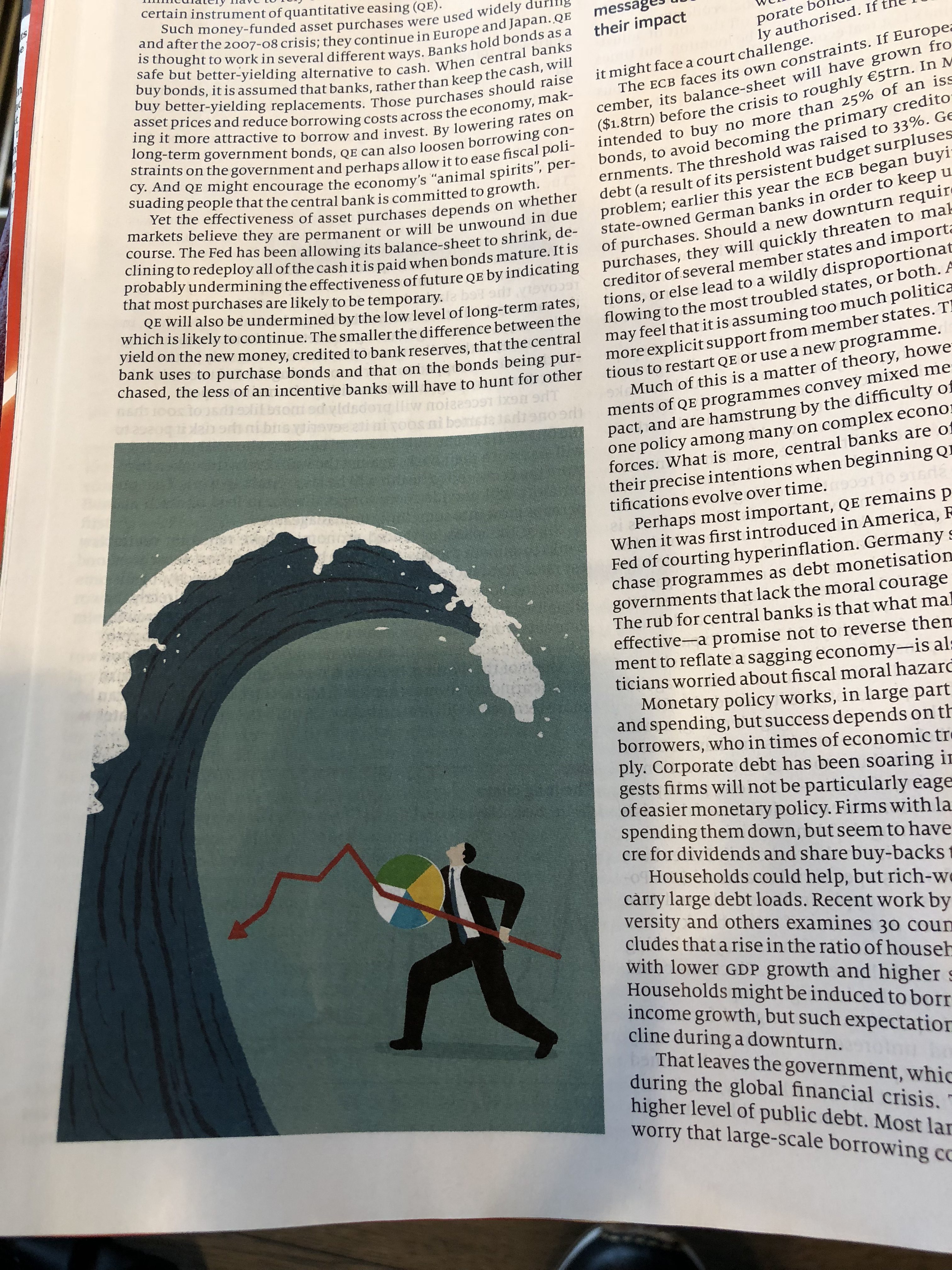
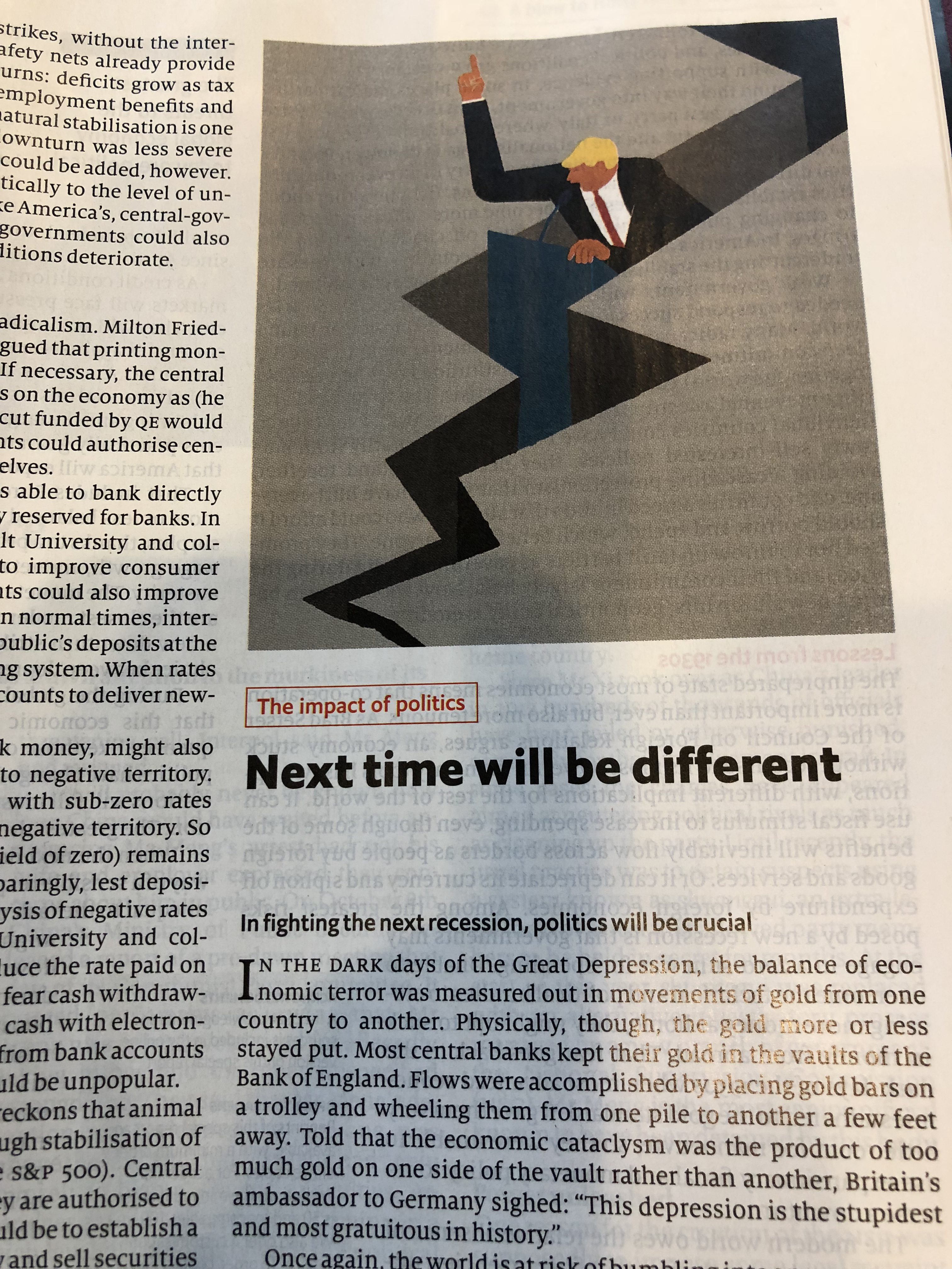
But, aside from the pessimistic (but well documented) content about the recession that may come, I liked how The Economist’s design team again resorted to visuals that are appropriate and that reflect the content of the story. In this case, illustrations move us from one segment to the next. Loved the cover graphic which communicates the essence of teh story at a glance.


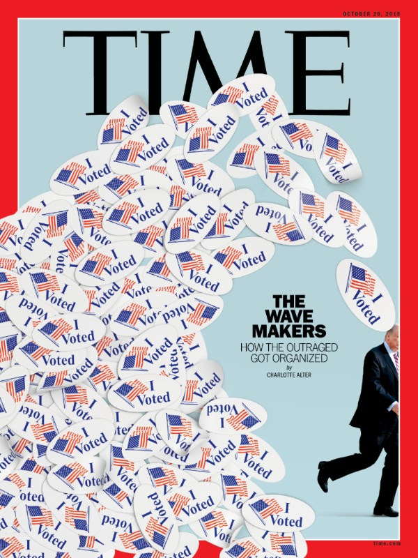
A vibrant, timely TIME cover this week

TheMarioBlog post #2932
The Mario Blog
04.14.2025—4pm
Mario Vargas Llosa (1936–2025): The Scent of a Master Writer
04.02.2025—1am
Teaching about two revolutions in the newsroom
03.31.2025—1am
For editorial teams, the product people are the challenge
03.30.2025—7am
When type alone does it!
03.28.2025—3am
Celebrating the 4000th entry of TheMarioBlog today
—2am
Has the first AI-generated newspaper set visual journalism back?
Sign up and we will keep you updated