Reporting from Delhi, India–
As far as the marketing goes for tourism here, it is all about Incredible India!
The tagline fits well. I always find my trips to India to be interesting, full of excitement, great food, visits with some of the nicest, kindest people in the world, and discovery of delicious foods (this time I am in love with egg curry, a dish that I think would make for great conversation and a delicious serving in a typical American Sunday brunch—I am getting the recipe).
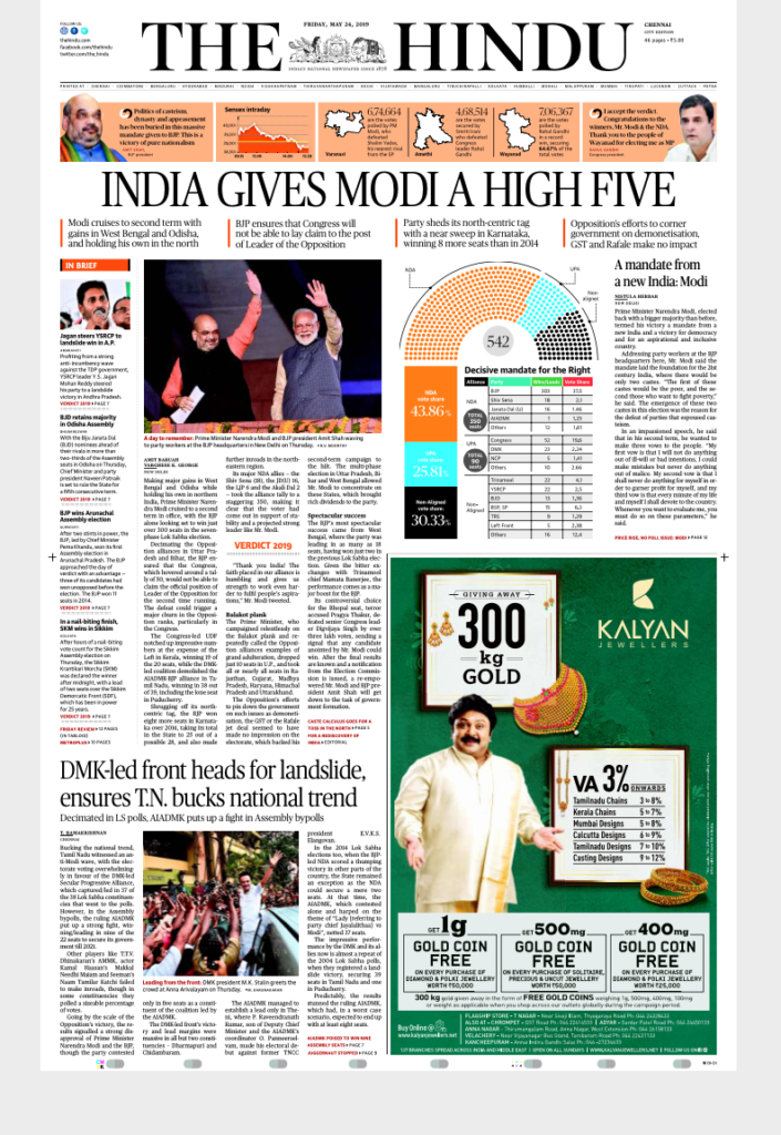
However, when it comes to recipes, the one for the design of most Indian newspapers is one that is a bit dated, although not lacking in spice, the kind that comes with over the top use of color, tons of stories on each page, headlines that bump into each other, cutout photos and much more.
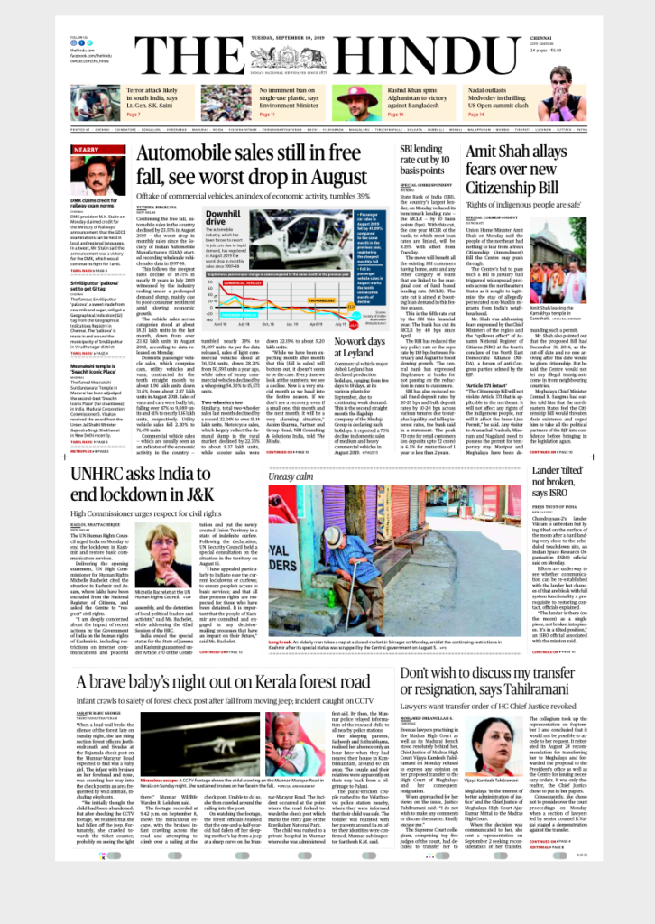
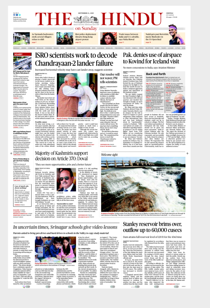
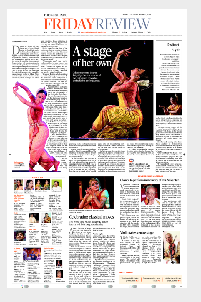
This was the subject of my earlier blog post Wednesday,, in which I mentioned that there is an exception to the “more is best” philosophy of newspaper design in India: The Hindu, a newspaper that we at Garcia Media designed in 2005.
While The Hindu is published in Chennai, and its circulation and readership are heavily concentrated in the South Indian region, it is more than that, as its front page legend reads under the nameplate, ‘India’s National Newspaper Since 1878’.
Today The Hindu prints in 21 centres spread across the country.
The “uncluttered newspaper” challenge
The headline of my Wednesday post was all about Those Spirited Indian Newspapers, and emphasized how uniform in style all the Indian newspapers seem to be when it comes to their design, with the exception of The Hindu.
That is why I have been talking to , N. Ram, Chairman, The Hindu Publishing Group, and Murali N.,Chairman of the holding company of The Hindu Group., to get their take on the challenge. I asked Mr. Ram the following two questions: ’What makes The Hindu unique? What is the engine that keeps that more classical design alive?’
Here is Mr. Ram’s response:
The Hindu, one area where we lagged behind historically, in my view, was newspaper design. Some worthwhile efforts were made at the turn of the last century to introduce new design, but it was only when we came to you in 2005 – after N. Murali, the Managing Director, came up with the name of Garcia Media and made the initial contacts with you – that we learnt what a full-fledged newspaper design exercise was essentially about and what it could for our newspaper. We loved your ‘pure design’ (many of us devoured your 2002 book bearing that title and we stocked up copies for use by our editorial and design teams). And the ‘classical-contemporary’ look and feel that was given to The Hindu, very much on the promised deadline, was a notable success – with our readers, with our editorial, design, and marketing teams, and, I would say, within the Indian newspaper industry.
How it all happened!
I would say that the engine that keeps The Hindu’s ‘classic, elegant and uncluttered design’ alive is this seriousness of purpose – the commitment to independent journalism as a democratic craft which, if it is to succeed, needs to keep up with changing times in all respects while staying loyal to its core values – and the realization that pure design, a learned or acquired core value, is of timeless significance for us.
Specifically, Mr. Ram referred to The Hindu’s engagement with Garcia Media for the initial big design push:
One area where we lagged behind historically, in my view, was newspaper design. Some worthwhile efforts were made at the turn of the last century to introduce new design, but it was only when we came to you in 2005 – after N. Murali, the Managing Director, came up with the name of Garcia Media and made the initial contacts with you – that we learnt what a full-fledged newspaper design exercise was essentially about and what it could do for our newspaper. We loved your ‘pure design’ (many of us devoured your 2002 book bearing that title and we stocked up copies for use by our editorial and design teams). And the ‘classical-contemporary’ look and feel that was given to The Hindu, very much on the promised deadline, was a notable success – with our readers, with our editorial, design, and marketing teams, and, I would say, within the Indian newspaper industry.
“Curation is the key”
Suresh Nambath, Editor of The Hindu, thinks he and his team have found the perfect formula to draw readers to all pages of newspaper:
We have learned to draw the readers to all the pages of The Hindu through promos and pointers and briefs (for regional stories) instead of crowding the front page. Our effort is also to ensure in-depth, detailed coverage rather than give the readers a superficial sample of everything that is fit to print. Curation, we believe, is the key to catering to the requirements of the readers in an age of information overload.
Start the year with The Story
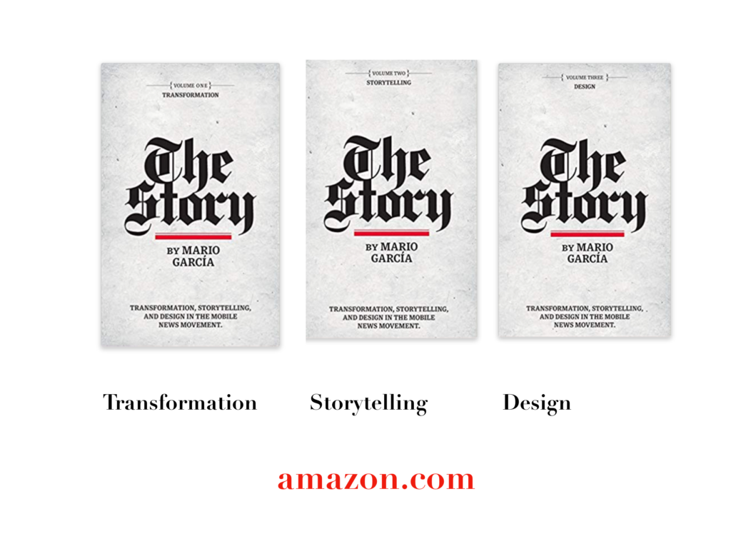
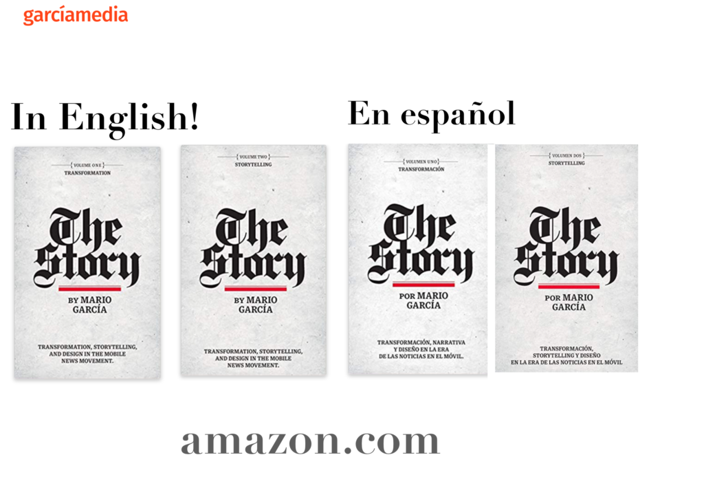
A good read to start the year 2020: The full trilogy of The Story now available–3 books to guide you through a mobile first strategy. Whether you’re a reporter, editor, designer, publisher, corporate communicator, The Story is for you! https://amazon
Mario’s speaking engagements
March 13, 2020
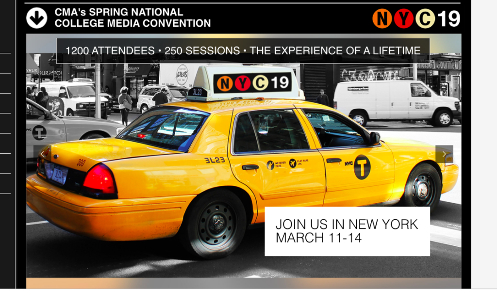
Keynote presentation at the National Media College Association Spring Convention, New York City, NY
March 27, 2020
Keynote
New York Press Association (NYPA), Saratoga Springs, NY.
TheMarioBlog post # 3182
