We at Garcia Media are proud to be involved, one more time, with the transformation of Harvard University’s student newspaper, The Harvard Crimson. Last time was in 2004 and much has happened to the craft of journalism since then, and the way we consume news.
That is why, current Crimson president (editor) Raquel Coronell Uribe, who, by the way, is the first Latinx woman to hold that position, decided to transform the Crimson into a digital first publication, with print only as a weekend product. Raquel, working closely with Jasper Goodman, managing editor, and a team of talented journalists and designers, have made this Crimson transformation possible.
Here is how Raquel explained this transformation to the Crimson readers and the Harvard community:
Today, an overwhelming majority of our readers interact with our content online. We must lead the way in embracing that reality.
This fall, The Crimson will make a historic change to harness the opportunity presented by the digital era: We will shift to producing a weekly print edition while recentering our operations and product to prioritize online content.
We understand the significance of this change: The University Daily will no longer appear daily in print. But this isn’t a move away from our commitment to covering Harvard every day — it is a step into the future that will allow us to improve the substance and delivery of our product while better serving our staff.
Here is how Raquel promoted the new Crimson in social media:

Design specifics
This is the Crimson that we started working with. While elements of our 2004 design remained in place, the overall look was showing wrinkles and it was time for change. This is how the Crimson looked in its last version as a daily print product:
As we at Garcia Media began the process of conceptualizing ideas for taking the Crimson print product to a weekly weekend edition, we knew that we were, in essence, creating a totally new product. That is why we took the liberty to propose a new logo, one with three lines stacked and in the crimson, which is the primary color in the newspaper’s palette:

We knew that the broadsheet format of the newspaper would not change. We also were aware that the Crimson is a text driven newspaper, and it would continue to be that way, emphasizing long, in depth stories suitable for its weekend readership.
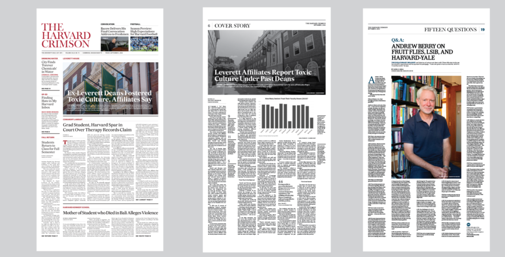
Here are some pages of the new Crimson: notice the use of white space, a five-column grid for the front page, and larger images, sometimes one per page. The front page emphasizes navigation to inside stories, while displaying a visual that accompanies the cover story of the week:

You can see a full edition here in pdf format:
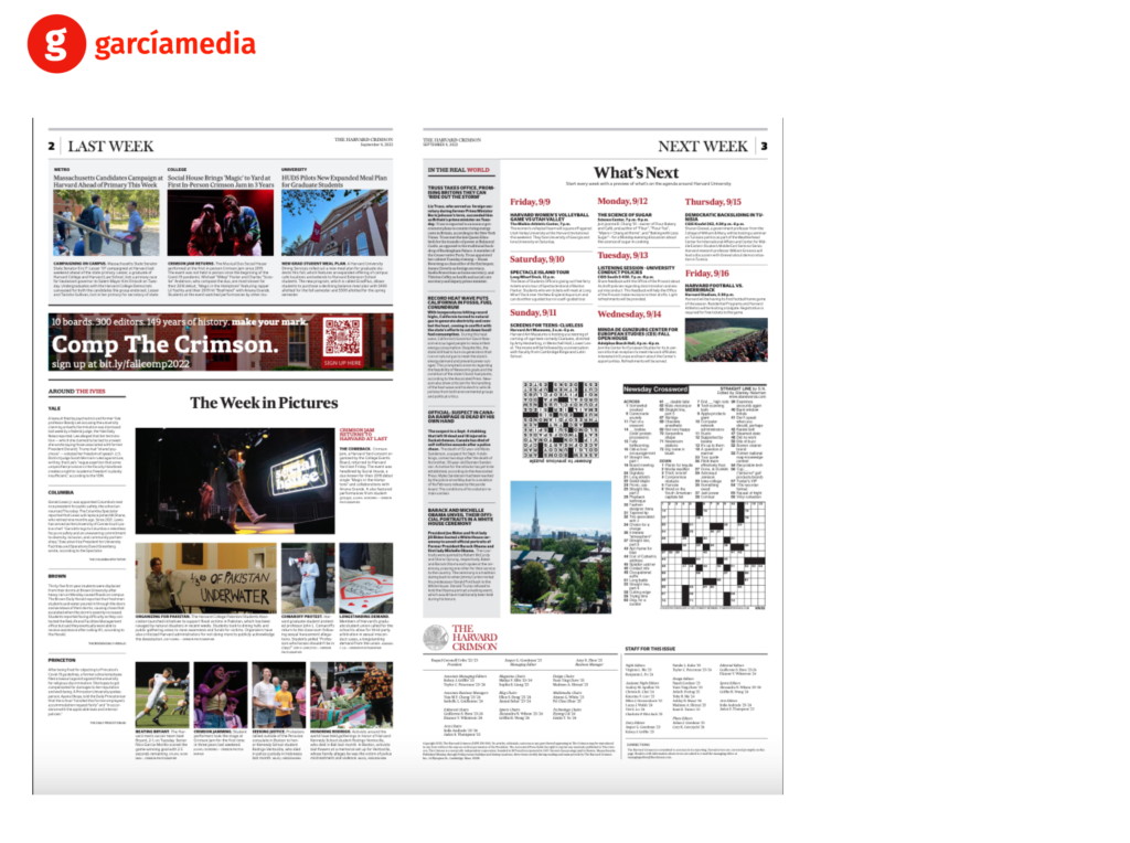
Reaction seems to be favorable so far, but early to say. Here are some pages from the second edition since the launch of the new Crimson:
Pages 2 and 3
These are destination pages with fixed content and design, so that the readers get a review of the week that was and the week ahead.

The typographic palette:
The fonts used are the same as what was introduced in the 2004 redesign: Sueca Serif, San Serif and Mercury Text.

The team:
The Garcia Media creative team for this project: Mario Garcia, CEO, chief architect of the project.
Rodrigo Fino, president/senior art director, Garcia Media Latinamerica
Paula Ripoll, Vice President/senior art director, Garcia Media Latinamerica.
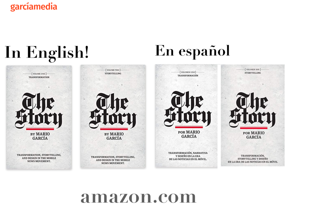
Spanish version of this blog post:
For the complete guide to mobile storytelling: The Story
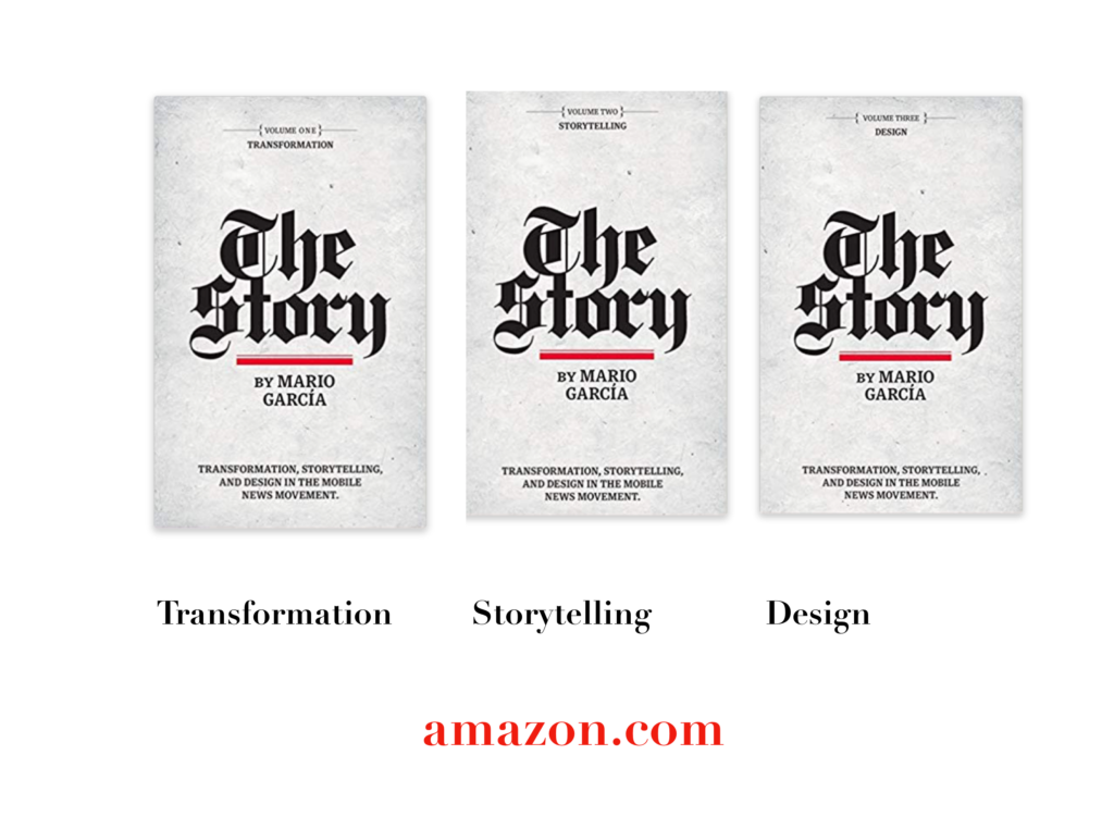
I urge you to consult my latest book, The Story, a trilogy full of tips and explanations about mobile storytelling, which represents the latest genre for journalists to explore. See information below:


The full trilogy of The Story now available–3 books to guide you through a mobile first strategy. Whether you’re a reporter, editor, designer, publisher, corporate communicator, The Story is for you! https://amazon
TheMarioBlog post # 3354
