Updated, Tuesday, Jan. 16, 2018 at 09:03
It is more than a change of format for the UK’s The Guardian.
As I looked at the front page of the January 15 edition, the first in the new tabloid format, I realize that gone, too, is the trademark blue logo.
However, the color coding continues to be used to identify sections on the newspaper’s website.
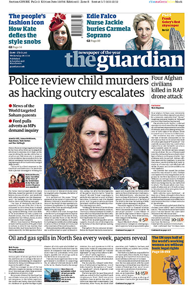
New year, new format, new branding, I guess. See below the old Guardian logo, with its deep blue background.

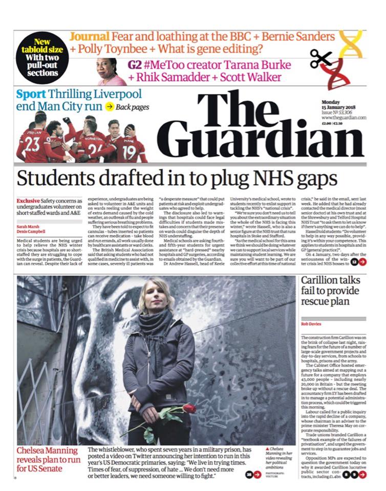
And here is the first edition of The Guardian in its new tabloid format, but also displaying new branding.

And here is how new brand appears on the newspaper’s website:

New typography
The Guardian has introduced a font called Guardian Headline. According to a note from the editor, the new font was a collaboration with the design experts Commercial Type, who created the original Guardian Egyptian.
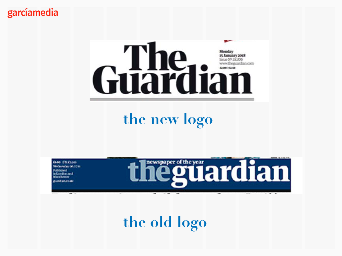
Comparing logos
I tend to prefer the older logo as a more contemporary branding, and, definitely one that would have gone quite well with the new, smaller tabloid format. I particularly liked the all lower case branding, which separated The Guardian from newspapers everywhere where publishers and editors believe that lower case would render their newspaper as less serious. The Guardian has proved to be serious and authoritative even with its youthful blue, all lowercase logo. I especially liked the “g”. Now it is a double decker logo with capitalized words, black, and, surprisingly, not very contemporary. It will be interesting to see how readers react to the change.
And, a question in my mind, is the new Guardian attempting to use this new branding to make us see it in a new light?
In the words of editor in chief Katharine Viner:
The masthead has a renewed strength and confidence to represent the Guardian’s place and mission in these challenging times.
What I would tell my Columbia students about this logo next week: the old one had personality, attitude, and it stayed with you. This The Guardian could be a newspaper anywhere with that name—and there are several! It would have made perfect sense, during a large to small format transition, to go from the new The Guardian, to the old blue, all lowercase theguardian. Thinking in reverse here!
The Guardian’s video introducing new look
Of related interest
Here is a column from Guardian editor Katharine Viner:
https://www.theguardian.com/media/2018/jan/15/guardian-new-look-online-katharine-viner
For several months, a team including our exceptional creative director Alex Breuer and senior editors and designers have been discussing and refining the Guardian’s new look, as well as gathering invaluable feedback from readers.
Highlight:
There will be understandable excitement at Guardian HQ over the change to tabloid. The outsourcing of printing may go unremarked. I hope a way can be found to recognise and thank the many people who have produced the paper at print centres in London and Manchester.
We’re using a range of energetic colours, and the much-loved Guardian visual wit and style remain at the heart of the look. The masthead has a renewed strength and confidence to represent the Guardian’s place and mission in these challenging times.
The New York Times’ story:
https://www.nytimes.com/2018/01/15/business/media/guardian-tabloid-uk.html?_r=0
The Guardian rebrand: will the tabloid relaunch revitalise the newspaper’s dwindling fortunes?
Highlight:
First impressions from readers could make or break the move as the Guardian looks to turn around a financial deficit which at close of the financial year ending July 2017 saw £45m in losses recorded. Newspaper sales are also in steady decline. In the 11 months between December 2016 and November 2017, there was a 9% drop in sales from 161,191 to 146,753 according to official ABC figures. This drop off has been widely replicated across the industry.
https://magculture.com/guardian-goes-tabloid/
Other views from designers in Europe
https://medium.com/@nkuepper/the-guardian-with-a-new-design-in-print-web-and-app-30fab6c97529
Mario’s Speaking Engagements
April 18-19, 2018-–Newscamp ,Augsburg, Germany.

May 26, 2018 —Associacion Riograndense de Imprensa, Univesidad de Santa Cruz (Unisc), Brazil

June 3-6, 2018—The Seminar, San Antonio, Texas.

Garcia Media: Over 25 years at your service

