It’s been a week of discussing the role of print for me.
Yes, it was the first meeting for my Columbia University course, Multiplatform Design & Storytelling, and in my introductory lecture I, of course, mentioned the role of print: no longer the protagonist, but still viable, forceful and “there” if given its proper place. In addition, I was scheduled for an in-depth interview with a media magazine where the main focus of questioning was on the role of print in my projects.
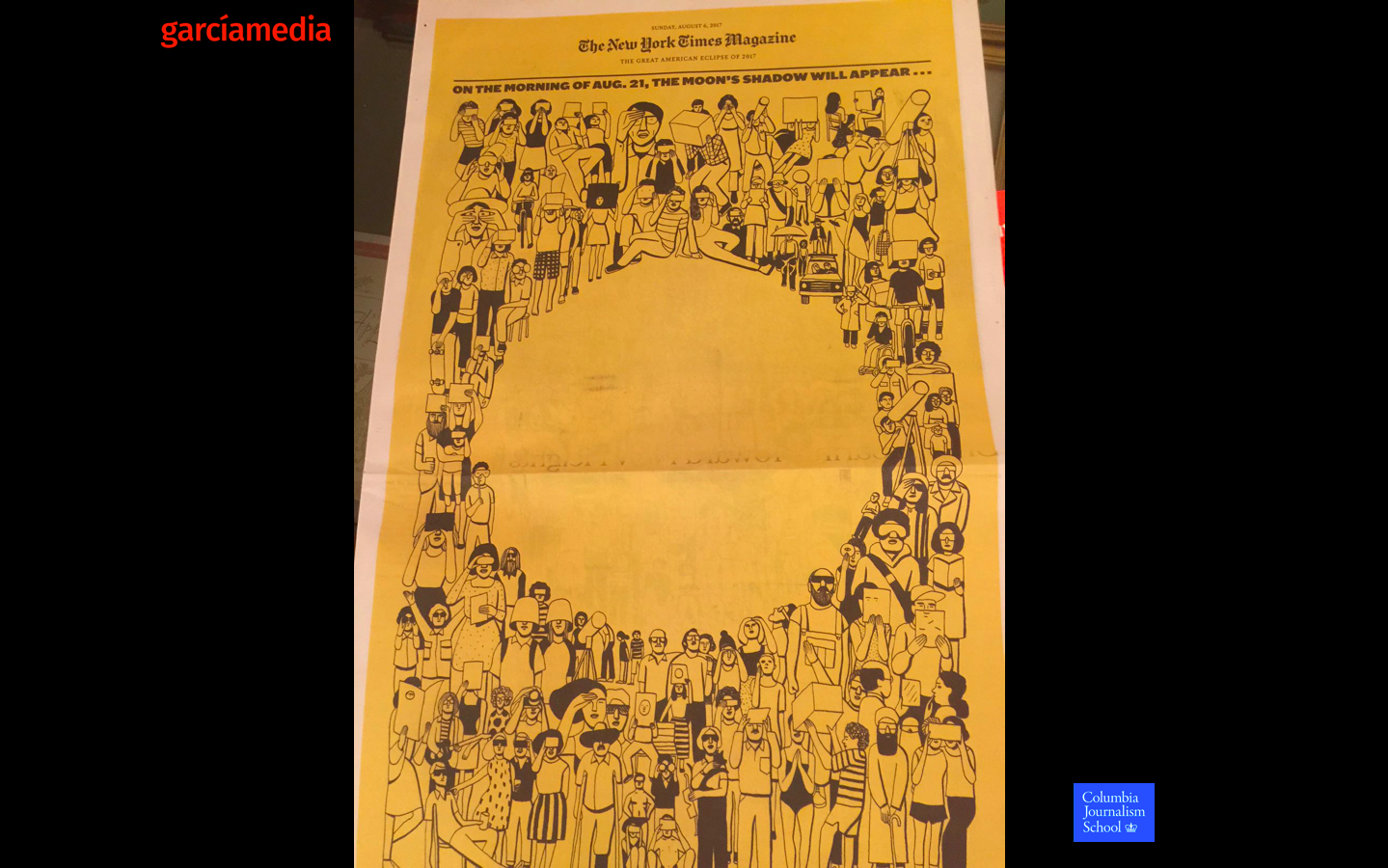
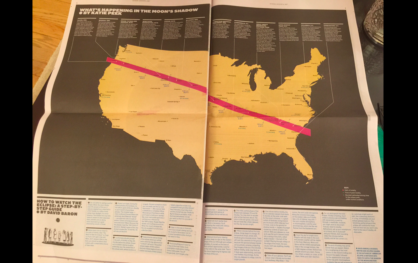
As I have said often, and written repeatedly in TheMarioBlog, I am a firm believer that things begin to happen positively in newsrooms once those involved get through the hurdle of accepting that you don’t break news in print, but that you can surprise the readers, and do things with the printed edition that are a bit more lackluster in their digital manifestations. Take, for example, The New York Times‘ special coverage of the 2017 solar eclipse. The Times’ graphic treatment across a double page was unequaled in presenting the story visually, and allowing readers to get the information instantly. This would have been more difficult to accomplish on the small size of a phone screen, for example.
At The Globe and Mail
Take a look at the new daily front page design, as well as the more magazinish weekend edition:
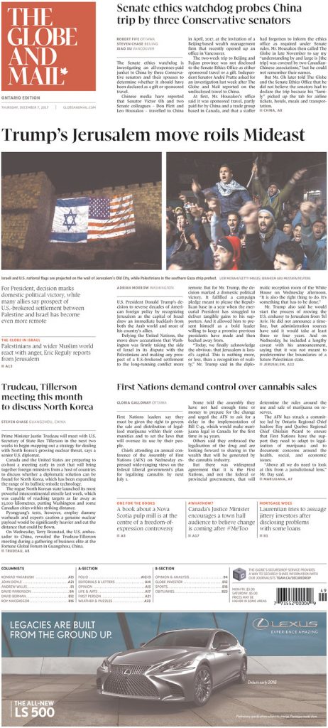
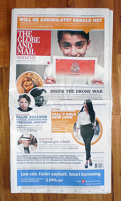
Now, Canada’s has launched a redesign of its print edition, and as I read all about it in a recent INMA report, I was impressed by a couple of items in the piece by Adrian Norris, the Globe & Mail’s creative director.
–First, the print redesign came at the end of a process of transformation, not at the beginning. Wise decision.
–The print redesign, by becoming the culminating point of the process, could be visually unified with the rest of the platforms. Indeed, this is the digital first approach that is important for all planning, not just for how a story flows. All of our efforts must begin with the smallest of the platforms, the phone screen, and move on from there.
In Adrian’s own words:
We were also in the middle of redesigning all of our digital and app products. The print product would need to reflect the new, streamlined look of our digital environment.
The entire company was in the process of transformation and the revitalized print edition was the culmination of the changes, demonstrating our commitment to print and showcasing our award- winning journalism.
More importantly, the redesign of The Globe & Mail’s print edition was much informed by 0nline analytic data.
The major changes
–On weekdays, it’s now two twenty page sections, the width has shrunk an inch, and there is more white space on the page.
–On Fridays, the paper includes a real estate section, and an automotive section in Toronto area papers. The weekend edition is the biggest at six sections, including a new opinion section and “Pursuits” which combines books, travel, fashion and food coverage.
–The width of the paper was dropped to 10 inches
The importance of opinion
I am not surprised that part of the data collected by The Globe & Mail as it planned its print edition redesign included the tremendous interest of readers in opinion pieces, something we have observed in our own work and focus groups with client newspapers.
According to Globe & Mail executives, they have “developed enough intelligence about reader habits since Sophi has been in place to apply it to the newspaper itself. From Sophi data, consistently the most popular thing we do is opinion.” And so, opinion pieces are now in the A section on weekdays and opinion has its own 12 page section in the weekend edition.
Local news and opinion, those are the two workhorses when you ask readers. For print editions, a winning combination.
We definitely will keep an eye on the new Globe & Mail.
Read more about it:
Mario’s Speaking Engagements
April 18-19, 2018-–Newscamp ,Augsburg, Germany.

May 26, 2018 —Associacion Riograndense de Imprensa, Univesidad de Santa Cruz (Unisc), Brazil

June 3-6, 2018—The Seminar, San Antonio, Texas.

Garcia Media: Over 25 years at your service
TheMarioBlog post #2765